 This month, Sign Builder Illustrated speaks with a number of ADA signage -related manufacturers and suppliers about some of the big questions and misunderstandings that still persist in this field, as well as trends.
“There seems to be a lack of real information on what exactly is needed to be ADA-compliant,” says Chris Bayer, president of wholesale sign supplier Cab Signs, noting even after the Americans with Disabilities Act Accessibility Guidelines (ADAGG) hashed out insufficient information to disengage some confusion with an update back in 2012. “Some of the questions we frequently hear are, ‘Which rooms or sign types require raised letters and Braille?’ ‘What materials can be used?’ ‘What size must the sign be?’”
Architectural sign systems provider Clarke Systems found that some of the most common ADA violations related to our industry included outdated signs, missing signs, incorrect signs, wrong height, and incorrect mounting.
“The regulations specify positioning for ADA signage. When you’re installing multiple signs in a given area, be consistent in placing them—i.e., in a hallway along which signs are posted at every door—so that they are at the same height for uniformity within the specified space,” advises Charles J. Kelly, Jr., president of Clarke Systems.
One of the most common oversights within the sign industry is assuming that standards related to ADA-complaint signage only refer to people with vision impairments. It’s actually a little more far-reaching.
The ADA encompasses more than the visually impaired (an audience made up of persons with other disabilities), so directional and informational signs actually have their own specifications, since a majority of those people do have usable vision.
“The Law was created under the premise of accessibility—unencumbered access/exit to and from a public facility,” says Kelly, noting this allows for improved pedestrian accessibility (visually impaired or otherwise). “Therefore anyone who moves freely through the space is a beneficiary of the Law.”
But the visual aspects remain the topic that generate the most asked questions.
When it comes to designing for ADA directional and informational signs, Kelly states that this is primarily driven by visual standards. “Visual standards dictate that directional signs must meet contrast and visual height requirements relative background colors and viewing distance,” he says. “As for informational signs, most situations are exempt from any ADA regulations.”
Jessica Heldman-Beck, director of Marketing Communications at Rowmark, relays that, hands down, the most commonly heard question by her company regarding ADA contrast is whether or not a given color combination meets the 70-30 contrast ratio.
“This ratio is considered the standard recommendation for contrast and is not strictly defined in the law,” she relays. “The law defines the contrast as: ‘characters and symbols shall contrast with their background—either light characters on a dark background or dark characters on a light background.’”
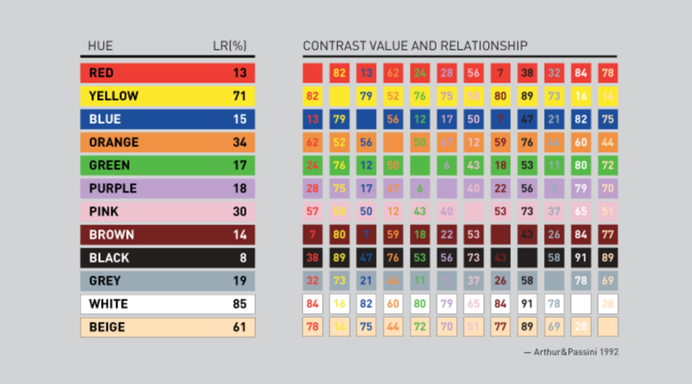
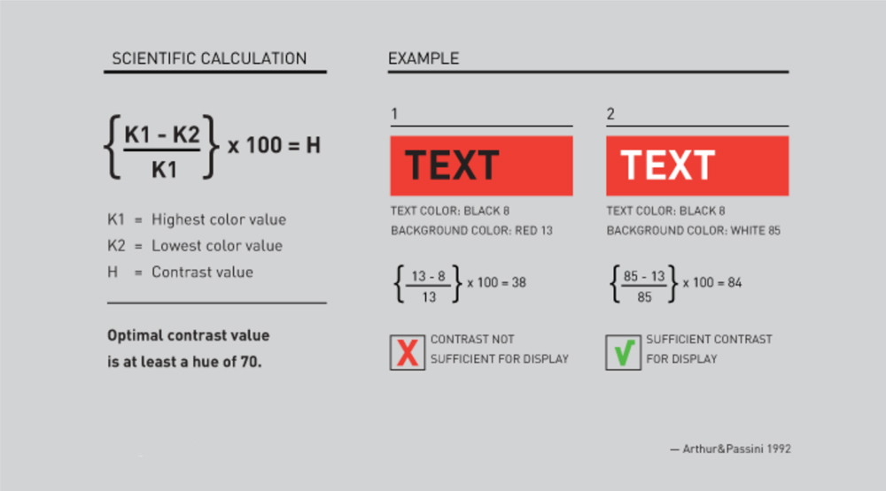
 Taking a look at the chart above, Kelly explains that the optimal contrast value is at least a hue of 70, and he offers the following scientific calculation to determine the optimal number for your ADA sign: K1 (highest color value) minus K2 (lowest color value) divided by K1 (highest color value). Then multiply this number by 100 to come up with the contrast value.
If the number totals to less than 70, you will need to rethink your color selections to come up with the optimal 70/30 contrast.

According to Rowmark, following in a close second for frequently asked questions is the Light Reflectance Value (LRV) of a specific color. “Light Reflectance Value is a measurement of the percentage of light that is reflected (and conversely how much is absorbed) from color when illuminated by a light source,” relays Heldman-Beck. “LRV runs on a scale from 0 percent to 100 percent. Zero is assumed to be absolute black and 100 percent being perfectly white.”
Historically ADA-compliant signs have been perceived as rather basic and bland, but according to information relayed by Heldman-Beck, that is no longer the case, especially now that ADA signage is being incorporated into building designs and décor.
“The biggest trend that Rowmark sees in ADA signage is the incorporation of branding into the overall signage plan for environmental spaces. Customers are seeking more architectural aesthetic options to fit their corporate branding and image,” she relays. “Gone are the days of utilitarian black-and white ADA compliant signs. Today’s ADA-compliant signs have style and design and just a touch of flair to create a custom, branded look.”
Now that UV printing is being used more as a component of many ADA signs nowadays, Bayer reaffirms that this means they no longer have to be text-only and non-attractive. “They can be colorful with digital images, different fonts, styles, and formats,” he says.
Kelly finds that most questions aimed in his direction relate to the allowance for a visual design component. “Modifications allow for a non-tactile decorative graphic and its ADA equivalent at a minimum height of 0.5-inch versus the standard ADA height of 0.625-inch,” he says.
Still these must abide within the rules. “When designing ADA signage some of the most basic standards for consideration are the tactile letter depth of 1/32-inch, the letter height needs to be between 5/8-inch to 2 inches, letter styles should be sans serif only, and only use upper case for tactile characters,” relays Heldman-Beck. “The characters and background need to have a matte, egg-shell, non-glare finish with characters and symbols contrasting with the background color. In addition, the Braille specification is to be domed Grade 2 Braille.”
And this variety doesn’t just stop with decoration; it also encompasses materials, which include zinc and photopolymer. “We are also seeing demand for aluminum, brass, Corian, Wilsonart, Chemetal, and other substrates,” says Bayer.
The good news is that you can find updated regulations on the U.S. Department of Justice’s Web site.
By Jeff Wooten
Photos (top to bottom): Rowmark, Clarke Systems, Clarke Systems.


