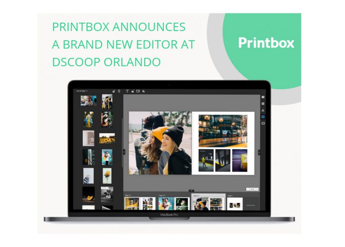
Software developer Printbox announces at Dscoop Orlando a brand-new editor of its software to sell personalized photo products. The new editor includes five innovations: Autocreation, Drag & Drop creation mode, Photo Panel for comfortable review, Layouts per page and spread, and Dark Interface built for the professional use.
Autocreation
Printbox created a deterministic algorithm that analyzes images based on selected parameters, such as the date of creation of the image, the place of creation, and what is the content of the image. When talking about what the image represents, the algorithm considers the color scheme of the image. This is an algorithm, which analyzes pictures, arranges them into a list and then tries to “cluster” them in such a way that the design is arranged automatically. So, this is mathematics, not an artificial intelligence, but the difference is only slight – where the math ends, and AI starts.
Fast Drag & Drop Creation Mode
This mode is a complete novelty in the system. The main purpose is to easily create a project that will be very neat and accurate, using ready layouts. As the user arranges the components himself, he can do it negligently, unevenly (for example, with pictures that are not aligned, but were intended to be). If the layouts are well prepared by the shop administrator, the whole composition will be consistent in the project. The shop administrator should make sure that the whole design is perfect, with evenly arranged components, for example, that there is a 2cm margin on both sides of the book, on each side. The interface is created in such a way to allow this smooth creation process from both sides: the admin panel and the front office. The user has ready-to-use layouts, so there is no chance of spoiling the project.
There is a lot of interaction, such as “drag & drop,” and this is enough to decide which photos should be on which page or spread. The interface adapts to the user’s movements and choices, so when a user drags a photo from one page to another the system is rearranging layout automatically and decreases the number of photos on this page and increase on the other. If there is a properly prepared database of layouts, the user is able to make a nice book quickly, in a very simple and fun way.
Photos Tab (Photo List)
Printbox launched in the new editor PRO a separate tab for managing the library of photos, which is also a complete innovation in the Printbox system. In other editors, there is “one-page view”, where all elements are shown on one screen (which is good in less advanced systems for less advanced users).
Layouts Per Page and Spread
Layout is a structured arrangement of visual elements such as photo slots, texts and clipart within a page or a spread. Printbox can call it a design as well, presented by a designer or a shop administrator to their client.
The new way of defining and applying layouts will be introduced with the launch of the editor PRO. The new system will work for products with the split workspace—left and right side of the page. A layout can be set “for one page” or “for the whole spread.”
This might be particularly useful in the case of books based mainly on photographs rather than backgrounds and clipart. By making a good selection of quality layouts and by blocking transformers for all components, it is possible to simplify the users’ quick creation of a design. You can offer wider possibilities to create a nice project in a simple way and inspire your customers with a bigger product range.
Dark Interface
The design was created based on the needs of professional users. Printbox has built a powerful tool for work, which is recommended especially to companies that cater to professional photographers.
The whole project was a response to the needs of people who treat tools of this type not as a source of joy, but a source of money. This is supposed to be their work tool, as they are selling albums that they are preparing in this editor.
Editors for less advanced users are built in such a way that users have every feature at hand, at the click of a mouse. Large buttons with descriptions, easy to click, lots of tooltips, clear messages. On one hand, the user doesn’t have to learn these features, but on the other, there must be a limited number of functionalities in order to fit in one browser window.
Printbox CEO Michał Czaicki commented, “Our most recent PRO editor is completely different. It is natural that at the beginning each user will have to learn how to use the functionalities. It’s not all that clear and simple, but we think that after getting acquainted with the functions, keyboard shortcuts and buttons—in this editor users can work better and more comfortably, and the possibilities are much greater. What’s more—we have a huge list of new features to be implemented soon—and this will be a real revolution on the market of personalized photo products.
What is the Biggest Competitive Advantage of This Editor?
Looking at other, free solutions of this class, the advantage of Printbox is its huge experience in creating this type of Web applications. In their opinion, they have created the best Web editor in the world. There is no Web-based competition with this number of functionalities. The editor is available for free; there is no need to install it and it works quickly. The usability and visual refinement—these levels are unrivalled all over the world.
For more information on Printbox or to schedule a demo, visit https://getprintbox.com/.
Printbox team is at the Dscoop Orlando 2019 on a stand 632. Anyone who wants to book a meeting during the show, can speak to their team on the stand or use the quick booking form here http://bit.ly/DscoopOrlando.


