The 2011 SBI Sign Making Innovation Award contest was open, this past summer, to any sign maker or sign shop that had: Designed and/or built highly creative signs; implemented environmentally friendly initiatives into the production process or workplace; incorporated a number of varied sign processes in one project; improved their business and/or profit model; found a new market in which to sell their signs/graphics; or worked in any capacity on a sign project that could be considered innovative.
We sorted through all the uploaded entries and, after tough deliberation, narrowed them down to six finalists. Online voting by our readers was held between August 23 and September 13.
All the votes have been tallied, and the results are in!
Reminder: The First-Place winner will be featured in an exclusive headlining article in the December 2011 edition of our publication, as well as receive a special plaque recognizing this honor. We’ll also be presenting write-up briefs of the runners-up, as well as a gallery of some of the projects that nearly made the finalists list but were designated as “Honorable Mentions.”
In the meantime, we’ll be using this space to count down the top-three vote getters (in ascending order) over the next week. So be sure to check back in to see which project was crowned the first winner of our 2011 SBI Sign Making Innovation Award contest.
Schedule:
The third-place recipient will be revealed on Friday, September 23.
The second-place recipient will be unveiled on Tuesday, September 27.
And the first-place winner will be announced on Thursday, September 29.
In the meantime (and to refresh your memories), here is a list of the six finalists that were selected for voting:
 Downtown Sacramento Project; Sacramento, CA
Submitted by: Ryan Drury
Company: Pacific Neon Company
Location: Sacramento, CA
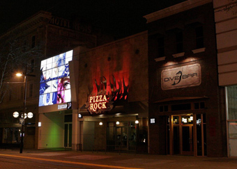
Pacific Neon Company designed, built, and installed innovative signage for a three-bar/restaurant complex developed by the same ownership that has created a “buzz” in the downtown Sacramento area. Pizza Rock headlines the signage with a multi-dimensional display of lights and color beginning with the 11’-6” “flames” in the background (which showcase a patterned background for the open pan channel neon letters).
Meanwhile District 30 is comprised of twenty staggered LED-illuminated panels with changing high-resolution digital graphics that creates a wall of themes on a continual basis.
And the Dive Bar features a simple, hand-painted interior ceiling graphic reminiscent of the Sistine Chapel combined with exterior gooseneck lights.
 Eddie Merlot’s Prime Aged Beef & Seafood; Louisville, Kentucky
Submitted: Rick Stemmler
Company: Creative Sign Resources
Location: Fort Wayne, Indiana
To create two entrance marquees, a blade sign, and an awning, Creative Sign Resources turned to the latest production technologies. For instance, the company used Google SketchUp Pro for the design and 3-D production drawings. Doing so, dramatically reduced mistakes and production time. Energy-efficient LED illumination was used throughout the project, and epoxy was used in applications that would’ve been typically welded. The end-results are high-quality sign solutions for a high-quality establishment.
 Giant Whales of the Deep; Chicago, Illinois
Submitted by: Matthew Weinreb
Company: Vector Media
Location: New York City, New York
Vector Media has changed the view of the standard double-decker bus tour ride and, in the process, made an innovative brand experience. For the Chicago Field Museum Exhibit, “Whales of the Giants Deep,” the company turned an entire forty-foot bus into a blue whale with a mouth, a tail, and a blowhole. The bus included interior branding with seat cushions, teeth, a spine, and tongue.
The exterior and interior featured “call to action” signage encouraging consumers to go whale watching! People were given the opportunity to win free tickets to the Field Museum by snapping photos of the bus with their smart phone and texting it to a predetermined SMS number. The exterior bold artwork and extension, interior domination, and interactive social networking component created a complete, interactive brand experience.
 Lolly Gobble Sweet Shop; Sidney, BC, Canada
Submitted by: Ryan Grealy
Company: Peninsula Signs
Location: Sidney, British Columbia
The goal with any sign for a business is to draw people to it. The Lolly Gobble Sweet Shop is located on a side street just off the main street. The challenge: How to draw people off the main street and into the Sweet Shop? The answer: By creating fun, imaginative, and colorful 3-D carved signs (the likes of which Sidney has never seen before), along with tasty graphics of candies and text cut to shape and applied to the windows and exterior wall.
Within days of putting up the 3-D HDU lollipop, the owner noticed a large increase in traffic and compliments on her shop and signage—not to mention pictures were showing up on Facebook of children and adults posing with the lollipop sign pretending to bite or lick it. Nothing like free promotion!
 Max Media; Selinsgrove, PA
Submitted by: Eric Lafore
Company: Ace of Signs, LLC
Location: Selinsgrove, PA
As competition to grab consumer’s attention increases with mobile devices, web based venues and daily overload of increased messaging, Max Media Broadcasting Group recognized the same is true when grabbing and holding the attention of their listeners and potential listeners. When challenged with the goal to turn a non-visual media into an extremely visual media and gain the attention of mall goers and Max Media listeners (or future listeners), Ace of Signs created the signage to successfully fulfill that need—as well as integrate the station’s multi-layered platform of using not only audio on the station broadcast, but video messaging and live client display/demonstration/sampling within their studio space in the Susquehanna Valley Mall.
Ace of Signs also conceptualized and implemented stage lighting to invoke the sense of watching an artist on a stage during a concert. GoBo projectors project logos or messaging on the back wall of the studio to promote and identify the activity in the space, and three forty-six-inch LED televisions capture the “live performance” feel.
 Taylor Shellfish; Seattle, Washington
Submitted by: Andre Lucero
Company: Western Neon Custom Sign Builders
Location: Seattle, Washington
The Taylor Shellfish sign, located on Capitol Hill, is turning heads in Seattle’s most densely populated neighborhood, despite illumination challenges. The City of Seattle’s Pike/Pine Conservation District Sign Code does not allow any sign to have internal illumination, Western Neon created a sign that brought the client’s logo to life in a dimensional sign and complied with local sign codes, while adhering to the client’s budget. Manufacturing the Taylor Shellfish sign with innovative materials was the highlight of the project.
The company used two sizes of faux-wood logs and marine-grade rope to add to the natural beauty of the sign. The use of faux-wood logs reduced the weight of the sign tremendously. Western Neon came up with the idea of using exposed neon to provide the final touches to this iconic sign, not only highlighting the text and the heron but also simulating the freshness of the ocean for the borders and water.
Thank you again to everyone who entered and everyone who voted! And remember, the countdown begins on Friday, September 23 with the announcement of Third Place!


