 Customization and personalization are some of the biggest social trends right now. Today it’s all about tailoring the ingredients of one’s personality and interests for the world to see. Cookie-cutter clones are out; custom one-offs are in.
So it’s even more exciting when this trend crosses over into the art of both sign making and retail, as evidenced on a recent exterior building graphic.
StickerYou is an e-commerce company that produces custom die-cut stickers, labels, decals, iron-ons, temporary tattoos, magnets, patches, and badges in any shape, size, and quantity for marketing, décor, and personal expression purposes. The retailer has been around a little more than ten years, yet in this short period of time, it was recently ranked in the top 200 of the Growth 500, a definitive listing that’s compiled by Canadian Business magazine of Canada’s fastest-growing companies. (Note: Currently StickerYou has amassed a five-year revenue growth of 470 percent.)
After years of online success fulfilling customized orders, StickerYou recently opened a new retail space this past summer called StickerYou: The Store—the world’s largest brick-and-mortar store devoted to stickers—in Toronto, Canada.
“At StickerYou, we make what matters stick, [and] we are excited to give customers the chance to interact with our products and experience the creative potential of stickers for business or personal expression,” said StickerYou Founder and CEO Andrew Witkin in a press release.
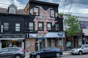
Located on Queen Street West, one of the “hippest streets” in Toronto, management knew they needed something bold that would not only stand out but also provide a customized look at the type of products the store offers inside.
The storefront exterior features a unique, three-story-high “sticker bomb” (a form of street art in which an image or message is publicly displayed using stickers) design on the storefront, installed in collaboration with applied sciences giant 3M. The graphic is shaped like a lightning bolt and features a collage of a multitude of sample sticker images.
The sticker bomb is quite a popular, familiar component of the sticker world. “We’ve used the sticker bomb aesthetic in countless initiatives as it’s an inspiring example of the possibilities of the ubiquitous sticker, as well as a nod to the sticker culture of Los Angeles, which is where [Witkin] first got the idea for launching StickerYou,” says Laura Fitch, director of Public Relations and Content Management at StickerYou. “Having a sticker bomb vinyl graphic on [the store] seemed like a natural fit.”
StickerYou wanted its store to stand out with a striking, impactful design, which is how they decided on the lightning bolt shape. “From the start, we knew that the sticker bomb motif would be a big part of our brand and feel,” says Vivian Choi, art director at StickerYou. “It combines self-expression and stickers (our primary product) with the roots of sticker culture in the street art movement.”
With this towering sticker bomb graphic, StickerYou wanted to show the public what stickers can do and how they can help people or businesses express themselves. “The exterior vinyl graphic is an innovative way to show how just one simple sticker (decal) can transform and enlighten the exterior of a building and retail shop,” explains Choi. “We wanted to inspire people to imagine what they could do for themselves with a simple sticker.”
They also wanted to use this oversized vinyl graphic to underscore three key tenets of their company’s philosophy: any size (“three stories high”); any shape (“a unique lightning bolt motif on an interrupted surface”); and any quantity (“the number of individual stickers in the sticker bomb motif itself”).
Excited by this idea but still “stuck” in the embryonic stages of figuring out how to make it a reality, StickerYou attended ISA International Sign Expo in Las Vegas this past April and met with 3M representatives. They told them their idea for the three-story-tall graphic and how it was going to be placed on a stucco wall. 3M gave them design and print advice regarding the graphic. “We’ve designed and applied large decals previously but never one at this scale,” says Choi. “This was something new for us.”
The sticker bomb storefront decal measures 17.5 feet wide and 30.5 feet high, yet high resolution wasn’t necessary for pulling off this large-sized project. “We did a lot of estimating and educated guessing and worked with local professional sign installers,” says Choi. “While most high-quality print files need to be sized at a minimum of 300-dpi, we’ve learned that oversized prints meant to be viewed at a distance can actually have a lower resolution. We still aim for 150-dpi on most oversized print files that we process for customers, but with this particular decal, we went down to 133-dpi for the actual size.”
The graphics were printed onto 54-inch-wide 3M SV480mC-10 film using an HP Latex 356 printer. “This film allows inks to fully cure. It was stored loosely coiled on a rack with a fan on it for a minimum of twenty-four hours,” says Choi, noting that it was then laminated with 3M 8550M matte overlam.
The storefront exterior features a lot of windows and doors that are jutting into the finished design. To make everything appear seamless, StickerYou, during the design stage, tried to estimate where the cuts were going to take place on the graphic. “Even with all of this, the vinyl graphic still had to be hand cut on the spot as it was being applied,” says Choi. “It’s similar to creating a painting—decisions on details had to be made during the application, no matter how accurate our renderings and mockups were.”
At the ISA International Sign Expo, 3M also passed along contact information for one of their Toronto contacts, who helped StickerYou through the adhesive and application process. The process used a unique, proprietary adhesive from 3M, as well as a special heat-roll application technique to ensure that the vinyl would stick to textured surfaces (including walls and windows) through varying temperatures and weather elements. The patented Envision 480 Film allows application in a single pass with a high-heat roller used by specialists trained in the technique.
“We did a pull test to test the adherence strength,” says Choi. “The first time, we didn’t use the 3M™ Two-Handled Textured Surface Applicator TSA-4 Large Area Roller, and it didn’t adhere properly,” says Fitch. “Once we figured out a few variables and used the [TSA-4], we were good to go.”
In order to adhere this particular vinyl graphic to the building surface, 3M conducted a number of adhesion tests to ensure the right amount of film and heat was applied. The installers used a combination of ladders, cherry pickers, and scissor lifts to place the vinyl up in sections.
One of the major issues with the application of the removable three-story vinyl graphic was the wall texture. In addition to the porous surface of the concrete and brick elements, the paint used was also potentially a problem. “New paints have low Volatile Organic Compounds (VOC), which make them dirt-resistant but also more difficult to adhere to,” says Choi.
For the application, they washed the wall with soap and water and painted it with Sherwin-Williams A-100 paint primer.
Planning to installation took about a month. “The longest part was waiting for the right weather for each stage of the application process,” says Choi.
For example, the front exterior wall had to be dry to accept the first coat of paint. “July in Toronto means unpredictable weather—from humidity to sudden rainstorms,” says Choi. “For a few days, it was too hot to apply the vinyl graphic. Then when it cooled down, it rained, so we had to wait another few days for the wall to dry.
“It was a constant back-and-forth between what the weather wanted and what we wanted. But eventually we got it done, and it looks fantastic!”
And the general public loves it too! “As soon as it went up, we started getting comments from people who knew it was our store saying how cool they thought it was,” says Fitch, noting that the store has also been sticker-bombing the city with smaller versions of the vinyl graphic to drum up additional interest and exposure. “We couldn’t have hoped for a better response. People love how unique it is, how it stands out, how it looks, and how it adds to the vibe of the neighborhood. It’s the perfect match!”
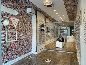
The sticker bomb branding experience doesn’t end with the exterior storefront. The interior also features sticker-bombed walls, a custom experience center where customers can touch and feel stickers (and be inspired by use-cases), kiosks to place personalized orders, and a sticker art museum. “We’ll also be holding a sticker art exhibition, with works from some prominent artists, in the fall,” says Fitch.
The oversized building graphic is a testament to the power that stickers have with the public and an example of how customization continues to be a conversation driver in today’s business climate.


