The Dallas VA Medical Center (Dallas VAMC) is a part of the VA North Texas Health Care System, which is Veterans Affairs’ second largest health care system. It serves over 113,000 veterans and delivers one million outpatient episodes of care each year.
It’s no surprise then that the hospital’s wayfinding system is key in helping visitors and patients navigate the campus. As the hospital has renovated, expanded, and relocated services and offices, their 15-year-old existing, modular signage program functioned well, but it began to show its age and needed to be updated.
Diagnosing the Problem
2/90 Sign Systems in Grand Rapids, Michigan—a 42-year-old business with roots in modular, architectural signage systems—did all of the work on the original sign system 15 years ago, and they returned to handle the update. “We worked with the VA to update and create a new design standard for the facility that blended their needs from an aesthetic standpoint but also from a functional standpoint,” explains Senior Sales Manager Chris Douma.
This can be difficult when dealing with a campus as large as the Dallas VAMC’s. “That presents one of the major problems with wayfinding. Most of these VA hospitals typically start with one large building but then as the population of veterans that goes to those hospitals grows, they have to build more buildings,” says 2/90 Sign Systems Field Operations Manager James Sutton. “Tying all those buildings together in a wayfinding sense can be a challenge.”
To meet that challenge, 2/90 Sign Systems assembled a team that included Wayfinding Associates on the design and sign planning and S2 Ventures on the architecture, engineering, and general project management work.
“It’s very rare for one company to do everything—especially in large, major projects,” says Douma. “The right companies on the right team can really solve wayfinding challenges.
“Together we assembled what was called an integrated project delivery team with the VA key stakeholders to design, develop, and implement this signage program.”
Treatment #1: Exterior Signage
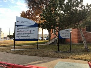 The wayfinding program starts from the moment a patient or visitor arrives on campus, continues as they travel to their destination, and finishes when they exit the facility. “The scope covered six buildings that were patient, healthcare-focused buildings,” says Douma. “The overall campus is quite large and there’s a lot of other buildings on site. But the six buildings were all unique, they had unique services and unique destinations for folks, but they all kind of blended together.”
2/90 broke the project up into a series of phases. “The first phase was to finalize and complete the exterior. The VA had partially implemented a signage package on the exterior campus, so our goal was to work with the VA to refine it and complete it,” says Douma. “Part of that refinement included naming and color coding the parking zones so that it was clear where people were.”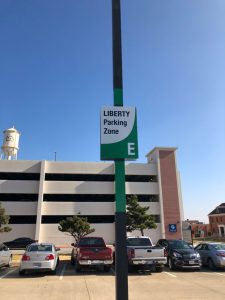
Digitally printed wraps on 3M vinyl were applied to poles to identify parking zones.
Other exterior signage was fabricated from SignComp aluminum sign posts and cabinets. The elements were painted with Matthew’s Acrylic Polyurethane and reflective vinyl graphics were applied. “There were several different sign types in the exterior package, but all of them had a frame with a changeable panel,” says Douma.
Treatment #2: Interior Signage
For the interior signage, one goal was to bring a warmer, more healing element into the design. “There was a lot of discussion early on in the project about selecting the right color palette to have the signage stand out but also blend in with the aesthetics of the environment,” says Douma.
The Dallas VAMC chose to select from 2/90’s own color palette of paint colors, laminates, and finishes for longevity purposes. “If they need to add a new sign or replace inserts, to have something that’s readily available from 2/90 as a standard color finish was important.”
In addition to updating the aesthetic, 2/90 also brought everything up to current codes and standards relating to ADA, room identification, life safety and regulatory, etc.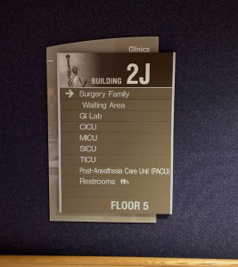
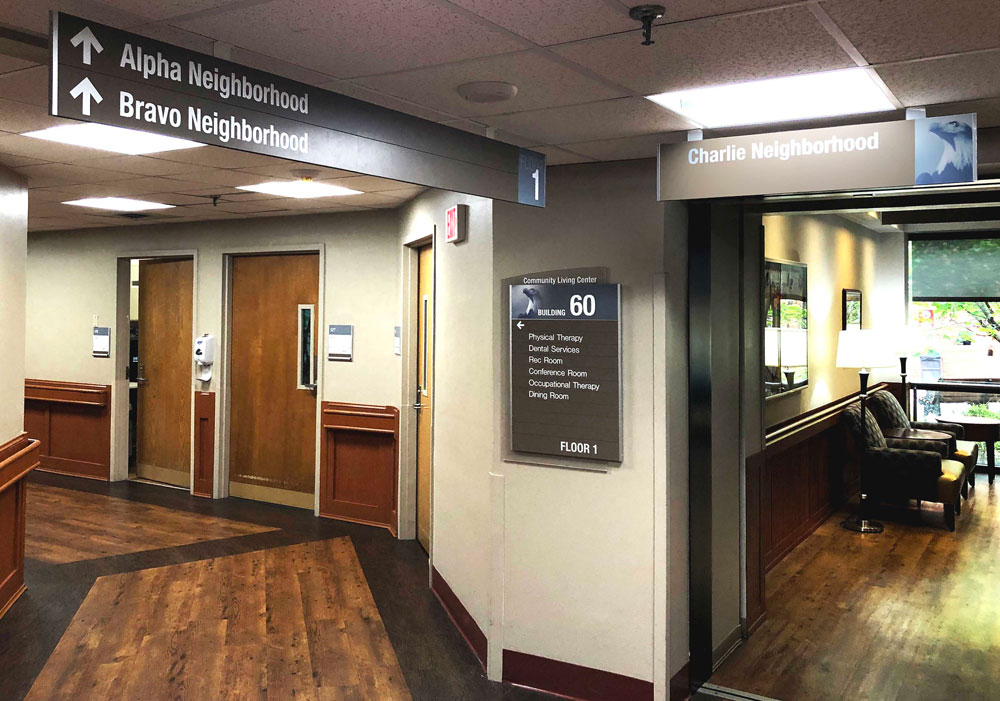
The interior signage employs a three-layered wayfinding system. First, the 2/90/VA Integrated Project Delivery Team collaborated on a building naming convention. “There were some architectural names, like building numbers, that were historically used that we utilized,” says Douma. “We also named the function of the building because most patients may not know if it’s building one or 100 but they do know if it’s a hospital or the mental health clinic.”
Second, color was introduced into the sign package as an additional identification measure for each building.
Finally, they also introduced imagery. The team explored and presented several themes to the VA leadership and ultimately settled on a patriotic theme that uses images like the Statue of Liberty, the Liberty Bell, a bald eagle, the Capitol Building, etc. “It really speaks to human behavior with wayfinding and navigation and how people use different landmarks, milestones, or recognition elements in order to navigate a space,” says Douma.
The Dallas VAMC selected 2/90’s Slide™ Modular Sign System to use for the interior, which is the only open-ended sign system on the market. Not only can the messages be changed, but the sign can expand and accept insert reconfigurations onsite to adapt to an ever-changing environment. “As facility change happens, they can update that sign accordingly without having to replace it,” says Douma, “which offers a benefit that a rigid plaque or another type of product doesn’t offer.”
 The extensive selection of three basic aluminum components (rails, inserts, and end caps) allows the Slide modular sign system to be customized into a near infinite variety of sizes, finishes, and configurations. “The insert substrates vary based on the graphic need. Most of it was ABS or photopolymer, or we have an extruded aluminum carrier that holds paper for a window insert,” explains Douma. “With those different insert configurations and properties, we build signs that meet the needs.”
Douma gave the example of a room identification sign that has an insert with integral ADA for room identification, a window insert for employee name and title, and an insert with a sliding component to identify if the room is available. The inserts slide onto the structural 2/90 rail and the the end caps lock the inserts into place.
Enhanced backers also helped to bring the sign system into the wayfinding theme as well as create a hierarchy of signage. “To identify key destinations for patients or important decision points, behind that 2/90 slide structural rail sign is an enhanced backer,” says Douma. “It’s made out of acrylic and is painted second surface and then there are some first surface graphics that are applied to the front of the acrylic. Some different sign types had dimensional letters applied to that enhanced backer to tie everything together.”
Treatment #4: Timelines
The Dallas VAMC project also included a number of timelines, which served as both wayfinding and branding elements.
VA 1sts. 2/90 fabricated two timelines dedicated to “VA 1sts,” which aimed to highlight some of the medical milestones that the VA has spearheaded and developed over time. The buildings involved in the wayfinding project were correlated to VA medical discoveries that occurred around the age of each building—for example, Building 2 is associated with the 1958 development of the pacemaker.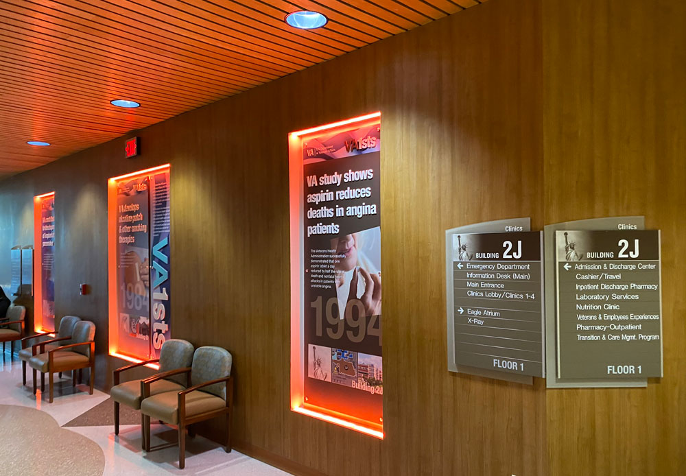
To further drive home the wayfinding, each building’s associated color, number, and imagery was incorporated into the panel design. For example, Building 2’s panel includes the color blue, the Capitol Building, a map of the building with its number, and a picture of the actual building.
“A visitor who’s looking at this display is seeing this discovery and they’re tying it together with color, with imagery, and with a physical map and picture of the building so that they understand where they are in the environment,” says Douma.
The Dallas VAMC wanted something durable, so the two timelines are built out of high-pressure digitally printed laminate on a hard, rigid board. 2/90 worked with a supplier for the printing onto the laminate. 2/90 fabricated cut acrylic dimensional letters using its MultiCam 3000 CNC Router and MultiCam MG Series Router, which were painted first surface and then affixed to the panels. MBS Standoffs were used to affix the panels to the walls.
The only difference between the two timelines was that in one location, the hallway had existing recessed alcoves illuminated by color-changing LEDs. The alcoves were the perfect size and shape for the panels, so the timeline was installed there.
To view a video of the timeline’s color-changing lights, click here.
VA North Texas. A second timeline was dedicated to the history of the VA North Texas Health Care System’s physical property dating from the 1940s to the present.
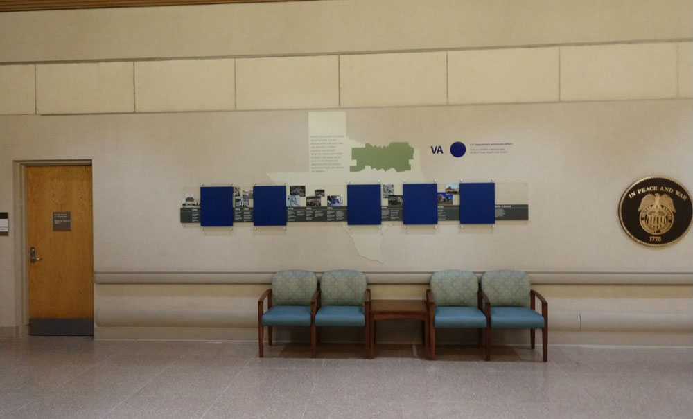
The timeline was fabricated in multiple layers starting with the Texas-shaped backing, which 2/90 routed from ABS using its MultiCam routers. The message was direct-printed to the surface of the ABS.
On top of that were several pieces of acrylic that 2/90 direct-to-surface printed with images sourced by the VA from the national VA archive in Washington, DC.
Below the images is the timeline with dates and milestones, which is painted acrylic topped with digitally printed graphics.
Five sandwich acrylic poster holders are affixed to the timeline with standoffs.
All the graphics were printed in-house on two direct-to-substrate flatbed Canon (Océ) printers.
Treatment #5: Scale Model
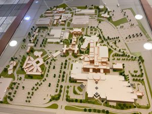 The Dallas VAMC had an existing scale model that had become a sort of wayfinding landmark of its own. However, it was so old that it no longer reflected the campus.
The A/E partner on 2/90’s team, S2 Ventures, worked with Dallas architectural model fabricator GRG Group to create an updated model, which is easily updateable as sections can be removed and replaced.
The model also ties in the wayfinding colors using lighting. When a visitor pushes a button associated with a particular building, it lights up in the wayfinding color—helping to close the wayfinding loop of the larger campus on a much smaller scale.


