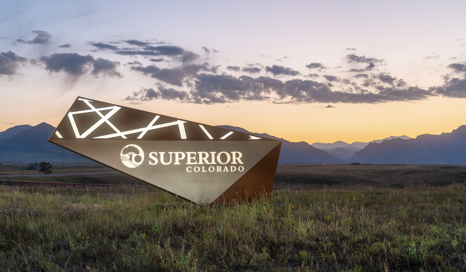
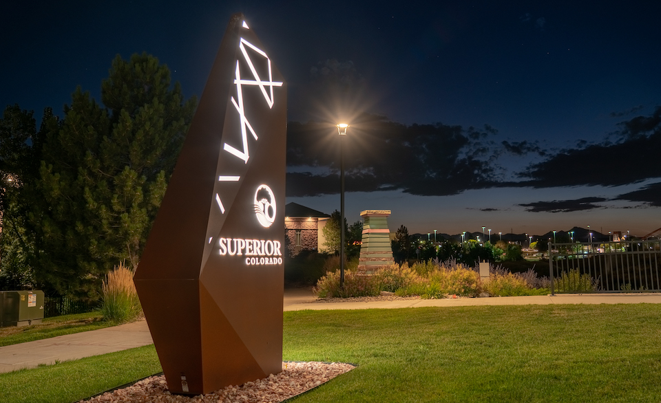
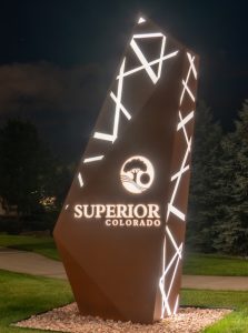
When the town of Superior, Colorado was looking to upgrade their signage, they turned to DaVinci Signs, the leading sign shop in the area. Superior was looking for landmark signs to mark the three different entrances to their town. While each sign was unique, the town wanted a cohesive aesthetic so the experience was consistent no matter where people entered.

Casey Easton, Senior Designer at DaVinci Signs, produced some initial designs based on the concepts the town provided. These went through multiple rounds of revision as the town sought approval from not only its residents, but also the Colorado Department of Transportation (CDOT). For example, the initial design called for red LED lighting, but the CDOT did not want any red lighting that close to the roadway. After six months of back and forth, the multi-faceted, angular design was approved (with white LED lighting), and the team got to building.
DaVinci Signs approached Victoria Engblom, Regional Sales Manager at Current, for a layout. These signs presented a particular challenge in that the distance from the LEDs to the face was very limited. This, coupled with the placement of internal structures supporting the sign, meant that the LEDs chosen had to properly diffuse light at a wide beam angle to prevent hot spotting.
Engblom used Tetra PowerMAX in 5000K for a warm white glow. The team at DaVinci did not shop around for LEDs—they switched exclusively to Tetra products several years ago. Eric Senesac, Operations Manager at DaVinci, said using Tetra in Superior’s signage was a no brainer.
“The PowerMAX turned out to be the best option,” he said. “The angle of the lens, the light output—it was definitely the best choice. We didn’t shop around for anyone else on that one, we just knew that Tetra was going to work.”
Compared to their previous house brands, Tetra offers more generous spacing between modules, true 170° beam angles, better loading and fewer power supplies with the 24V platform. Even the adhesive backing on the modules being easier to work with. That made the creation process fairly quick, considering the complex design.
Senesac added: “My fabricator made pretty short work of the lighting. It was pretty intricate just because of the layouts and working around the framework; it was a challenge getting them in. He ended up doing some panels back there that slide in and out for service.”

Once completed, the DaVinci team headed out to install the signs. Because these signs were being installed alongside a highway, DOT regulations stipulated that the materials used had to be highway-grade. Everything from the rebar to the ties had to be coated in epoxy, and the team had to put plywood down to protect landscaping. Being on the side of a major highway also presented a challenge in getting equipment in. DaVinci was able to work around these challenges and complete the installation, allowing the whole town, and its visitors, to enjoy the signs.
“The city loved the final product. Everybody has been all about it,” Senesac said. “We also did some art sculptures down the road, and between those two products it’s a total transformation. They’re a landmark staple for the city that they’re really proud of.”
 Emily Clapper, Management Analyst at the Town of Superior, only had good things to say about working with DaVinci. “DaVinci worked on three monument signs for our Town and the whole team was a pleasure to work with. There was a lot of back and forth as the Town received input on the signs, and there were some complications getting permits from the state, and DaVinci’s staff went above and beyond to help us navigate and provide support during the process. The signs look great and we’ve received a lot of positive feedback from the community!”


