 Jeff Wooten
The Anacapa Animal Hospital has been a long-time fixture in scenic Ventura, California. But when the head veterinarian decided it was time to hang up his stethoscope and retire, the new vets who had recently come on-board decided it was time to redo the hospital’s long-standing out-front signage. They felt doing so could also help increase their client base.
The animal hospital had been using a double-sided monument sign with a sandblasted wood appearance for quite a while. It was mounted onto a concrete base and uplit at night with ground-planted spotlights hidden amongst the surrounding bushes.
However the doctors agreed that they wanted something with a more up-to-date, “surgical steel” look.
Their landlord told them it’d be a good idea to contact Vogue Sign Company, a business based in Oxnard, California that has manufactured and serviced signs since 1962 (and located just across the river from Ventura).
“Yes you could say we got the lead through the grapevine,” says Christian Muldoon, project manager for Vogue Sign Company, noting they’d done some previous sign work elsewhere for the landlord.
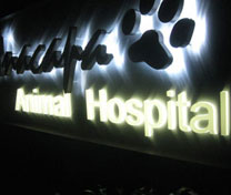
After meeting with the vets to learn about what they were looking for design-wise, Vogue Sign Company latched onto their client’s desire for something “silvery” and “shiny.” The arrived-upon solution: A double-faced three-foot-tall-by-seven-foot-long monument sign featuring a combination of aluminum components and LED illumination.
Vogue Sign Company came up with a lot of different concepts and drawings for the monument design—about seven revisions, in fact. One reason for the design changes was because of city-imposed regulations. Vogue Sign Company was familiar with the area and knew the local ordinances, so they had to work within those parameters before delivering a design to be approved.
“If we didn’t do so, we’d been wasting everybody’s time,” says Ron Wilkinson, sales representative with Vogue Sign Company. (Note: Once the animal hospital approved the final design, the sign makers then took it to city officials to obtain the necessary permits.)
The top portion of the finished sign design features a stylized font for “Anacapa” and a paw print. Meanwhile traditional-type fonts for “Animal Hospital” make up the bottom row.  However there was the need for some additional pre-fabrication work, in order to make the sign a reality.
This approved design was based on the veterinarians’ business cards, so some digital manipulation was going to be required. “The size and layout of the new sign panel was going to be more squeezed than a business card,” says Wikinson. “We only had a little space to work with, so we came up with a pretty good solution.” (Note: This logo was new and not featured on the original sandblasted sign.)
But since they were unable to scan the image directly from the business card to reproduce at an appropriate size, Vogue Sign Company had to go straight to the animal hospital’s print provider and acquire an EPS vectorized file of it. They imported this file into their design software program for additional manipulation. “The letters on their business card appeared quite jagged, so we had to clean them up and make them smoother, before we could proceed with fabrication,” says Wilkinson.
As for the components involved, Vogue Sign Company CNC-routed the background panel, the channel letters, and the dimensional paw print out of aluminum. The sign cabinet features a recessed aluminum center with a brushed silver finish.
Meanwhile the “Anacapa” text and the paw print are aluminum reverse pan letters painted a duranodic bronze; the “Animal Hospital” copy is 3/4-inch acrylic push-through letters.
When it came to illumination methods, it actually turned out pretty easy to sell the doctors at Anacapa Animal Hospital on LED lighting; they were already familiar with the technology.
Another factor for this lighting choice: Because of the hospital’s location, Vogue Sign Company knew that the vets needed something strong, sturdy, and resistant to breakage from sure-to-be-inquisitive hands. “Neon wouldn’t have been ideal in that location because of the small size of the sign and how close it would be to the ground and pedestrians,” says Wilkinson.
Muldoon adds, “[LED] would also look sharp day and night against the reflective aluminum.”
According to Muldoon, the sign company thought white, halo-lit channel letters would really add to the nighttime appearance, so it peeled-and-applied V Series White LEDs from SloanLED onto the backs of the letters and the paw print.
“The individually-made channel letters are pinned off away from the brushed aluminum surface,” says Muldoon. “The brushed aluminum surface was then drilled for the access holes. The power supplies are located inside the cabinet.”
Vogue Sign Company points out the streaky appearance of the illuminated letters also lends a “cool-looking” appearance to the sign. “The sign panel features real brushed aluminum finish,” says Muldoon. “That’s why, with the way the light is shining against the background, it has that really nice ‘streakish’ appearance.”
Since they were located only a few miles away from the animal hospital, Vogue Sign Company put the entire fully built monument cabinet onto the back of their two-ton flatbed truck and drove it out to the install site. They dismantled and removed the original sign and then used a crane to lift the new sign cabinet onto the concrete base and set it with anchor bolts.  Delivering the sign themselves gave Vogue Sign Company’s team the peace of mind that the sign would arrive in the proper condition. But when shipping for jobs a further distance away, Wilkinson urges shops to take precaution. “Shipping companies could care less about what’s inside a box. If there’s any way that something could possibly be broken, it will be,” he warns. “If you don’t make it forklift-proof by crating the sign with some kind of wood or other form of protection, you’re asking for it to arrive in a condition that it’ll need immediate repair.”
Once getting started, it only took Vogue Sign Company about a month to completely design, build, and install the new Anacapa Animal Hospital sign. This was a “dog-gone” excellent effort for all involved and one that features a result that’s close to “purr”-fection.


