 Jeff Wooten
Anybody who’s visited the Rocky Mountains in Colorado knows that the area is a breathtaking sight of natural beauty and scenery. And one hotel lodge in Estes Park, Colorado is doing its best to “blend the casual style” of the Rocky Mountains with the “comforts of a friendly Colorado mountain getaway.”
The Rocky Mountain Park Inn (RMPI) used to be a Holiday Inn until its owner, vacation and entertainment properties company Forever Resorts, decided it was time to rebrand the establishment. However before it’s grand reopening, Forever Resort management knew that they’d also need a brand-new, single-sided monument identification sign that would complement the RMPI’s architecture and the surrounding Rocky Mountain landscape and locale.
Enter DaVinci Sign Systems, Inc., a design/build firm based in Windsor, Colorado and servicing all of Colorado and Wyoming with custom-fabricated displays (including electric, architectural, masonry, LED message centers, and other special identity signage).
The company’s award-winning team of designers, fabricators, installers, and office staff is dedicated to handling a project from concept to completion. (Note: The company recently won First Place in the 2011 ISA Sign Design Competition’s “Wayfinding/Sign Systems” category for another project.)
Since DaVinci Sign had done some previous high-quality sign work for new owner Forever Resorts in the past, it was only natural that they’d be contacted about realizing this project as well.
Rocky Mountain Park Inn officials handed DaVinci Sign a vector logo file and requested a sign that would capture a rustic, lodge-type feel. “However the supplied logo layout was filled with bright colors that really didn’t suit itself for the type of design they wanted,” says Casey Easton, designer at DaVinci Sign Systems.
So even though Easton used the logo, he removed all the color from it and switch to a faux-Corten steel paint finish instead. “Corten steel is a good match for their desired rustic appearance,” says Easton. “After presenting them with this revised concept, they were super-excited.”
The ability to craft highly detailed and artistic sign work should come natural for DaVinci Sign, since the company derives its name and its art-and-science inspiration from the legendary Leonardo DaVinci. “[DaVinci] was an artist, inventor, and designer who had a great ability to bring new concepts to reality. We’re following [his] lead in the creation of custom identity products and monuments for our clients,” says Easton.
The company has also adopted “the Old and the New” philosophy. In addition to time-tested natural stone, sandblasting, and hand-fabrication work, they regularly pair these techniques with new technologies such as LED message centers, LED lighting, and water jet piercing of plate materials to create stunning signage and sculptures.
The company also makes efforts to incorporate the “green” concept into its work, especially when specifying a project. “We make [our signage] as changeable as possible, using native and natural stone in the masonry, recycled materials (such as aluminum), and other concepts (such as LED lighting)—even if the facility isn’t a LEED candidate,” says Easton.
Easton believes that thinking outside the box really applies to the sign industry, so he also brought up to RMPI the idea of incorporating wood and steel elements with LED lighting to add to the monument’s appeal. “When we design signs, we always try to make them as aesthetically pleasing and almost a piece of art that you’d be proud to have represent your company for years to come,” he says.
After making a few approved cosmetic changes, DaVinci Sign then applied for the necessary permits.
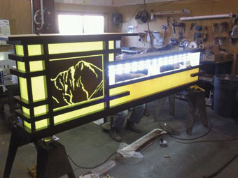
The end-result is an eight-foot-tall monument that features a mix of aluminum cabinets and frames, a 1/4-inch-thick aluminum dimensional recreation of the RMPI mountain-inspired logo, and 1/4-inch-thick aluminum letters mounted flush to the ivory acrylic faces. To create the faux-Corten steel finish throughout the sign, Davinci Sign used Matthews Paint 18439 Ebon Bronze Metallic finishes.
The base portion of the RMPI monument features a two-inch natural buff sandstone and approved timber-stained dark-color sections. Meanwhile the 1-1/12-foot-tall-by-5-foot-long “A Forever Resort” section is a stacked CMU base with a natural buff strip stone. It was fabricated out of an aluminum pan that was then attached to the CMU core. DaVinci Sign again finished the aluminum section using MP 18439 Ebon Bronze Metallic.
Certain sections of the monument are illuminated at night, and for this, DaVinci Sign employed the white rail system from US LED. DaVinci Sign slightly modified some of the supplied aluminum tabs to attach to certain sections of backs on the display.
“We had to get the right temperature white light to use behind the ivory acrylic that we sprayed with three different yellow colors,” says Easton. “Some higher-end white LEDs cast more of a blue light, so (when combined with the yellow of the sign) they were turning everything green. The US LED had the exact color of white we needed.”
Probably the biggest challenge with this project was turnaround time. The owners needed the sign finished as soon as possible, since its grand reopening was scheduled to commence in just a few weeks. “We only had a few days to come up with the initial design,” says Easton.
Even though the standard delivery time for a monument sign from DaVinci Sign is six to eight weeks, they had this monument completed in an astonishing three weeks. “We followed our normal procedures, but we found a way to fit it into our regular schedule much quicker than usual,” says Easton. “We had two guys in the factory dedicated to working on just this project, rather than the normal three or four departments it would typically go through.”
Once finished, DaVinci Sign loaded the main sign cabinet, the pole-cover sections, and the bottom wood pieces, onto its flatbed trailer for the two-hour trip out to RMPI’s Estes Park location.
 DaVinci Sign then installed the monument in sections by an existing concrete curb. They excavated the site through the existing asphalt parking lot and, before placement, poured a new concrete pad foundation. They stubbed out a 3/4-inch PVC conduit and placed it 18 inches below grade for 120V electrical hook-up for LED illumination.
To make the RMPI monument sign feel even more like a masterpiece, the monument was unveiled similar to a piece of art on the day of the grand reopening. “We covered the entire sign with a full vinyl banner cover,” says Easton. “It featured the full-color RMPI logo, the text ‘friendliest hotel in Estes’ and ‘changing for the better,’ and the date of the unveiling. There was a presentation ceremony, and one of our sales reps was behind the sign and pulled the cover off.” (Note: Video of the ceremony can be found on the RMPI Facebook page.)
Easton finds that a monument project such as this one is extra-special, because it doesn’t have the typical look and feel of a box sign just sitting on a pole cover. “We combined stone and wood elements with faux-Corten steel to create a rustic yet eye-catching display.”
Reaction to the sign has been nothing short of ecstatic. “The hotel uses the sign in all of its marketing pieces. It’s more than just their sign,” says Easton. “It’s a true reflection of what the Rocky Mountains are—rugged and colorful with a mixture of wood, stone, and greenery.”
Photos courtesy of Forever Resorts & DaVinci Sign Systems, Inc.


