Lakeshore Recycling Systems (LRS) recently moved their office headquarters into a one-and-a-half floor location in Rosemont, Illinois. With everyone there focused on growth, new acquisitions, and taking care of customers, their walls in the new space remained bare for too long. They wanted to feel proud to provide office tours to potential acquisitions while being able to tell their story along the way—including their history, current growth, and future trajectory.
The right solution to do this would not only have to fit their brand but also be something that would stay relevant and grow with LRS as they climbed past their projected $1 billion revenue mark.
Word of mouth led them to Jon Kuhn, president of Banner Up Signs in Sycamore, Illinois. The depth and creativity of the project was beyond what Kuhn’s company could do in-house, so they brought in my company, OC Creative, a creative agency in Northern Illinois with more than a decade of experience creating wall displays.
The two companies had paired up before to do similar projects—everything from refinishing a historic 1920s train station ticket window as part of a history wall to a timeline in the style of the Game of Life board game.
However neither of us had tackled something of this scope.
LRS wanted unique displays in recyclable or sustainable material for eleven walls in their office, a challenge we were excited to take on and confident to deliver on a relatively tight schedule.
The First Wave
To tackle such a large project, OC Creative and LRS broke the walls into three groups based on the client’s needs and the schedule they created. Walls that needed more data compiled would come later in the project.
The first group included four walls for which no statistics or additional assets were needed.
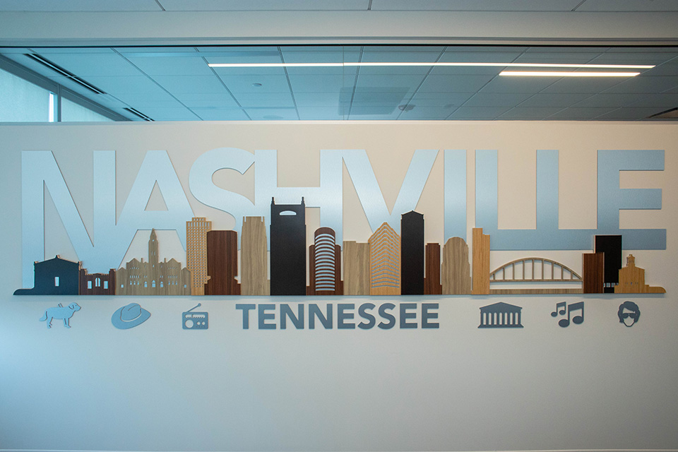
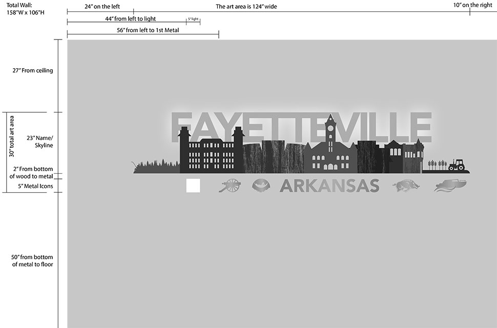
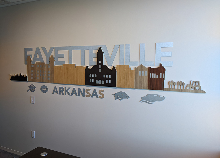
The conference rooms in the headquarters are all named after their regional centers in Fayetteville, Arkansas; Madison, Wisconsin; Minneapolis, Minnesota; and Nashville, Tennessee. Designers honored each city’s culture by creating a unique, layered skyline with icons to show what each place is known.
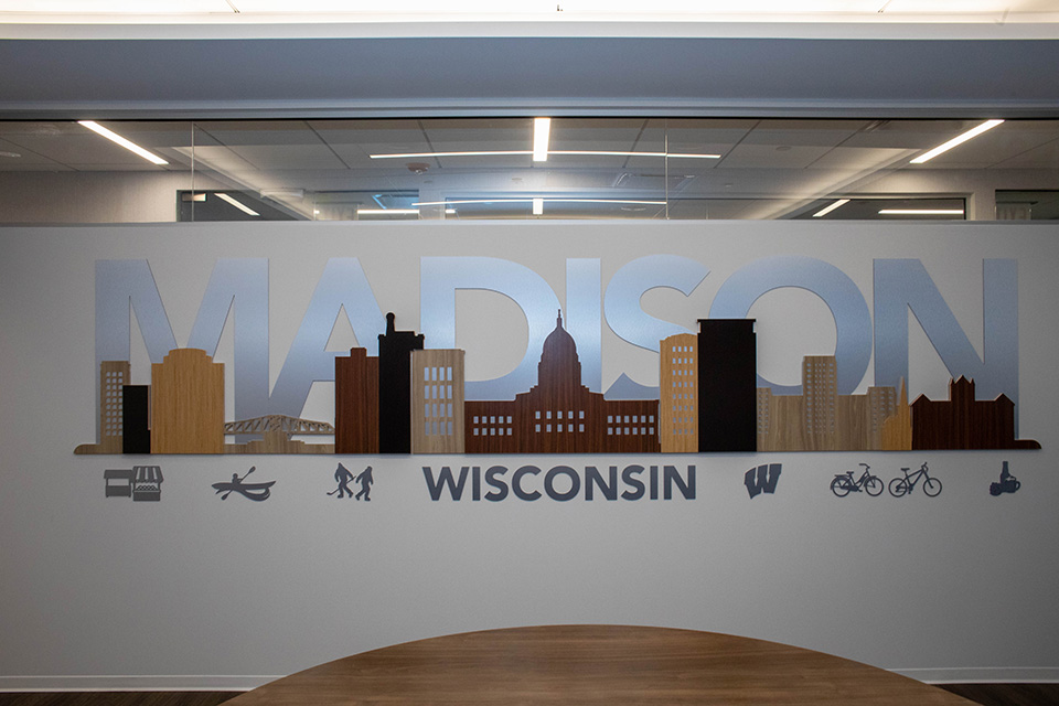
LRS wanted more than just a flat wall print, and OC Creative delivered a design in four layers—the first of which features the name of the city in dimensional metal letters.
The second layer has a wooden skyline composed of several types and colors of wood.
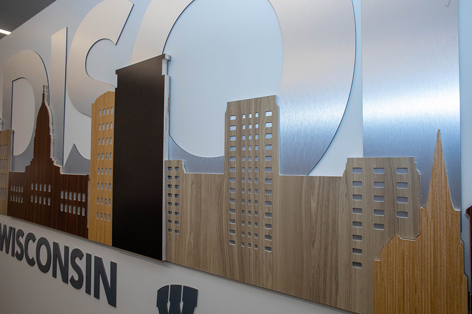
Buildings overlap in front of one another, creating a third layer of interest. The final layer is comprised of metal objects in the foreground representing what the city had to offer.
Each of the four conference room displays was constructed in a similar way, but each skyline design was created from scratch for a unique look not found anywhere else.
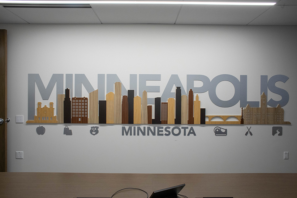
The metal portion of the project was constructed from 3mm Alupanel® with a brushed aluminum finish.
Laminated to the surface of various sizes of plywood were three specific Wilsonart Formica® patterns/colors that complement the décor in the office.
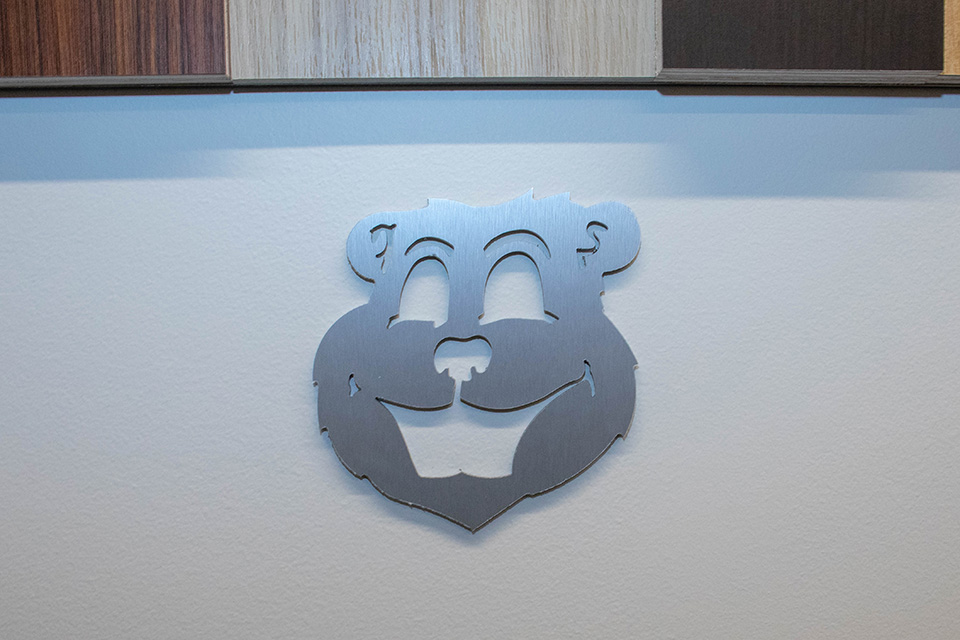
The OC Creative design team used Vectric Aspire to create the vector art route files; then Banner Up’s ShopSabre CNC router did the rest.
With the weight of the overall display being a concern, the Alupanel and buildings were installed with a combination of 3M™ VHB™ tape holding them in place while an adhesive caulk set. Screw anchors were placed where they could be hidden under the buildings.
The Second Wave
The second wave of wall displays feature the components that make LRS unique among similar-type companies.
Both of the walls let OC Creative come up with an artistic way of showing off the vision and values LRS lives by as well as a celebration of the people who are essential to the company’s success.
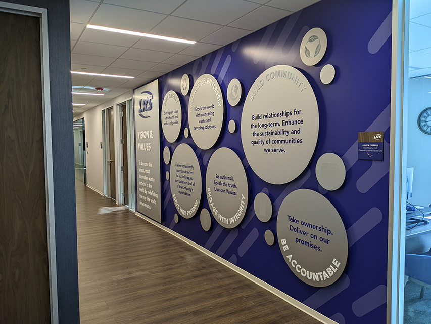
The Vision and Values wall display was planned as a layered wall with etched graphics in metal listing the company’s vision and values. This piece features an extruded logo and header text with solid-color sides, an extruded vision statement, a solid-color background, and circles in three different thicknesses (the thickest and second-thickest housing etched icons).
For this wall, Banner Up wrapped it with printed wallpaper first then created varying depth spacers to hold the face panels off the wall. The spacers were of the same construction as a hollow core door but in PVC. The front is 3mm brushed Alupanel that hangs on the spacers.
The Our People and Parade wall design doubles as an art feature in wood and metal collage. The overlapping materials create layers, adding dimension to the overall design that’s intended to show off photos of LRS’s people and events.
Shapes cut from different sustainable woods serve as a backdrop for metal frames, which allows twenty photos in four-by-six-inch, five-by-seven-inch, and eight-by-ten-inch sizes to be magnetically swapped out and updated as needed.
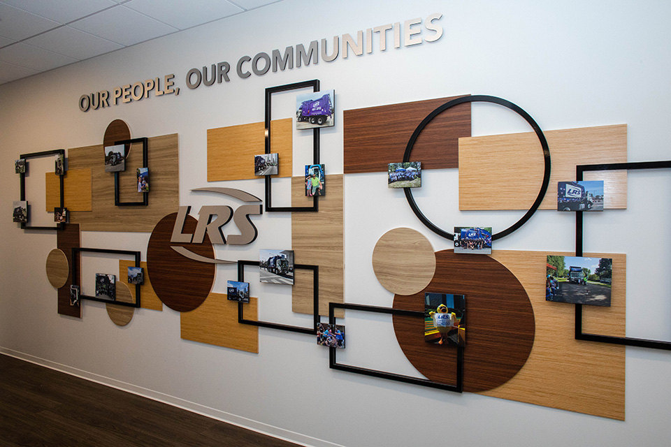
The Our People and Parade wall was a unique challenge. Using the same varying thickness plywood and Formica as the conference rooms, Banner Up had to create a puzzle that fit together, with all the picture frames ending up on the same plane.
All the frames are faced with Grimco’s 3mm MAXMETAL™ Element (steel laminated to a plastic center) that was then bonded to varying thicknesses of black PVC backers. These backers had to be routed and notched at varying depths in order to fit around he varying thicknesses of plywood or Formica.
Embedded in the back of the photo’s PVC backing are two powerful rare earth magnets holding the pictures to the steel.
The Third Wave
The third and final wave of the project had to wait until LRS had gathered statistics, but the end result of each of these five walls celebrating the acquisitions the company is making was worth the wait.
By far the most technical and difficult to install, the extra time everyone took to perfect the ideas speaks for itself when visitors see the results.
Unlike city skylines and company values, these displays feature information that frequently grows and changes. Therefore each display had to be designed with the future in mind.
Banner Up and OC Creative worked together to design and execute each display, leaving simple instructions for LRS to maintain the information displayed.
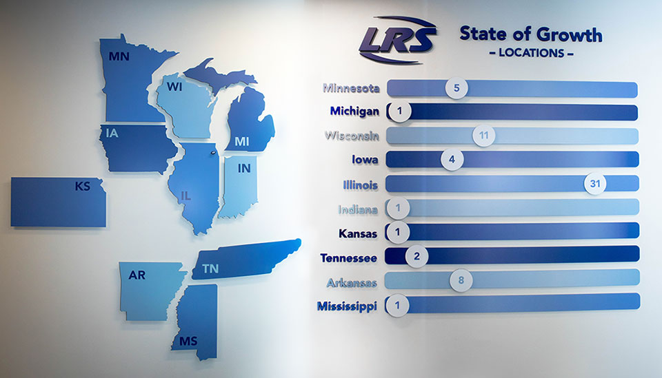
The most elaborate of these displays is the State of Growth wall. This aptly named wall features accurately scaled and extended-from-the-wall metal cutouts of the states where LRS has a footing, along with magnetic LRS logo blocks to show where in each state the growth is occurring.
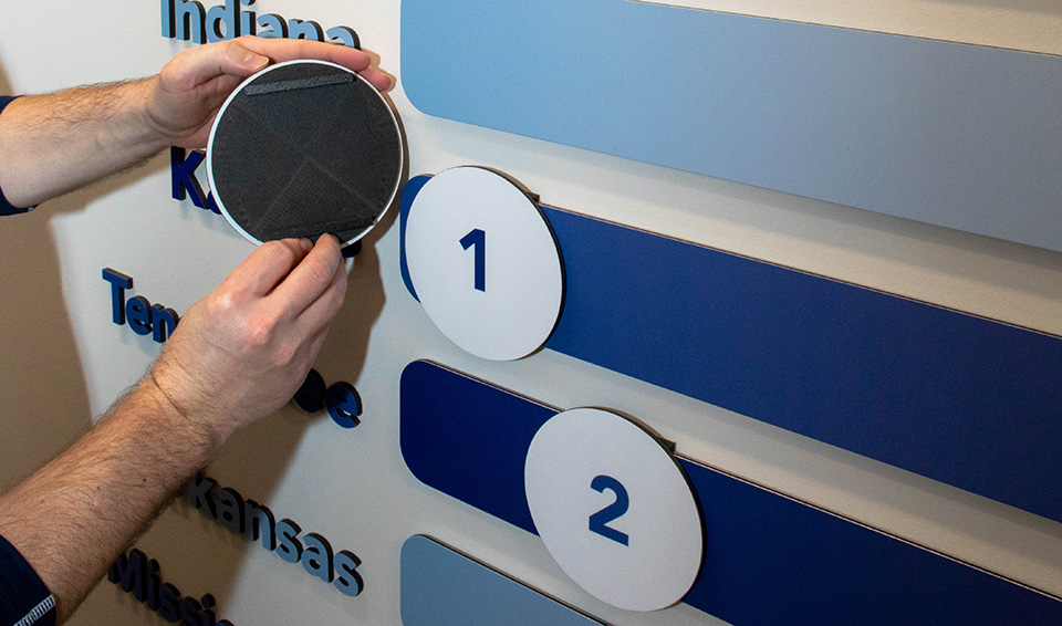
Alongside this map is a column of horizontal sliders for tracking quantities. These ingenious mechanisms feature changeable numbers and round markers on slotted tracks so they can be easily recalibrated based on the number of acquisitions relative to other states.
The result is a display that is both beautiful and functional, conveying information in a way people can grasp in an instant.
The entire wall was created out of PVC and MAXMETAL Element. The slidable numbers were the creation of Banner Up employee Jeremy Hale. His knowledge and skill with the router allowed for these sliders to be routed out of a single piece of PVC.
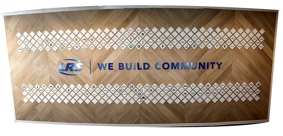
The We Build Community display posed an interesting challenge, as LRS wanted a single display to cover a twenty-one-foot-long wall. The design features the names of every municipality serviced by LRS on white tiles backed by wood panels. When completed, the striking display is easily expandable with more tiles and can be restructured if desired.
The background is constructed of six roughly 9-foot-tall-by-42-inch-wide plywood subfloor panels with 1-by-4s mounted on the backside to keep the two pieces of 4-by-8 subfloor together. This premade panel method made installation quick and served as a solid surface that could handle the weight of all the four-by-four tiles.
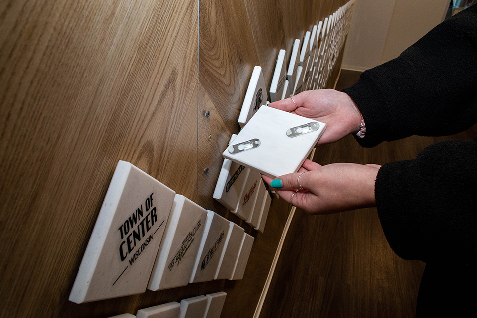
Composite aluminum, PVC, acrylic, and ceramic tiles were all considered, but premade samples of solid surface countertop won out both for the finish and to project the top-notch quality that LRS is known for.
Two slotted picture hangers that coordinated with screws in the wall were attached to the back of each, and clear decals were attached to the face.
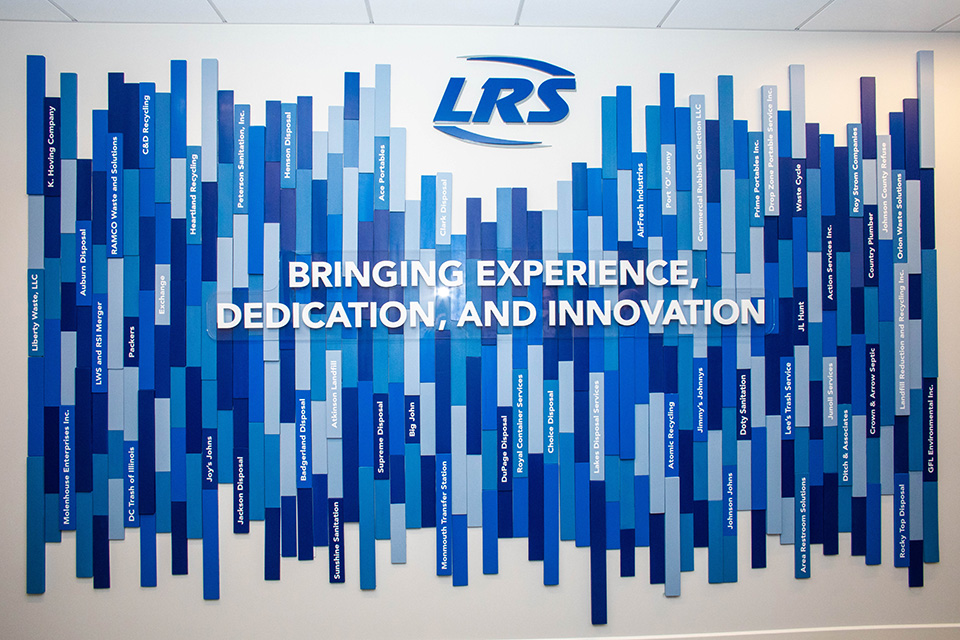
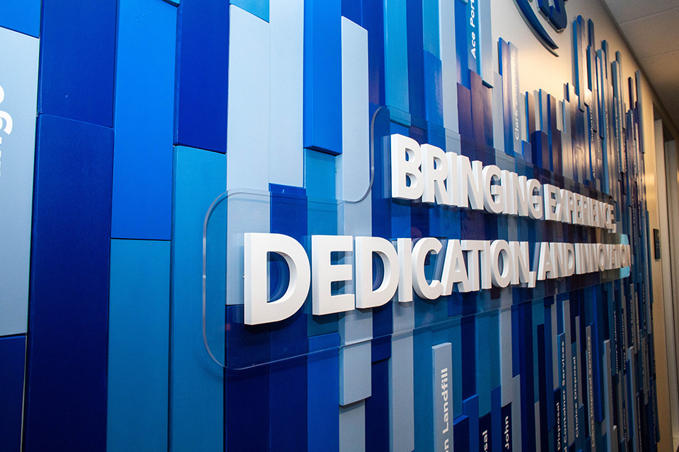
In the same vein as the municipality display, OC Creative and Banner Up created a large Acquistions Art wall to showcase the names of the companies that have been acquired by and now fall under the banner of LRS.
The design features panels in LRS-branded blue which are elevated from the wall in different layers, each showing off the name of one acquisition. Names can be added every year as the company grows, honoring the companies that contribute to LRS’s success and showing where the company has come from.
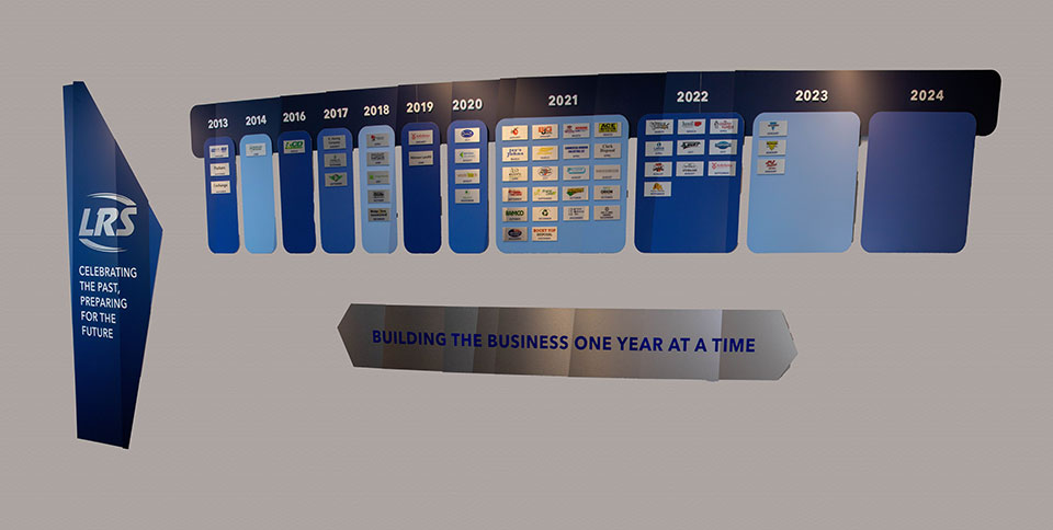
The Acquisitions By Year wall display is simpler but no less impressive. It shows a display of years, with the logo of each acquired company beneath the year it was acquired. This display allows for easy expansion.
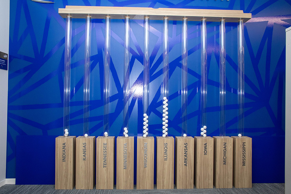
The final design had everyone scratching their heads. The client needed a way to show national growth in a dynamic way, different from the State of Growth board.
An elegant solution presented itself: The Acquistion Celebration wall, featuring three-inch-wide, oval, mounted tubes secured to wooden pedestals with ping pong balls counting out each measure of growth.
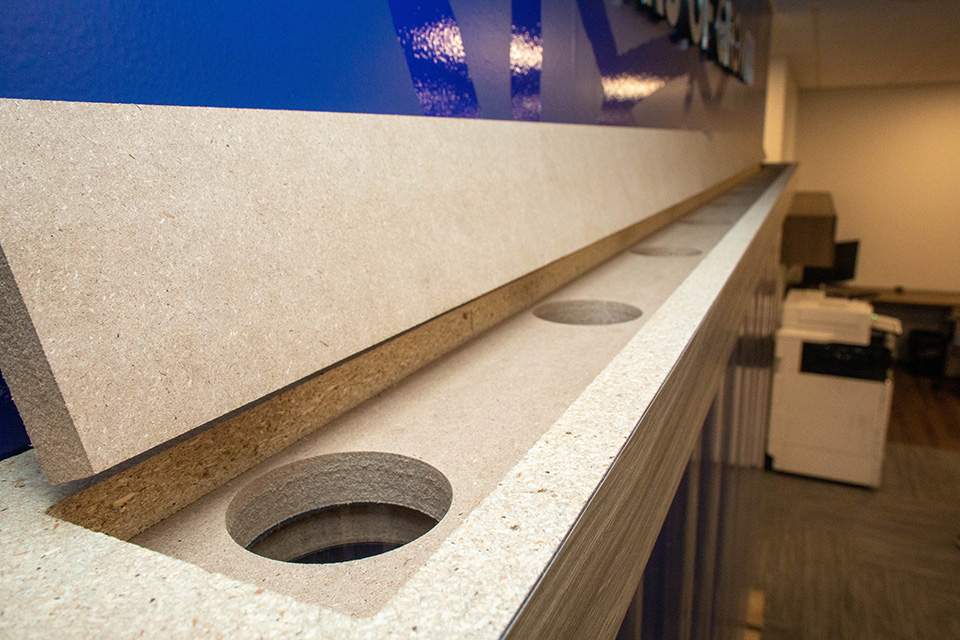
The oval shape allows for two balls to be positioned next to one another in a staggered stack, each labeled with the name of the company acquired. This layout permits fifteen states to be represented.
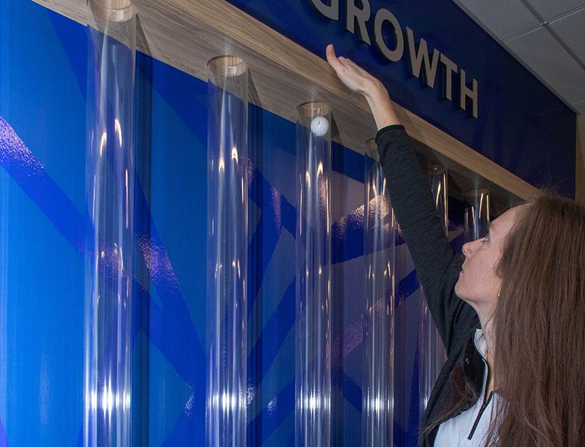
The tubes are arranged with the greatest numbers located in the middle, creating a bell curve.
At a glance, this clean display conveys exactly where the company is growing and where opportunity lies at either end.
Impact
Such a large task seemed daunting at first, but by breaking the job down into three waves of design and installation, no one involved with this project had to accept a solution that wasn’t ideal.
Lakeshore Recycling Systems may be the masters of recycling, but they certainly don’t use recycled ideas when trying to make an impact on visiting clients.
Brian Oster is creative director and president of OC Creative.


