 Atomic Tattoo is a family-owned shop with many locations around the Austin, Texas area. Due to its success, Owner Larry Edwards recently decided to open a new store at a strip mall located in a secluded area off the highway. Since this is a potential “blink-and-you-could-miss-it” setup, Edwards knew he was going to need big, bright signage that would “pop” and catch the attention of drivers going past at speeds up to seventy-five miles per hour.
So he turned to Jay Gordon, owner and founder of Blackout Signs & Metalworks in nearby San Marcos, Texas, to make this vision a reality. His only request: He did not want a plain, flat sign.
“Plain” is the last adjective one would use to describe Blackout Signs. Gordon’s shop specializes in designing, building, and installing creative, custom signs and sculptures (“weird stuff,” as Gordon describes it) that’s pretty attractive
to architects and designers—just the kind of signage that this tattoo shop would need. (Note: Gordon’s work on flashing, illuminated channel letters for the Perry’s Tent area at the Lollapalooza music festival was featured in our November 2011 issue, “Rock Star Letters”). In addition to Gordon, his wife Darcy Hanna works at the shop (as do sometimes his son Blaze and daughter Ruby), as well as fabricators Zach Forester and Jonathan Whittaker and painter Shay Miller.
You won’t find any CNC routers or design software at Blackout Signs. Instead Gordon and his team craft and build everything by hand—using tools like grinders, jigsaws, and welders. “Our clients have been seeing the stuff we’re doing and, because of this, they’re letting us push boundaries a little more,” he says.
Since Edwards was a long-time tattoo artist, Gordon thought it was important to include him in the design process as well, so they ended up bouncing design ideas back-and-forth.
Edwards initially provided some hand-drawn sketches on notebook paper. This allowed Gordon to see where he was coming from and to help refine it. “I also had to keep in mind how everything would go together, how we could build it, and how it would look up on his roof,” he says.
The icons Gordon noticed were the atomic bombs and the mushroom cloud, so his inspiration turned toward classic carnival rides with their colorful neon, bright bulbs, and bold colors. “We knew we were going to need bright primary colors and cotton candy-pink,” comments Gordon.
Gordon had one request for Edwards: “Just trust us.” And he did.

Blackout Signs had plenty of freedom on color selection. In fact, the final colors used in the sign evolved in Gordon’s mind as the project progressed. “I hate designing everything to the absolute end on paper, because so many things change,” he says. “It’s when I see [the sign] physically standing before me in the shop that it starts talking to me.”
In fact, Gordon laughs that no computers were harmed in the making of this sign! He loves designing signs by hand and avoids computers as much as possible. (Note: Gordon admits he has seen people do some amazing work on the computer, but it’s just not his style). “The only computer work on our end involved emailing scanned sketches back-and-forth,” he says.
Blackout Signs scaled up the finished art onto full-size paper patterns. These patterns were then transferred to the sheets of aluminum with carbon paper, with adjustments made along the way.
Gordon’s shop built all the frames, faces, and returns for this sign out of aluminum. This would make it more resistant to rust. “It also made it lighter, allowing us to move it around the shop more easily,” he adds.

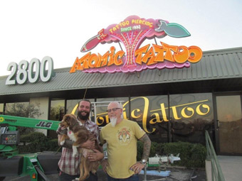
The bombs and the custom “Atomic Tattoo” name were fabricated as four-inch-deep, open-face channel letters. The bombs employ blue-green, yellow, and white neon. “The light stays in the can and doesn’t bleed over onto the rest of the sign,” says Gordon.
And although the neon used inside the “Atomic Tattoo” letters is orange, Gordon painted their cans yellow. “This way, we were able to get some amazing color blends,” he explains. “Having an orange can with orange neon would’ve been a wasted opportunity to do something cool.”
The sign was constructed into separate pieces to be later attached out at the job site. Probably the most time-consuming element of the project involved breaking apart the pieces of the sign during fabrication to make sure they would still all fit together once out in the field.
The consensus for the mushroom cloud was that a majestic, purple, cotton candyish blend would work best, so Shay Miller painted this portion using 1-Shot and T.J. Ronan paints. She applied a matte finish to the cloud (so that it would soak up the light and enhance its glow) and painted inside the bombs and the channel letters with a high-gloss (to complement the reflection).
For the “Perry’s Tent” open-face channel letter sign Gordon created for the Lollapalooza festival last year, he used classic 11W incandescent bulbs with each letter on its own circuit. Gordon used this same technique for the mushroom cloud, but to add more excitement (and even more color) to the sign design, he wired the bulbs in a four-circuit sequence this time.
Gordon has boxes of these sign bulbs in many different colors lying around his shop. So he installed the old-style “snap in” sockets into the stem of the mushroom cloud and inserted a mix of clear, white, yellow, red, and orange bulbs that are sequenced to chase and blow upward into a v-pattern. “I love the way the neon plays off these bulbs and how you can see those little filaments burning and flickering,” he says. “It’s a cool blending of light styles.”
In addition to the neon inside the sign cans, the words “Tattoo Piercing Since 1992” were also bent using different colors of neon. For all his neon glass-bending work, Gordon turns to Kirk Tunningley of Big Dog Neon in nearby Lockhart, Texas.
“He’s able to decipher our chicken scratch patterns and designs,” laughs Gordon. “We’ll trade beers and go over all these ‘cryptic’ paper patterns with him and try to best show where all the neon starts and stops are.

“He’s told us we give him the worst patterns possible, which we don’t do on purpose (sorry, Kirk!), but he’s just got one of those intrinsic feels on how to make stuff look amazing.”
A couple of weeks later, Tunningley returned with a truck-full of glass—an adventure in itself. Gordon alerted the shop that they were on “lock down” mode until the glass had been installed to the sign. All the shop dogs were put on leashes and employees were told to be very careful when walking by this glass on the table. “I reminded everyone that there was a lot of time and money [here],” he remarks.
But let’s back up a bit though. Before designing anything, Gordon first visited the new location to pull measurements on the building. Not only did this help him determine what he could build also how to install it safely and securely.
Since the roof slopes at a pretty steep angle, Gordon knew he’d also have to build some custom brackets for the sign. So he crafted four 2-by-2-by-3/8 angle iron brackets that are attached behind the sign and mounted to the roof diagonally. “All the penetrations were sealed with roofing seal,” he says. “There are also a couple of backing braces off the top of the mushroom cloud going down. We made those out of angle iron as well.”
Earlier we told you that lighter weight aluminum was used to fabricate the sign. This material was instrumental in installing the sign as well. Blackout Signs is a small shop lacking any hoists or forklifts. “Weight is a big issue for us because everything in the shop is moved by manpower,” explains Gordon. “We rarely put steel inside a sign for the frame. I’d estimate the finished sign weighs only 400 pounds.”
Two transformers powering the sign were placed at its top and two more at its bottom. “In fact, I think the transformers probably weighed more than the sign,” laughs Gordon.
To transport the sign out to the installation site, Gordon wrapped it in blankets and Styrofoam™ and placed it on his sixteen-foot-long trailer. “We’re not a big company, so if we break something, we have to take care of it,” says Gordon, “so it was a real slow drive. I checked my rearview mirror quite a lot.
The three-man installation team used a JLG man lift to put the sign up on the roof. “I figured it would be a little easier to install in two pieces,” explains Gordon. “We bolted the top mushroom cloud part onto the bottom part just above the lettering.”
This was a dream job for Gordon (pictured, above left), who’s always been a big fan of how tattoo shops are artist-driven and use lots of color. (Note: Jay also loves color! And tattoos!) Edwards (pictured, above right) was also ecstatic about the sign. “He’s already talked about maybe doing some more [work] with us,” says Gordon.
By Jeff Wooten
Photos courtesy of Blackout Signs & Metalworks.


