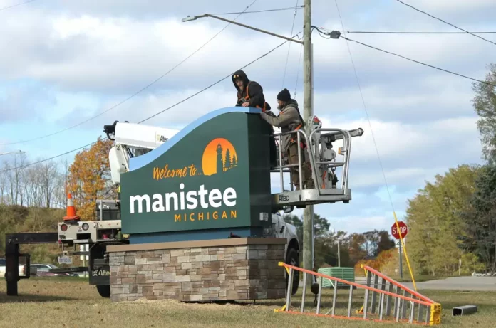
Manistee, Michigan is working on a new streetscape plan for the city’s downtown. Late last year, Amor Sign Studios, a division of Michigan-based Johnson Sign Company, installed some new welcome signage to draw in passersby and increase branding efforts. During a March meeting, Johnson Sign’s Madeleine Lamb discussed signage strategies and restrictions with the City of Manistee Planning Commission.
At the event, Lamb spoke to local citizens and business owners about the impact signage can have on the community and the consequences of tight sign restrictions, the local News Advocate reports.
“Restrictions on signs do not solve issues of unsavory businesses, and they do not solve issues of context. Worse, extreme restrictions make it difficult for businesses to attract customers or cultivate a thriving economy,” Lamb said. “On the other extreme, a lack of signs, says ‘pass us by.’ Businesses need signs to thrive, to invite customers and to bring revenue that keeps the community healthy.”
When it comes to the size and placement of signs, Lamb noted it’s important to consider nearby traffic trends.
“If cars are traveling at 50 miles per hour and a business wanted to get you to pull over, get into the turn lane and pull into the parking lot in time, it has to have a larger sign,” Lamb said. “Businesses in this context require this kind of signage to attract customers and revenue. A restrictive sign ordinance would not solve this problem.”
In other words, the most effective size and height for a sign can be determined by the speed of travel and viewing distance.
“Along a 50-mile-per-hour road, the sign needs to be 8 feet wide to be seen in time to turn,” she said. “When inviting people to exit the freeway to fuel up, your sign better be 16 feet wide on an 80-foot pylon pole or no one is ever going to see it in time to stop. That’s just the reality of how the context of the signs’ location necessitates a certain design.”
Lamb explained how streetscape design can go a long way in eliminating overly large signs by making them unnecessary. “In some contexts, a small sign is best. In other contexts, you need a 20-foot cabinet on an 8-foot pole,” she said. “… The signage style is emerging from the necessities of the context in which they are situated. Manistee has a unique character — a sense of place. Its signs help to say … it’s worth experiencing.”


