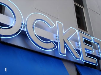
In my opinion, one of the problems these days with comparisons between LEDs and neon (Photo 1) is that you really can’t make a fair comparison. It’s apple and oranges.
In fact, there really is no comparison.
Unfortunately if you investigate this topic via the Web, you’ll find instances of lopsided, generalizing comparisons. Those who have long lists of the many LED “pros” and only a few “cons” appear to be merely in a mode of not selling neon.
But there are a few instances where LEDs are 100 percent better than neon, and at this point in history, we can be specific and limit it to a few specific types of signs.
Small Size
The real key to using LEDs is when it comes to size and simplicity.
One of the main characteristics of LED sign modules is that they excel at fitting in, i.e., they’re a light source that easily goes into a tight spot. So a set of closed letters where LEDs work well are small or thin letters or letters where the font has a very narrow stroke (Photo 2).
If we really look at what LEDs have become, they’ve turned into a good source of illumination for enclosed channel letters—channel letters in malls; reverse-lit channel letters with white plastic backs; and anything well diffused, completely covered, or where the viewer cannot directly see the source of light.
There are even some very good lighting modules that have come out to retrofit fluorescent-lit signs, especially useful for those signs that are hard to reach, complex to service, or past their initial electrical life and need a complete upgrade. (Note: Again, in these applications, the LED light source is not directly visible to the intended viewer.)
With LED lights behaving more like bright little packs of spot lights or uniform rows of little spot lights, they fail when the light reflection and/or light diffusion is not up to par (Photo 3). Replacement of the inherent light scattering across several feet of a round T12 fluorescent light, for example, often leads to a spotty job of illumination with LEDs.
To get a continuous illuminated look comparable to neon or the fluorescent tubes, you’re going to need additional components.
It’s all too easy to walk into a shopping center and see a sign that’s made with LED lighting (Photo 4). The round linearity of fluorescent and neon make them ideal for smooth, uniform lighting in multiple directions. But LED lighting requires diffusion, distance, or density to achieve the same uniformity of light.
Don’t get me wrong. I personally don’t have a neon plant, nor am I someone who produces neon. I also don’t work at a company with an in-house neon bender. But I am someone—like many in the sign, graphic, and design industries—who understands what lighting works in specific applications.
One of the keys with LED lighting success is the fact that a lot of sign companies apparently don’t produce neon in-house and LED gives them the freedom to produce not just a complete set of letters, but the entire sign. This also translates into a sign that’s easier to ship and install without the risk of breakage.
Now this isn’t as big an issue with stock-size fluorescent lamps, but it’s a much bigger one with custom-bent neon. It’s also important for sign producers that are creating and sending out a national sign program.
{2j_imageviewer 85}
Eight Colors of Crayons?
One of the shortcomings that time will eliminate is the color spectrum for LEDs.
The harsh blue-white color of LEDs is often a plus in getting a sign to look bright, but it’s a different color white than that of fluorescent tubes, which have existed for years and we’ve grown accustomed to.
If we look at LEDs, we see that there are very few colors for it compared to the spectrum that neon tubes produce. This is a major shortcoming in the “LED vs. Neon” comparison.
Technology is a hurdle here that the sign builder is remote from.
One plus for LED is that possible solutions exist with the use of RGB (Red Green Blue) modules.
Simply dial in the color. This color is often a close approximation. It’s also something that can be changed as needed or permanently set (depending on the manufacturer and the process of controlling the level of lighting with the three colors of LEDs).
As you can imagine, this process is more expensive because you’re essentially putting in three sets of LEDs unified in a single run or a single chain of modules. Adding the controlling circuit to adjust the color correctly comes at a higher cost (when compared with single, defined-color LED modules or strips).
Direct experience has shown that the longevity of LEDs isn’t always as described. The lamp, the actual diode, and the actual light producing item appear to last as long as expected, but the conductivity, the circuit strip, the circuit board, the copper conductors, and the electronic components associated with these light emitting diodes can be very problematic.
Failure mid-stream from the manufacturer’s connections will require replacement from that point on or the need for splicing in a section of modules. Failure of a partial section of LED makes the sign look like a lamp is out.
One site I recommend looking at is signletters.com from Gemini, Inc., particularly their catalog that touches on LED letter illumination. The company pairs eight different face colors to only five LED colors for the best result (Photo 5). One interesting note is the reverse channel letter example shown.
By Peter Perszyk


