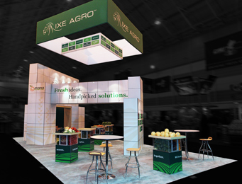
If you can create innovative concepts, design the system, fabricate it, and finally, install a tradeshow experience, you can take on just about any large format display project.
In considering all the components of a spectacular tradeshow exhibit, the composite becomes more than a series of banners, fabrics, graphics, panels, posts, and signage—it transforms into a unified experience, one that you hope will make an impact on every visitor.
Once a company can succeed in this market, the sky’s the limit, and other projects—such as wall displays, banners, and poster graphics—become simpler to execute (though still require the same level of creativity) in comparison to the complexity of producing tradeshow graphics.
Among the hundreds, if not thousands of businesses and suppliers in the tradeshow industry, there are still the small “artisan” design shops that keep the innovation high and the ideas fresh.
One such company is Raleigh, North Carolina-based Point Concepts, which identifies itself on its home page as Brandcrafted (“your brand” + “our one-of-a-kind handiwork”).
Founded by Dan Schwab, president and lead designer (also known as the company’s head tinkerer and “figure-outer”), Point Concepts dedicates about half of its work to tradeshow design, forty percent to environmental graphics and corporate environments, and the rest to museum display graphics.
As the sole proprietor of Point Concepts, Schwab manages nine staff members—five of which hold design degrees. The 8,500-square-foot facility allows his staff plenty of room to both stretch their creative imaginations and exercise a hands-on approach to fabricating and constructing large displays.
“Designing and building tradeshow exhibits is what our business was founded upon,” says Schwab, “so we know we’ve done the job right when our products bring you marketing success. With our full-service capabilities, we can handle any type of construction in-house. We understand the shipping, weight, and labor issues faced with any fabrication project.”
Serving mainly mid-sized clients who are mostly local to Raleigh and Research Triangle Park (which encompasses the University of North Carolina and surrounding tech companies), on any given day, Point Concepts might be producing front- and back-mounted graphics, backlit graphics, custom-printed wallpaper, and dimensional signage.
Each year, they ship their graphics to over two hundred shows all around the country.
Point Concepts views themselves as designers first and builders second. “If the design is not right, no level of craftsmanship, after the fact, will make it right. Listen, design, deliver…this is our mantra,” says Schwab. “Our goal, from the beginning, has been to try to understand what our customer wants to accomplish.
“We ask an enormous amount of questions to understand their business. It’s only then that we can provide a truly valid solution.”
Schwab continues, “It is even more important, when designing brand messaging, that we know our customer’s needs almost as much as they do.”
Finding the right medium is critical to sound design. When it comes to films and laminates, Point Concepts typically works with 3M, but the company also uses others such as Orafol and Avery, which they have found are less expensive options for printing on transparent vinyl. They work with Lexjet for back-mounted graphics, as well.

They’ve also turned to Displayflex for a durable laminate finish and Fixon double-sided adhesive for back mounting. Their substrates include acrylic, Dibond®, Sintra®, polystyrene, MDF, sublimatable acrylic, and wallpaper media.
On where the future is headed for large format graphics and tradeshow designs, Schwab believes, “Fabric graphics have become one of the dominant solutions in retail, and I see this continuing to increase.
Several of their large format display projects show the range of clients who have turned to Point Concepts for a branded approach to environmental design.
In designing and constructing a 20-by-30-foot tradeshow booth for one of Point’s longstanding clients, MTS (a sensor manufacturer in North Carolina), innovating and on-your-feet thinking helped to transform MTS’s smaller exhibit display (10-by-20 feet) to fit a larger space for a special conference that the company attends every three years.
“We designed a booth that repurposed their 10-by-20 into a conference room and then rented MTS the rest of the components to fill the booth,” says Schwab. “The challenge was to make the whole exhibit look like it was not a combination of two different systems.”
(Note: All of the graphics were printed on 3M vinyl with matte laminate.)
For global tech innovator Redhat in Raleigh, Point took a simple, but highly creative approach to interactivity: create a tradeshow display with surface areas that could be colored with markers.
Designed for the well-attended annual SXSW festival in Austin, Texas, the 20-by-20-foot exhibit utilized 3M vinyl with matte laminate and dimensional logos that were laser-cut by Gemini.
“It was a huge success, and the booth stayed packed with visitors,” explains Schwab. “People colored all over the booth, the bean bags, and even the carpet.”
Projects that move outside of the tradeshow industry utilize the same creative principles as any environmental graphics should but can expand in scope and size, depending on the configuration of the pace.
For example, Point Concepts created a unique concept for another Raleigh-based tech company, Citrix, that involved thousands of keyboard keys, producing a series of ads for Terminals 1 and 2 in the Raleigh-Durham International Airport.
“All it took was 13,899 keyboard keys, a few shades of grey, a giant grid, and all-hands-on-deck to build the custom, hand-crafted installations,” explains Schwab.
A balance of projects—for both non-profit and for-profit—helps keep the excitement in the air among the company’s creative team.
Turning to sports history, Point Concepts designed a museum exhibit honoring baseball legend Buck Leonard, a beloved native of Rocky Mount, North Carolina.

“In an effort to honor the legend and share his story, the city planned for a custom-designed exhibit, which would feature authentic artifacts of historical significance pertaining to his life,” says Schwab. “We were thrilled when our proposal for the design, fabrication, and installation was chosen, and we are proud of the exhibit and its value to the Imperial Centre of Rocky Mount.”
In creating a donor wall for the YMCA in Danville, Virginia, the goal was to display the names of those who donated to the organization on a 20-by-18-foot wall.
Working with a mix of clear ORAFOL and 3M vinyls with matte laminate graphics, the wall serves a dual purpose of paying homage to the donors as well as showcasing the history of the building site (which once housed a mill).
“The trickiest part of the design was that the majority of the wall was too high to be used for the donor portion,” says Schwab, “ and the only mill picture that needed to be enlarged to nearly twenty feet was a low-resolution image at only 949kb.”
To solve this, the team incrementally enlarged and slightly blurred the file until they reached the final size.
Because the image was part of the background, as well as translucent, this approach was a success.
In situations like this, it’s imperative to create a solution that will make an impact since the graphics will dominate the space.
“Custom wallpaper changes an environment,” says Schwab, “whereas a sign may only enhance an environment or serve a particular function.”
By Lori Shridhare
All photos: Point Concepts


