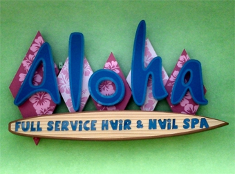
The owners of Aloha Hair and Nail Spa, Trina Tran and Frank Chan, resided in Hawaii for fifteen years before moving to Bradenton, Florida several years ago to open up their boutique, where the “Aloha Spirit” awaits their clients.
To them, this Island philosophy is more than just a greeting—it’s a way of life.
The couple has combined a spirit of care and warmth with a healthy dose of fun and food into their services to make quite a name for themselves.
Due to their success (and growing waiting list), they decided to relocate from a cramped strip mall location to a freestanding 3,740-square-foot “state-of-the-art” spa that took a year-and-a-half to build. The outside is painted two-tone electric yellow and pastel green, and inside, you’ll find “authentic Hawaiian hospitality” being employed through a custom-built bamboo service desk, earth-tone ceramic tile, and bright wall colors.
Trina and Frank had been using a small, plain set of confined channel letters surrounded by vinyl banners at their strip mall location. However they knew they were going to need much more dynamic signage at their new building.
Shortly before the grand opening, the building contractor called Christopher Wicks II, owner of full-service Global Sign and Awning in Clearwater, Florida. The shop boasts a variety of employees to help complete jobs—designers, fabricators, installers, project managers, etc. “We cover all the bases,” says Wicks, who has quite a history providing high-quality signs for shopping centers and their tenants.
According to Wicks, the contractor told him about the new spa facility being built in Bradenton and asked if his shop could make a stronger sign that better evoked a Hawaiian experience.
“I told him that, yes, we could do this,” says Wicks, “and he responded that he needed a proof by the next day!”
After finding out the contractor was serious, Wicks still agreed to do the job, enticed by being given carte blanche at designing a sign from scratch, as long as it featured Exotica-inspired iconography.
Wicks was already in a creative frame of mind thanks to having recently watched the Disney movie Tomorrowland starring George Clooney. “I was inspired by the futuristic-retro architecture and signs featured in the movie,” he says, “and those ideas bled over into this.”
His idea was to take unique blue letters with a Tiki beach vibe (but with a modern twist) spelling “A-L-O-H-A” and place them over irregular-shaped, alternating-pink-and-purple-pattern diamonds.
Wicks designed everything in Adobe Illustrator in twenty-five minutes. The contractor and the spa owners loved the concept and quickly approved it.
“They made a few small changes,” says Wicks. “They suggested adding the hibiscus flowers to the diamonds, which I crafted using stock imagery.
“They also wanted to include a surfboard with unique, ‘fun’ text below
the diamonds.”
All the pieces were cut using their CNC router. “We made the surfboard out of an aluminum face with half-inch clear push-through copy,” says Wicks. “Then this copy is backed with 1/8-inch blue acrylic to make it look like water.”
Lighting proved to be another avenue of creativity for Global Sign and Awning here. The channel letters are front- and back-lit using white Principal LED Street Fighter modules.
“They are Channelume trimless channel letters with a blue acrylic face, and we added blue vinyl for the outline,” says Wicks. “Doubling up those blue colors gives it an electric vibe at nighttime, and then in the daytime, you have a blue face with a dark-blue outline that makes it ‘pop!’”
The diamonds behind the channel letters are reverse-lit with LED modules and feature a .090 aluminum face with a Lexan® back. Global Sign and Awning then wrapped the Lexan back with transparent ORAFOL vinyl to those colors.
“We tried to find pink and purple LEDs, but those don’t exist,” says Wicks, “so we used white instead. Because the light shines through it, translucent vinyl would hold too much of the light back; the transparent allowed enough light to go through it and give us the pinks and purples that we were looking for.”
Wicks challenged his shop’s creativity on this project. He wanted the vinyl-covered diamond shapes projecting out to be staggered. “So one diamond stands off the wall six inches, one stands off nine inches, the next six inches, the next nine inches, and so forth,” he says.
However while the diamonds are going in and out of the wall, Wicks envisioned the channel letters remaining on the same plane. So they used different length standoffs to accomplish this.
Global Sign and Awning was careful not to go too far from the wall that the light would be inconsistent. “So there is only about a three-inch difference between the two so that they still light up consistently,” says Wicks.
They shipped the sign in six pieces—the “A,” “L,” “O,” “H,” “A,” and surfboard—to the recently constructed building. They used their Elliott Equipment and Dur-A-Lift trucks to install the illuminated sign onto the exterior wall of the building. (Note: The company also built and installed a 14-by-14-foot, LED-illuminated aluminum cabinet with vinyl copy featuring the new design on pylons painted bright yellow and green using Matthews Paint.)
Because of the staggered design of the sign, Global Sign and Awning couldn’t start with the “A” and work their way left to right. “The letters had to be installed in a pattern, so that the diamonds would overlap correctly,” says Wicks.
The remote power supplies are located inside the building for several reasons. One was for ease of service in the future. “And because the letters were so specific, if we had a power supply go out in the middle, we would be forced to take off three letters,” says Wicks.
The wall sign and the pylon sign were knocked out in two weeks, just in time to greet clients at the grand opening. Aloha indeed!
By Jeff Wooten
Photos: Global Sign & Awning


