2/90 Sign Systems is a forty-two-year-old business with roots in modular, architectural signage systems. “We specialize in comprehensive architectural facility signage packages for primarily healthcare, corporate, higher education, government, and hospitality,” says Chris Douma, senior sales manager at 2/90 Sign Systems. “We fabricate several different system lines that promote modularity and functionality of architectural signage within the environment.”

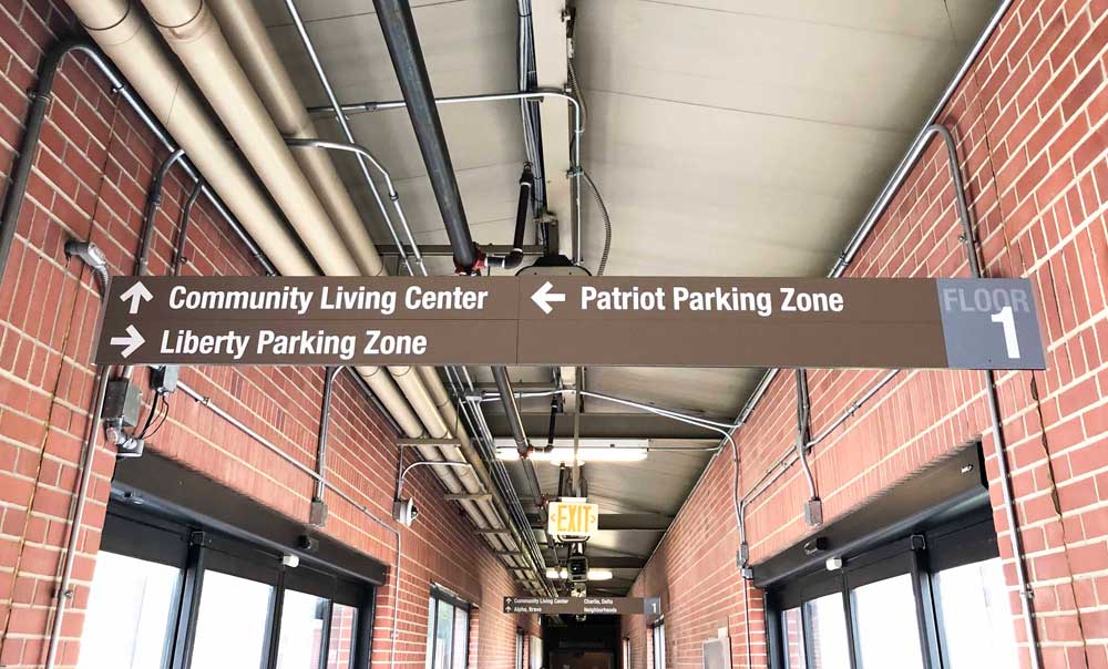
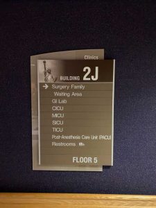
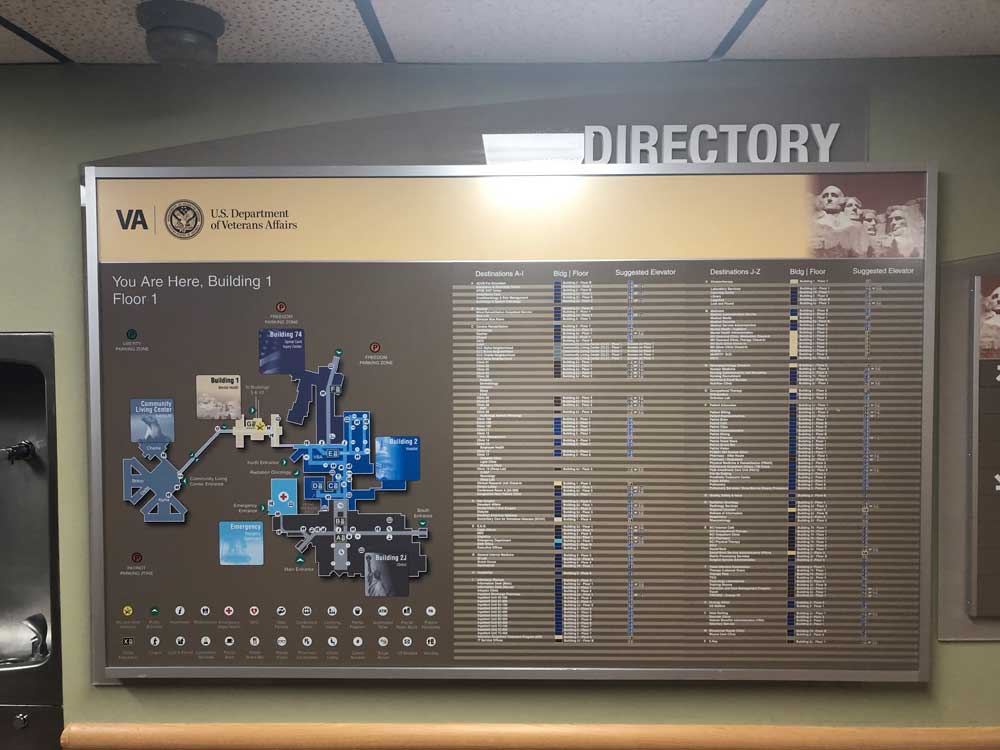
2/90 Sign Systems’ offerings include identification signage, regulatory informational signage, and wayfinding directories and directional signs. In fact, you may remember the large-scale project they worked on for the Dallas VA Medical Center that we covered in our August 2020 issue (“Curative Wayfinding”).
For large projects such as the VA Medical Center, 2/90 Sign Systems says the wayfinding experience starts from the moment a visitor arrives onto a campus.
“It’s not just inside the individual buildings,” says James Sutton, field operations manager at 2/90 Sign Systems, “it’s all over the campus trying to get the visitors to the buildings or the parts of the buildings where they really need to be.”
2/90 Sign Systems says to take a systemic, big picture approach to wayfinding and focus in from there. This is especially important when planning wayfinding layouts for large, complex campuses like hospitals or colleges.
“Think about landmarks, milestones, and how people navigate any space or any environment from point A to point B going from a macro level to a micro level,” says Douma. “You want to get people, for example, to the right building and then to the right floor and then, once they’re on that floor, direct them to the right service that they’re seeking, and then to the right room and entry point.”
Don’t provide all of the micro information in a complex environment at every step in the wayfinding process—it will just lead to confusion and overwhelm the visitor.
If you’re visiting a campus or a building with an existing wayfinding system that needs to be updated, Douma says it’s important to pay attention to your first impressions. “We have the benefit of sometimes seeing their space or navigating these wayfinding challenges for the first time,” he says. “We bring that fresh perspective and point out and offer some suggestions that help in a way that might be unique or new.”
Whether updating an existing wayfinding system or creating an entirely new one, consider all of the methods of navigation and the ways in which people process information. “Some read building titles or nomenclature, others might remember color or imagery better,” says Douma. “Some people are color blind, so using color as your only source of identification in a wayfinding solution doesn’t work for everybody. Try to explore and combine these into one solution that is a macro-level wayfinding package.”
Sign shops can also pull design and navigation inspiration from elements of the existing building or campus. “Each facility has unique characteristics to it that can either be inspiration or lend themselves to wayfinding solutions such as lighting, features, or finishes,” says Douma. “It could be something as simple as taking a particular wood trim and using that as an element in the signage to blend it together.”
 Above all, be sure to practice empathy when designing a wayfinding system—especially in areas of high stress, like hospitals. “Make sure that the wayfinding solutions that you’re presenting are appealing to the patient because they’re the real customer,” says Sutton.


