Appropriately based in remote northwest Montana, Giavasis’s firm Highline Design, which he founded with his wife Elma in 2012, works on a range of environmental design projects that reflect their broad interests in community and their myriad talents in graphic design and art.
“By accepting projects that align with our company’s ideals (wilderness conservation, outdoor recreation, community development, etc.), and working with local nonprofits as often as we can, we hope to use design to affect positive change,” says Giavasis.
While public land is abundant in Montana, the state’s trail system signage has languished over the years, possibly due to a lack of tax funding.
Fortunately Highline has harnessed the financial power of private foundations and other fundraising efforts to support their design work on trail signage—efforts that are in line with the priorities of state residents who have demonstrated a solid commitment to the land.
This is exactly the kind of effort that yielded a win-win for Highline and conservationists when a partnership was established to revamp a trail system at Herron Park called Foy’s to Blacktail Trails.
Located just outside the small city of Kalispell, Highline supported the nonprofit FTBT as they sought to raise $2.4 million towards land conservation efforts (including modernizing the existing trail system).
The key to helping this nonprofit was integration of all marketing pieces, including wayfinding systems and signage. Highline not only designed the trail systems but also created a print map, which was used not only by visitors, but also for fundraising efforts.
In consultation with the organization’s board of directors, the team redesigned the map with an eye on simplifying the complex network of trails and created a color system to identify the trails.
Once Highline moved on to design the trail signage, their mission was clear: Make the trails user-friendly and enjoyable, while enhancing the visitors’ experience and commitment to the trails.
The challenge, the team discovered, was creating a signage system that could adapt as the trail system expanded, while remaining within the established budget.
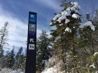
“To keep costs down and allow for flexibility, we purchased affordable fiberglass posts and weather-proof decals for the main wayfinding signs,” says Giavasis. “Intersection and infrastructure points are clearly marked through direction arrows and a color identity system.
“By limiting the amount of copy appearing on the signs, the user is left with a simple system of colors and icons, which makes better use of limited space and complements the main map and pamphlet graphics.”
The style of the signage is unobtrusive, yet attractive, and the function and messaging were geared to convey safety, navigational, and educational information to ensure visitors have an enjoyable experience. The trail signage was required to stylistically blend with Forest Service signs, and was submitted for approval by the county as well as other partner landowners.
In addition to the signage, Highline also created FTBT merchandise, event materials, annuals, and newsletters.
“When new users can find their way intuitively, they have a better experience and come back for more,” says Giavasis. “More park usage means more donations, a happier community, and higher property values.”
It’s not as obvious how signage can directly help preserve the natural environment, but when people are adding their footprint to trails, signage can help mitigate their impact and remind them of the value of conservation.
“Better signage means users stay on the trail, develop fewer undesignated tracks, and keep their impact to a minimum,” says Giavasis.
It also helps to employ sound design aesthetic to the system. While many hikers are used to basic signage guiding their way, there’s no replacement for engaging, dynamic signage that is created with an eye on both form and function.
In essence, it helps to think of trail signage as part of a brand connecting to the organization’s core values.
Since signage is usually an outgrowth of an established brand and one of the final elements in content development, Highline often advises starting each project with the basics.
“If the customer lacks a comprehensive visual identity, we might start by stepping back and establishing a consistent visual style for their brand that we can carry across the signage program,” says Giavasis.
This initial conversation is followed by a series of steps that involve researching the client’s potential needs after the team conducts an audit of existing materials and content—the information needed, the users and their method of transportation, the surrounding environment, etc.
“Once we know as much as we can, we start concepting designs and materials,” says Giavasis.
For example, in creating signage for Foy’s to Blacktail Trails, Highline’s team took into consideration the perspective of the users and the activities they would be undertaking when viewing the signs.
“These signs needed to be used by hikers moving slowly, bikers moving quickly, and those on horseback who were up high,” says Giavasis. “For those moving quickly, the trail and direction can be identified from a distance by the color and large arrow.”
Highline incorporates best practices into both their design aesthetic and the copy, and they keep information at
a minimum.
“Less is more. Everyone knows that, but they still find more information to add to their signage,” says Giavasis. “What are your goals of the sign, and what is the minimum amount of information needed to convey your message?”
Giavasis notes additional trail wayfinding best practices. For example, when possible, sign posts should be placed on the user’s right when heading into the park. “A sign post only points forward,” he says. “In turn, arrows only point right, left, up, diagonally right, and diagonally left.”
He also advises to use as few sign posts as needed. “And don’t use more than three decals per sign post,” he says.
In working on the topic of nature, it’s not surprising that Highline would also veer towards environmentally friendly products when choosing materials, while working within the allocated budget.
However this wasn’t the case when the team chose fiberglass posts for Foy’s to Black Tail Trials.
“This option was versatile and relatively inexpensive, which meant that the foundation could allocate more funds toward conserving more land,” says Giavasis. “The posts and the decals we applied are both incredibly durable. This means we’re creating less waste, requiring less work, and saving money.”
For sign companies looking to work on projects that support parks and the natural environment, Giavasis has some words of advice.
“First it’s ideal to partner with a good designer—signs work better if people like to look at them,” he says. “Second design a great product, but have an idea of how it will be made and how much it will cost to produce and install.
“Finally a close relationship between the sign company and the designer is crucial to create realistic designs.”
By Lori Shridhare
All photos: FTBT


