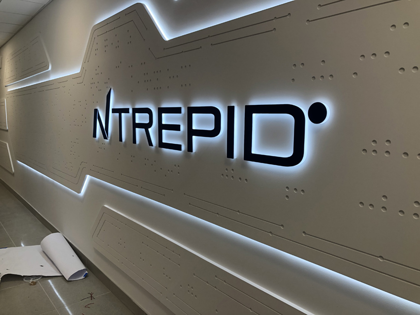
Ntrepid® is a company that provides endpoint security and online information management solutions, and with that kind of focus, it should come as no surprise that “state-of-the-art” would be a part of its DNA.
One such example of this updated ingenuity can be found along a ninety-foot-long hallway at their headquarters in Virginia, as Axiom Design and Build recently built a futuristic-looking dimensional wall covering out of exterior-grade MDF panels and combined it with edge-enhancing LED lighting and stud-mounted letters to create a finished look that really complements the Ntrepid brand.
Axiom Design and Build is located in New York City and prides itself on innovative solutions and world-class craftsmanship. This fabrication-and-installation-only company originated back in 2010, and they fulfill projects all across the northeastern United States, mainly dealing with branding companies and architects. “We execute their designs and vision—either through cutting it, jetting it, painting it, or whatever needs to be done,” says Alex Khalfan, founder and CEO of Axiom Design and Build. “We also have our own installation team, so nothing is outsourced.”
One of the architects they have worked with in the past brought them onboard the Ntrepid project, telling Khalfan that they were looking to spruce up the plain-looking wall space in a main corridor with something more modern looking.
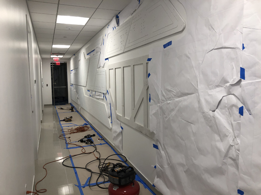
The floor-to-ceiling wall covering they were going to be providing would have to cover forty feet of the ninety-foot-long wall. Axiom Design and Build performed a site survey—measuring the wall and then setting up a design template to show the client what their finished assembly would look like. “The site survey also showed us what the wall looked like and helped us come up with fabrication ideas,” explains Khalfan.
The Axiom Design and Build team paid particularly close attention to the quality of the wall surface that they would be decorating, as well as looked out for where they were going to draw in power to light the wall.
Khalfan points out that a wall space measuring 90 feet in length is most likely not going to be 100 percent plum throughout, so since they weren’t going to be working with a sheet rock wall, Axiom Design and Build decided that MDF would be the better material choice for the wall covering panels.
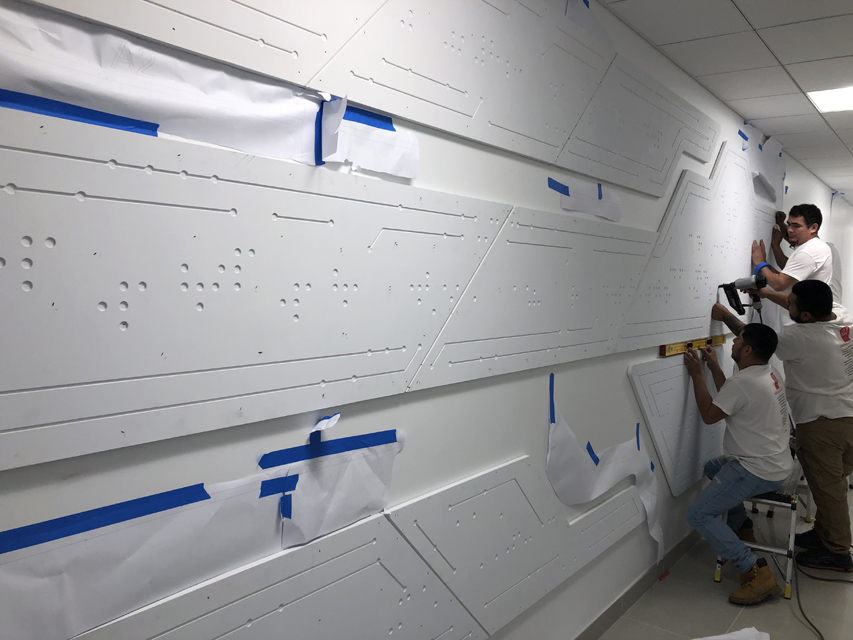
However there were still factors that needed to be considered using this material. “When you paint one side of MDF, it has a tendency to warp,” explains Khalfan, “which can still occur even if you paint both sides. We had determined from the survey that these pieces were going to be ten to fourteen feet in length and joined together with fasteners, so we didn’t want them to buckle at any point.”
The Axiom Design and Build team ended up using their CNC router to cut and carve twenty-six panels out of exterior-grade MDF for this wall covering.
So you might be asking yourself: Why exterior-grade for an interior project?
“Since we were going to prime and paint both sides of the MDF, we routed a one-inch-wide, one-quarter-inch-deep slot along the entire back of each panel and on the ends where they meet,” says Khalfan. “We fitted a one-quarter-inch steel plate into the slots to hold everything tight at the seam and applied a little glue and Bondo™ on the seams to join the two pieces together.
“Usually when you’re butting something like that and fill it with putty or Bondo, it always has a tendency to crack depending on how it’s installed—because the glue is pulling it, the nails are pulling it, and the hot-to-cool temperature causes a tendency to flex. Exterior-grade MDF doesn’t experience this.”
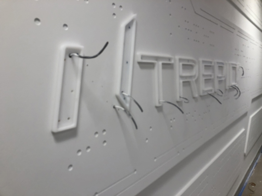
Axiom Design and Build also used their carving tools to add some extra details to the router-cut MDF panels.
Next they painted the panels with Benjamin Moore® paints in their spray-booth at their New York City facility as well as on-site at Ntrepid headquarters. “The wall was supposed to be painted the same colors so it all had the white-on-white effect,” says Khalfan. “We ended up painting a certain area on-site after it had been put up (not the entire piece). It was more like touching up areas where there were fasteners or interlocks.”
The company sanded the pieces multiple times after each finish and priming. “The routing was fine. The challenge was sanding it down,” says Khalfan. “You couldn’t really put a machine to it because you wanted the surface to be perfect.
“You can’t blast MDF, so we had to hand sand everything. On the last round of sanding, we literally had to do one circle at a time just to make sure it would be smooth. It just took a little time.”
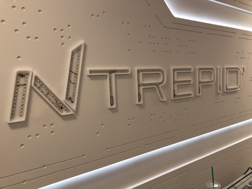
Meanwhile Axiom Design and Build created the centerpiece “Ntrepid” channel letters out of 3/4-inch milky white acrylic. “We didn’t use translucent because we didn’t want shadows from the LED light to be seen,” says Khalfan. “It’s such a tight area, and the letters aren’t that wide.”
Khalfan and his six-member install team traveled down to Virginia for the day-long installation at Ntrepid’s headquarters. They used liquid nails to hold the panels into place as they were screwed down to the studs attached to the wall. “Once we screwed it down, we capped it,” says Khalfan. “We cut some half-inch caps out of the exterior-grade MDF and plugged them all in.”
Multiple types of white LEDs were used throughout this wall covering. Some of the exterior-grade MDF panels were offset from the wall with pins so that light placed behind the panels could shine through the back.
Axiom Design and Build attached the milky white acrylic Ntrepid letters to the mid-section of the new panel conglomeration via one-inch stand-offs. They placed white SloanLED strip lighting inside the milky white acrylic and capped it off with 1/8-inch P95 white acrylic.
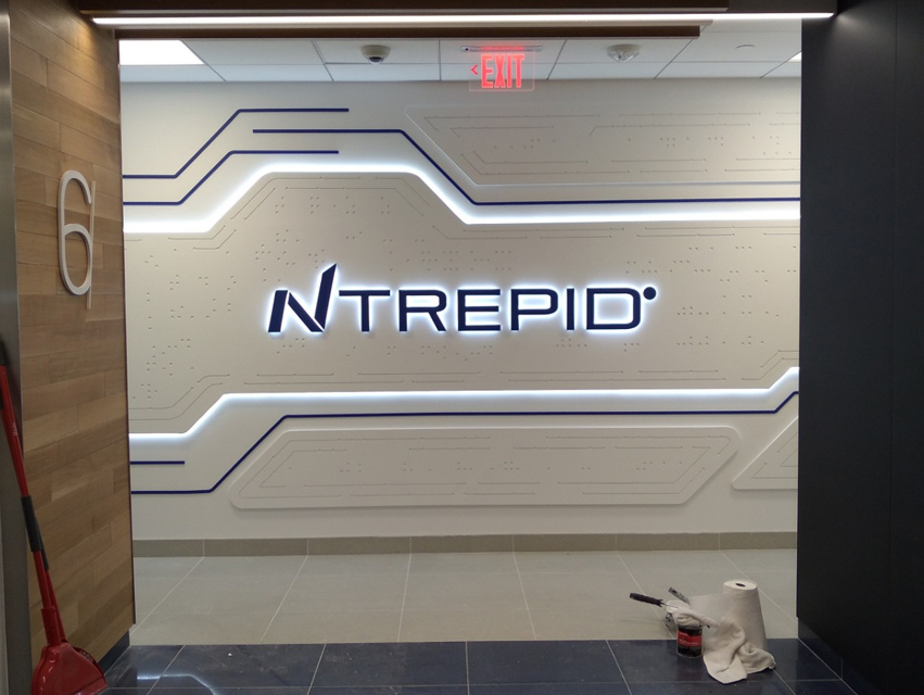
“We were trying to control the depth of it, so we had to put the first layer of acrylic on the MDF and screwed that down. Then we applied the strip lighting and capped it,” says Khalfan. “We tried to get it as thin as possible, but we also had to consider the wiring. The centerpiece with the logo on it is only a half-inch from the wall, and there’s an internal aluminum frame structure behind it that we built holding everything in place.
“So we created a 1/2-inch-diameter internal pocket behind the panels up to the ceiling. This pocket would allow us easy access, say, if a transformer wasn’t working or something was wrong with the wiring.”
The LED lights had to be installed to the letters and to panels while on-site, as it was going to be impossible to mount them in the shop and then transport them down to Virginia. “The internal pocket we created allowed us to work with placement of the lighting as well,” says Khalfan.
In the end, the exterior-grade MDF and the LED lighting combine to create a sleek, futuristic-looking wall centerpiece, which has really helped enhance the Ntrepid brand and transform its once-plain interior.


