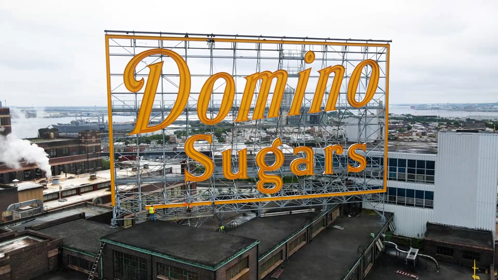
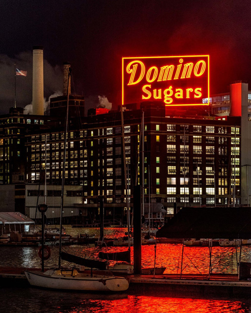
The Domino Sugar sign, perched high over the Baltimore Harbor, is an iconic part of the city’s history. The original sign was constructed by Artkraft Strauss Co., of New York. It was installed on top of the Domino Sugar refinery in 1951, and its neon lights have illuminated the skyline ever since.
But after seventy years of exposure to the elements, the sign was starting to show its age. Domino (ASR Group) turned to Gable, a visual solutions and sign company in Baltimore, to give the sign a refresh.
“The ASR Group originally thought they just wanted to replace the lighting on the sign,” says Paul Gable, president of Gable. “They had us go through an exercise of doing a complete survey of the sign to determine if the neon could be replaced with LED tubing.”
After a full analysis, it was discovered that the situation was actually more dire than had been anticipated.
Significant portions of the steel letters were found to be rusted and eroding. The steel frame also needed repairs. “The ASR Group knew it was time to rethink the sign,” says Paul Gable. “We were given the opportunity to find another way to replicate the sign as close to the original as possible, while employing modern-day fabrication, lighting techniques, and materials.”
Pre-Fabrication
Gable started with a series of technical surveys, taking detailed measurements of the letters and their positions. Workers physically measured the height, width, and girth of every letter segment—no small task, with the sign measuring 120 feet long and 70 feet tall.
“Not only did all the letters have to be measured but [so too] the spaces in-between all the letters, to make sure the layout was visually exact,” says Bill Sackmann, vice president of Construction Services and Quality Management at Gable, noting the company also used a drone to shoot footage of the front of the sign layout.
These measurements were crucial for replicating the look of the original sign. “One of our major goals for the client was to maintain the integrity of their typestyle,” says Paul Gable. “The original typestyle was hand drawn because there was no technology in the making of patterns back then. Everything had to be mechanically reproduced by hand on large paper patterns.”
In the next phase, Gable worked as a consultant and collaborator with a Domino Sugar contractor to remove the old letters, taking them down in pieces. For example, the letter “D,” standing at more than thirty feet tall, came down in six sections.
During this process, Gable’s expertise as a sign company proved essential. “Being in this industry for over forty years, I knew that a lot of people who climbed high in the air on a sign frame didn’t always bring that transformer back to the ground when servicing the sign—and transformers were quite heavy back in the day,” explains Sackmann. “They had to be super careful when starting to remove letters, as the sections came apart, that the transformers didn’t fall out and hurt anyone.”
The contractor planned to remove the letter pieces via a freight elevator that opened onto the tenth floor, the same level as the roof. However, because the letter pieces were so large, the contractor first needed to remove a window and part of the wall to access the elevator. Even with this modification, some of the old letters still had to be cut into pieces. (Note: Domino Sugar donated the old letters to Second Chance, an architectural salvage nonprofit in Baltimore.)
Domino Sugar’s contractor removed old electrical cables and coordinated with Gable on which parts to reuse. The contractor also handled structural repairs on the steel sign frame, including re-engineering the frame’s connections to the building and repainting the frame a medium gray.
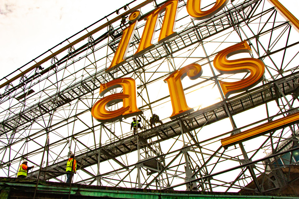
On Gable’s suggestion, the contractor added two continuous catwalks that extended across the frame to make it easier and safer for workers to service the sign. “In the past, when someone had to service that sign, they had to hook onto the steel structure, climb around, and do everything from planks. They had to try to change transformers and neon from the planks, which was very unsafe,” says Sackmann.
Design + Build
When it came to designing new letters for Domino Sugar, Gable had to contend with several logistical challenges.
The original letters had been brought in on a barge and hoisted up the side of the building. This installation strategy meant there were few limitations on the size of the letter forms. “They split their ‘O’ down the center. It was twenty-two feet tall,” says Sackmann.
However, since then, the footprint of the Domino Sugar refinery had changed, making current access points an important factor in how Gable designed its letter forms.
To get the new letter forms onto the roof, Gable was going to have to fit pieces through an 11-foot-wide set of bay doors in the refined sugar warehouse, then down a narrow 12-foot-wide aisle, and finally into a freight elevator measuring 14-1/2-feet-deep and 12-1/2-feet-wide.
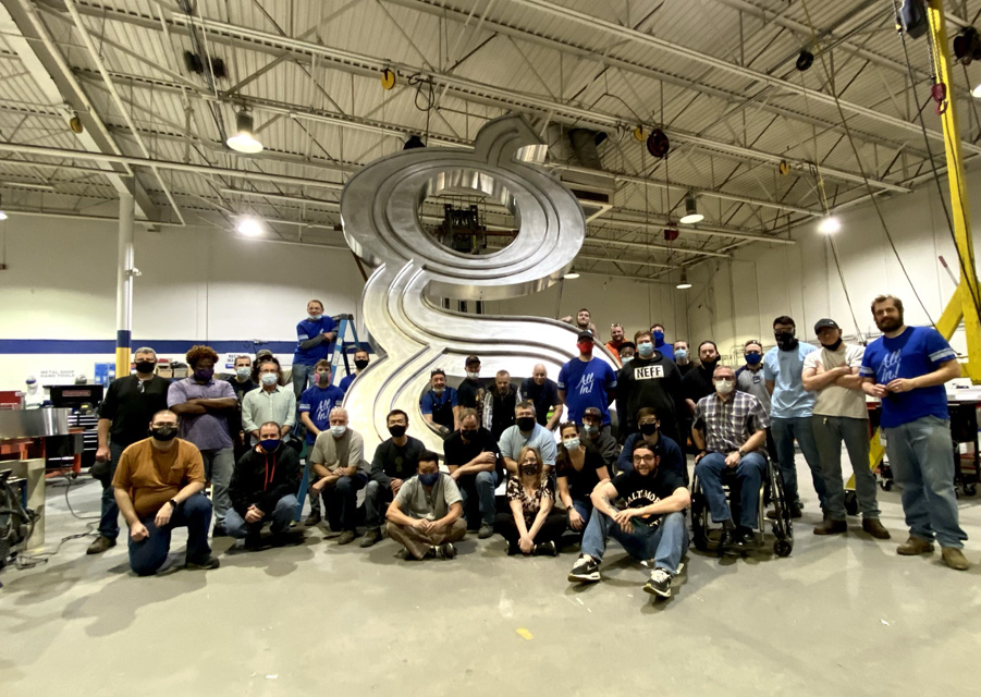
This influenced Gable’s design of each segment of the sign. For example, Sackmann says, unlike the original vertically split ‘O,’ Gable’s version was split horizontally. This would allow the workers transporting the letters to hook it through the opening of the bay door. “We had to measure the elevators at least three times,” he says. “We had a couple of the letter forms that were right up against the edge. We maximized it.”
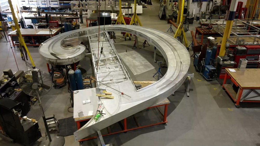
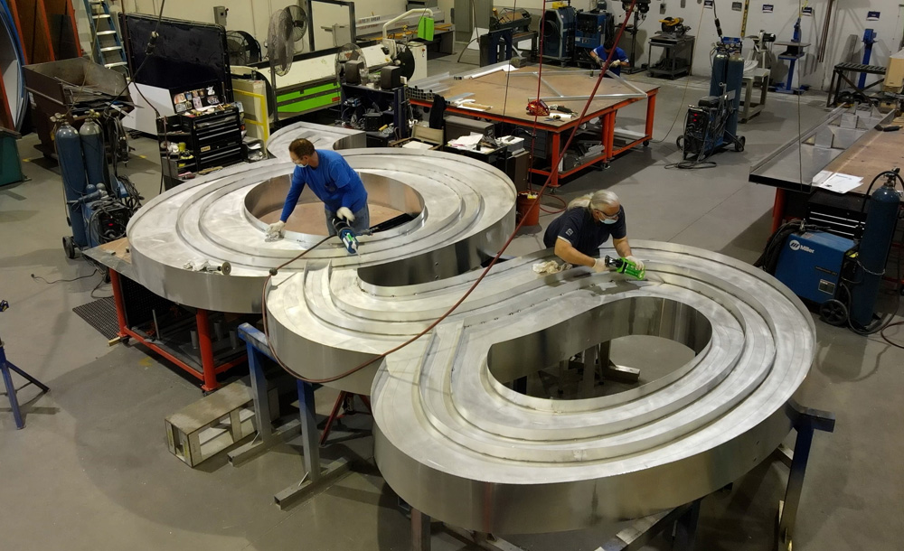
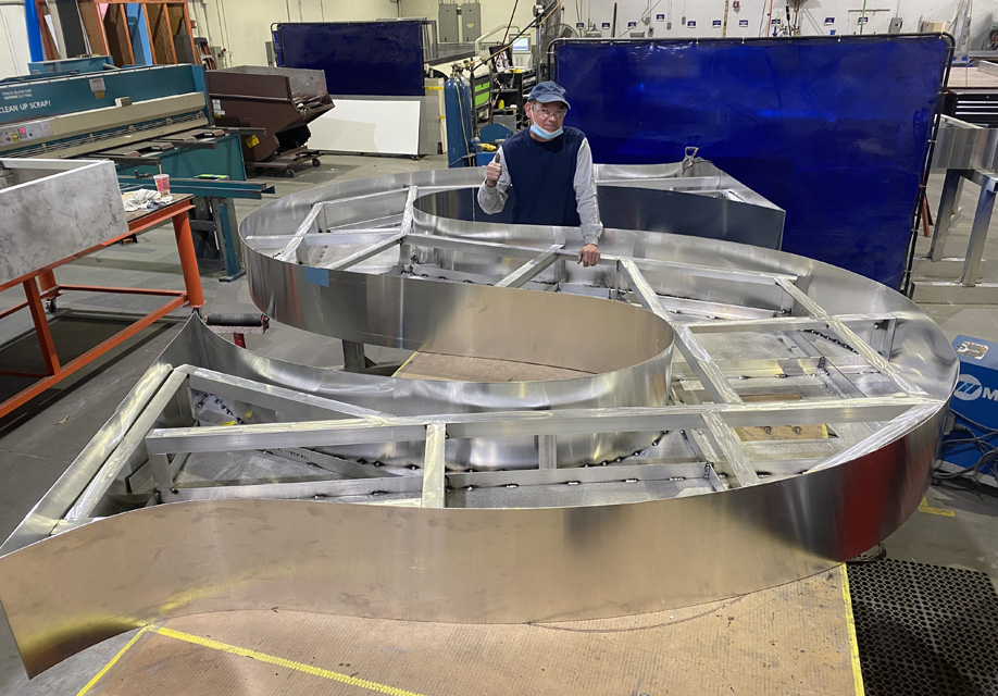
The new letters have an aluminum frame, aluminum faces and backs (sheet goods), and aluminum returns (coil stock). “Our goal was to lift every letter as a whole letter. In order to do that, we had to keep our weight down,” says Sackmann, noting why they decided to use aluminum rather than steel.
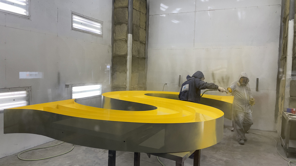
The original letters had porcelain enamel faces with exposed skeleton neon tubes for the lighting. To match the color of the original, Gable used Sherwin-Williams’ ColorSnap technology. They cleaned off a segment of the original porcelain enamel and took a photograph, which sent the color to a smart phone. Gable primed the new aluminum letters and applied four coats of Matthews Paint—two in a high-solid yellow and two in a transparent yellow.
For the new lighting, Gable used SloanLED’s FlexiBRITE Citrus Orange flexible LED tubing. The company assembled the letters in its shop and connected and tested the LED lights to make sure everything was functional before shipping. They then disassembled the letters into segments for transportation, wrapping the lengths of LED tubing around the letter forms.
Installation
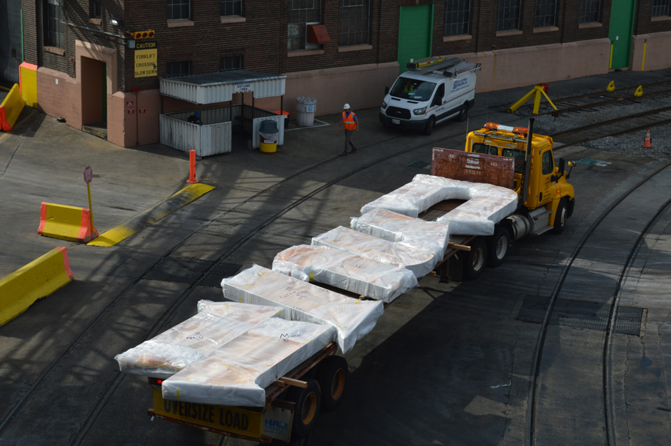
Using CAD software to visualize layouts of the letter forms, access points, and rooftop, Gable coordinated a process whereby completed letter forms were transported via flatbed trailer to the Domino Sugar refinery. Once there, workers lifted individual letter forms onto specialized dollies and reviewed their strategy for maneuvering the letter form into the building.
“We did a couple of diagrams showing the door and showing the letter, as well as a video of how they had to orient,” explains Sackmann. “When we were offloading the trucks, we took a minute and looked at that before we started to move anything, so we knew what we were doing.”
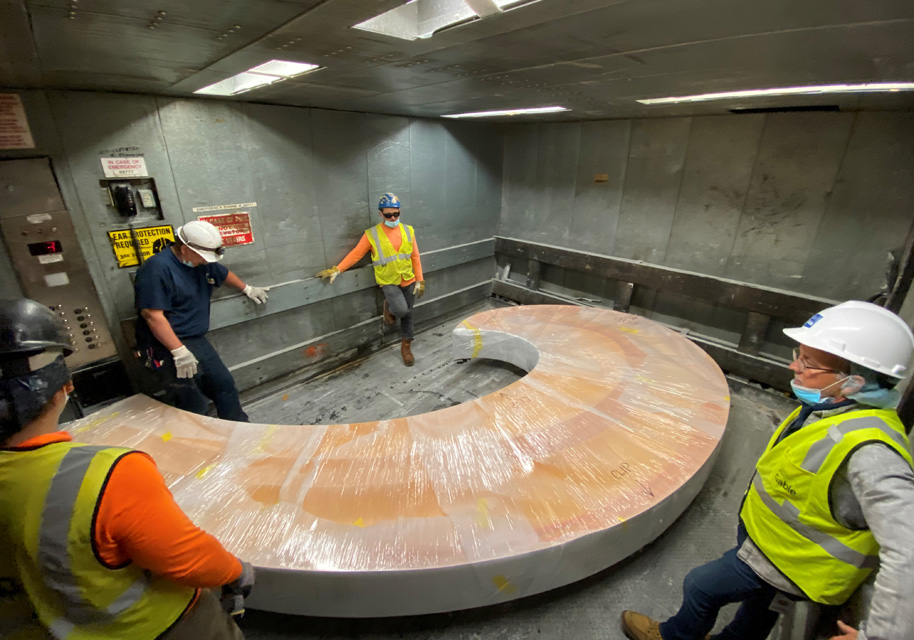
Even with aluminum construction, the segments were still large and heavy enough that it took four or five people to move each one. When assembled, the “O” weighed in at 1,200 pounds total, making each of its segments 600 pounds. The “D” was 2,200 pounds in total, with each of its five segments weighing more than 400 pounds.
The sugar refinery was an active environment, and to avoid disrupting the factory schedule, Gable’s workers started early in the morning. They maneuvered letter forms on dollies through the bay doors and down the aisle to the first freight elevator, which went up to the ninth floor.
After that, they moved the letters across the ninth floor and into a second identical freight elevator, which opened onto the tenth floor, level with the back roof behind the sign.
On the roof, though, workers faced another space limitation.
The area where they could store letter forms measured approximately 93-by-32 feet, which was enough room for only four to five letters. Gable pre-planned how to lay the letter segments on the roof using CAD. This also influenced the order in which the letters were manufactured. Gable manufactured the first set of letters based on what would be installed first and then continued to manufacture the others while the first set was being installed.
Once letter forms were delivered onto the roof, workers lifted the pieces onto saw horses to get them into position and bolted segments together to form complete letters. After test-lighting each letter, they used two hoists attached to the top of the sign frame to lift the letters into position. Having two hoists allowed for proper adjustment of the slant of the italicized letters, giving enough control to adjust the right- and left-hand side of each letter.
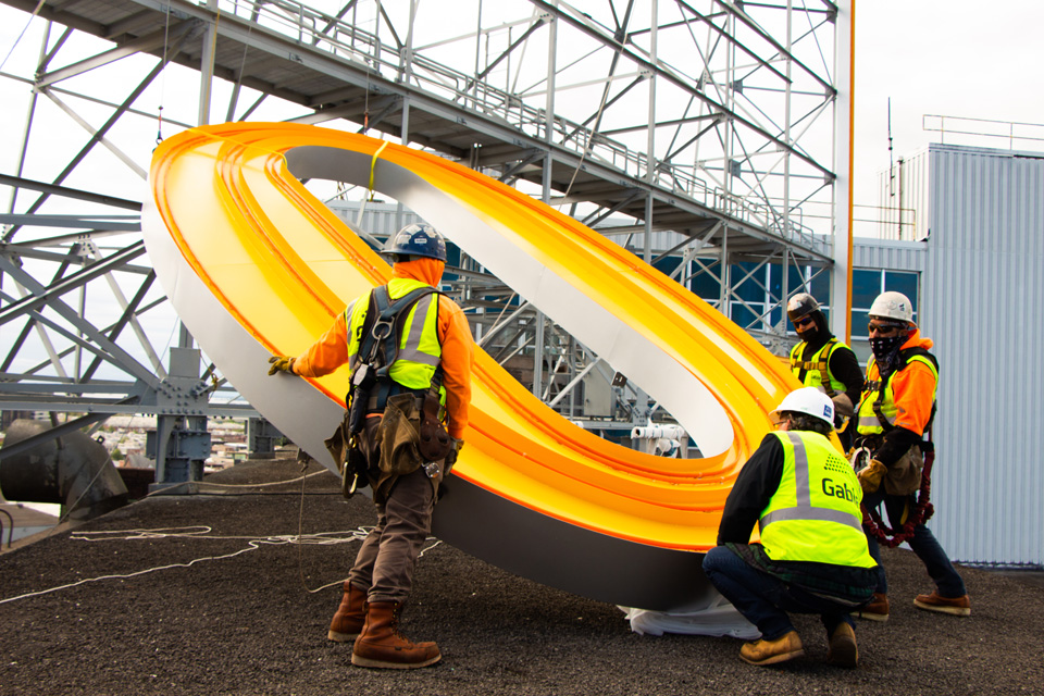
According to Sackmann, the “D” required its own choreography.
“Our team members pre-assembled sections of the ‘D’ on two levels of the roof, because it was too large to fit on the portion of the upper roof perpendicular to the sign frame,” he says. “We temporarily installed the bottom portion of the letter onto the lower portion of the frame, aligning the seam with the lower catwalk. The upper section, which was pre-assembled on the upper roof, was then married to the lower section, internally bolted together, prewired, and erected as one piece.
“We orientated the letters and sections underneath the backside of the frame, so our pick points were directly underneath our hoist, and crisscrossed the lines to spin the letter forms so they would face outwards.”
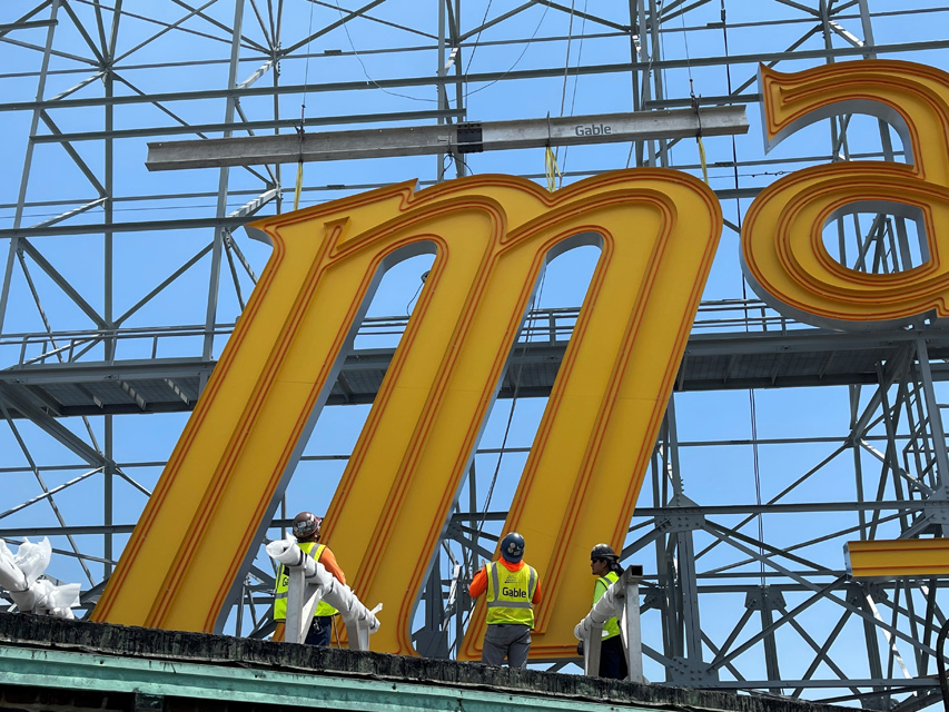
Careful measurements were key to making sure the rectangular border around the letters fit properly.
The top and bottom horizontal lengths of the border were offset by two-and-a-half inches, making it necessary to adjust to that difference while installing the vertical segments. After installing the first forty feet of the upper left hand corner, Gable’s workers paused to take a measurement and ended up making a half-inch adjustment.
“Overall the installation went very well,” says Sackmann. “The last piece that we installed was a perfect fit.”
Other Challenges
Gable faced further install challenges—from water to wind.
Shortly before the installation of the “O,” a rain forecast prompted Sackmann to purchase a thirty-foot tarp to cover the letter. Returning to the site after the storm, he found that some thirty gallons of water had pooled in the center of the tarp-covered “O.” The Gable team had to remove the water so the letter would not be damaged.
Due to the building’s height and location, wind was also a significant factor.
“Not many people realize when you’re this high up on a building, next to the inner harbor, it’s a very windy job site,” says Sackmann. “When you’re trying to lift large, heavy letters up on an open frame, you have to be very careful.”
Because the wind picked up in the afternoon, usually starting around noon, Gable began each day at 6:00 a.m.
Conclusion
The new sign has greater brightness and clarity. It also consumes significantly less energy. Whereas the old sign consumed 25,000 kilowatts of power per hour, the new one only uses 1,300 kW.
After a few test lightings, the sign publicly debuted its new look at Domino Sugar’s Fourth of July celebration with more than 300 people in attendance. Its illumination coincided with the refinery’s one-hundredth anniversary.
A Domino Sugar employee of more than fifty years had the honor of pushing the button to light the sign. And the residents of Baltimore were thrilled to have their favorite landmark back.
“We’ve had amazing feedback and a lot of positive support and ‘thank you’s.’ I’m very proud of the sign and the way it turned out,” says Paul Gable. “Every little step we took to be as accurate and precise as we were was worth it.”
—Emily Eckart


