Borland Groover is Florida’s largest gastroenterology clinic, serving over 100,000 patients each year. Headquartered in Jacksonville, this health organization has eighteen locations across the state—stretching from Port Orange to Fernandina Beach—and is still actively growing.
The Borland Groover St. Augustine Endoscopy Center is one example of this expansion. This seven-story gastrointestinal facility opened earlier this year and is reflective of executives’ directions to move away from being part of a behemoth hospital system and instead toward a standalone, devoted building or campus. At this new facility, Borland Groover exclusively provides upfront diagnosis, consultation, and surgical capabilities.
The new St. Augustine location also hosts a bevy of complementary exterior and interior signage solutions. Borland Groover had earlier worked with a design agency to retool their overall branding and marketing initiatives, and its officials deemed it “top priority” to mold this branding into a new signage program here.
Harbinger Sign, a full-service sign company also based in Jacksonville, completed the comprehensive sign program for the new Borland Groover St. Augustine Endoscopy Center this past spring.
Ed Busey is vice president of Business Development at Harbinger Sign, and one of his professional contacts with ties to Borland Groover introduced him to leadership to discuss signage ideas. “They wanted implicit trust that they were dealing with an expert,” recalls Busey.
The agreed-upon goal was to combine the newly designed branding program through signage to reflect Borland Groover’s architecture, interior design, fittings, and furnishings.
Harbinger Sign designed, fabricated and installed multiple sign types—including outdoor wall signs, a ground identity sign, an interior lobby sign, and assorted small canopy and directional signs.
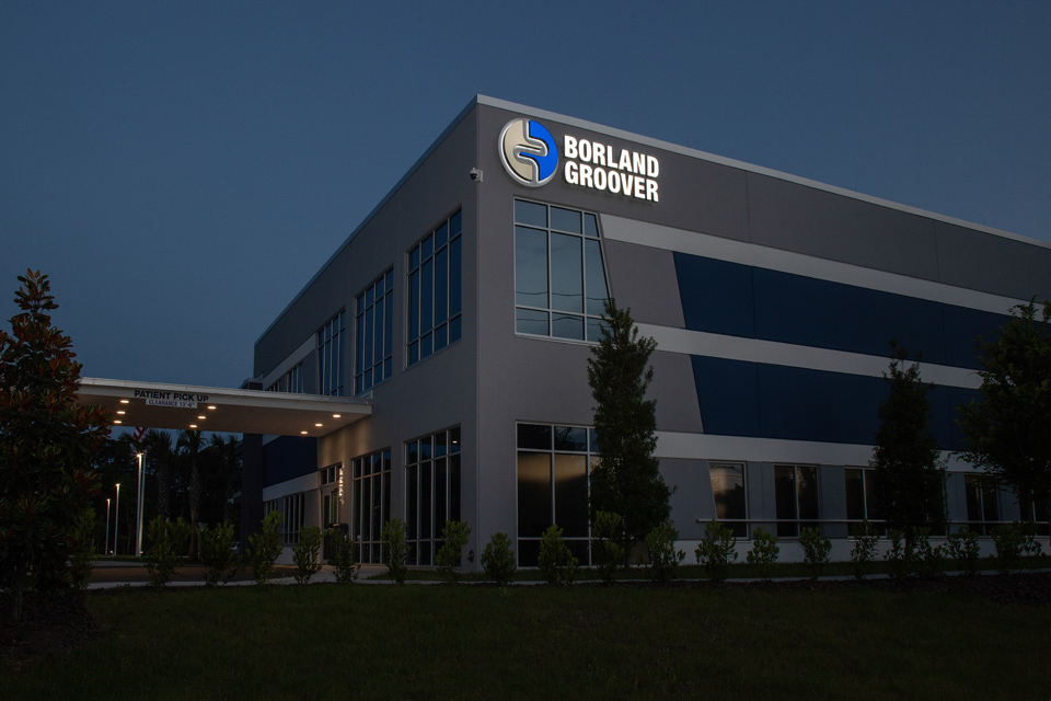
Look closely at the redesigned circular logo and you’ll probably notice that it subtly incorporates intestines that act as a divider between the calming blue and gray color schemes. The ad agency designed this as intentionally minimalist, an effective suggestion of Borland Groover’s specialty without being obtrusive about it.
Harbinger Sign employed the specialist’s hues into their signage and typography for a seamless look. “But, first and foremost, these signs had to be functional in nature,” says Busey.
Harbinger Sign is adamant about blurring the lines over the role of a traditional sign-providing partner when it comes to capabilities and services. Their focus here was on helping tell the Borland Groover brand story to both patients and staff. “We always ask clients to tell us how we can help tell their story outside the traditional realm of channel letters and ADA signs,” explains Busey. “I’m excited to work on aspirational, high-level goals that are far beyond just putting up a postage stamp of one’s logo onto a building.”
When Harbinger Sign started this project, construction on the new St. Augustine facility was nearly 30 percent complete, which meant construction crews were already on-site while the finished building’s appearance was consigned to technical drawings.
Harbinger Sign conducted multiple site surveys, with Busey emphasizing the word “multiple!”
Busey and Harbinger Sign’s field superintendents, designers, and installation managers met on-site with the senior construction team and facilities management team, as well as the general contractor, to determine best practices for signage placement, scale, size, attachments, and electrical accessibilities.
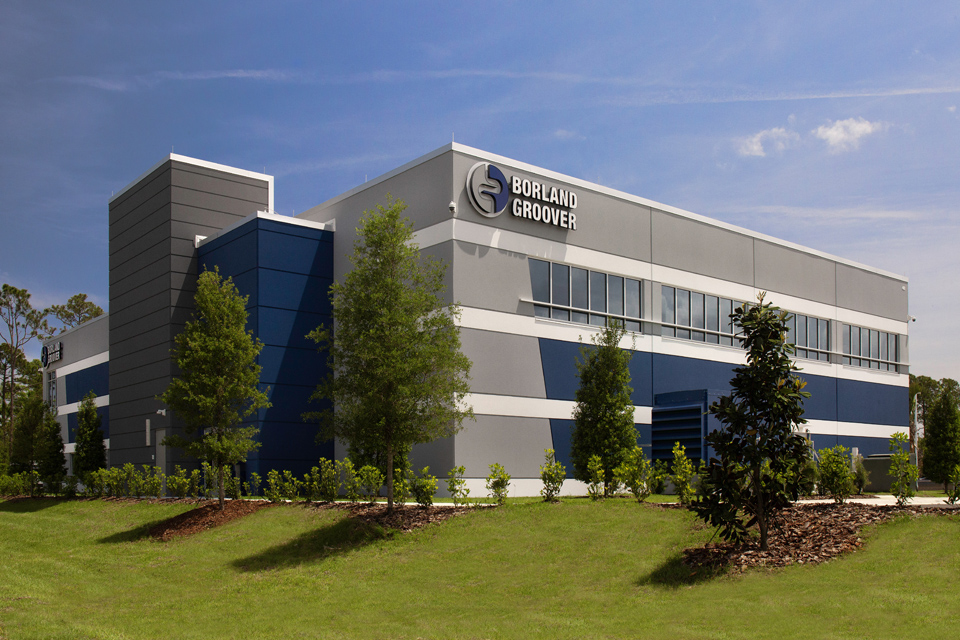
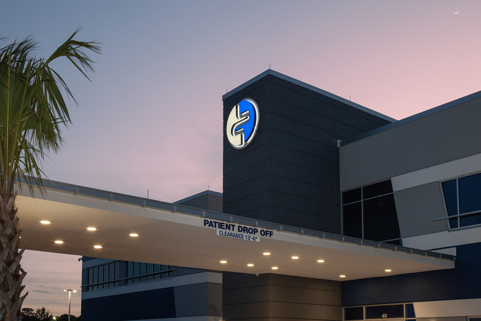
Harbinger Sign created two reverse channel logo signs for placement atop the building. One roosts above the front entrance and the other is perpendicular on the side and accompanied by channel letters. Both are populated with internally illuminated white LEDs.
The sign company CNC-routed the Borland Groover emblem faces and returns from solid aluminum, welded them together, and then attached them to a Plexiglas backing panel. They then stud-mounted and epoxy-fixed the circular signs to the new building as soon as that section was completed.
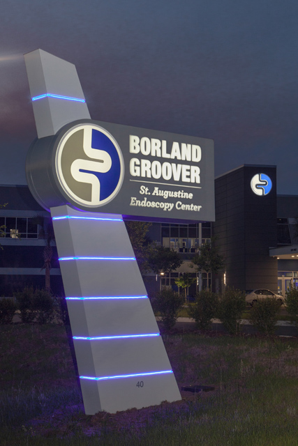
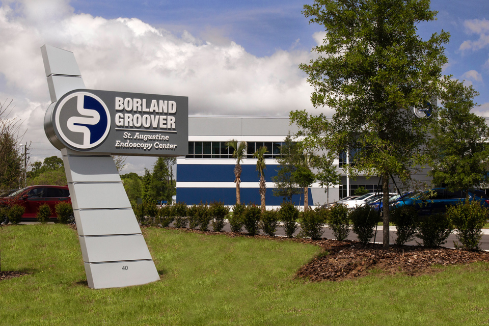
Borland Groover officials specifically asked Harbinger Sign to develop the fin-capped, angular, illuminated architectural ground sign to be harmonious with the brand and the architecture.
The fin element of the sign matches the portico located at the entrance to the facility, and its trapezoid shape reflects the building’s architecture from certain vantage points. The blue and gray paint on the sign matches the building exterior. Blue LED border lighting elements fit in nicely with the branding.
This vertical, angular steel cabinet sign can be considered three pieces. “You have the central cabinet,” explains Busey. “Then you’ve got some in-depth push-thru illuminated faces that attach to each side of it to scallop or wrap that fin element. It appears nice even when not illuminated.”
Its installation involved digging subterranean-engineered footing and then using a bucket truck and crane to guide the heavy steel pieces into place.
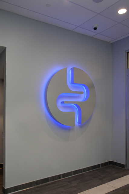
Harbinger Sign fabricated the interior lobby sign as a two-piece logo with string module blue LEDs strategically placed along its curves for halo illumination.
Harbinger Sign provided small front canopy lettering indicating patient drop-offs and pick-ups, while directional/wayfinding signs on the property help navigate and circulate traffic (whether pedestrian or vehicular). “They make sure the right entrance and exits are being observed, or if a particular street is ‘Ambulance Only’ accessibility,” explains Busey.
When Harbinger Sign was awarded the job, they had to ramp up their completion schedule. Borland Groover had planned a hard grand opening event on a specific date with staff, team members, and invited health-care providers coming in from all over the country.
While there wasn’t a need for breakneck speed or manic panic on the part of Harbinger Sign, Busey admits crossing the finish line using this timeline was a bit challenging. They had to make introductions, develop designs, and go through the St. Johns County permit process (which took thirty days) before they could even begin fabrication, let alone installation.
“Harbinger Sign was an excellent partner that worked with us to execute our vision,” said Melanie Wood, director of Facilities at Borland Groover, in a press release. “The end-result was a sign program of exceptional craftsmanship delivered with professional expertise.”
In fact, Borland Groover is working with Harbinger Sign on three brand-new facilities in North Florida. “What you see deployed at the St. Augustine location has essentially become their go-to exterior signage program at other locations,” says Busey. “I appreciate a client who puts that investment into their partners like Borland Groover has for us.”
“Our partnership with Borland Groover on this exciting project is an excellent example of how dynamic signage can boost the patient experience while building brand awareness,” added Steve Williams, CEO of Harbinger Sign, in a press release.
Mike Lev, vice president of Industry Relations and Innovation at Harbinger Sign, says that the health sector dynamic, as it relates to signage, can be very fast- paced and timely, noting that a vast array of value-added partners, product manufacturers, and seasoned team members has allowed his company to maintain a competitive edge and strong presence in this field. “[These clients] are most interested in using signage that complements or stays consistent with their brand and the overall design of their campus or facility,” he states. “This might include stone veneer bases, architectural columns, and wood elements on pylon/monument signs/wayfinding.”
The health sector dynamic, as it relates to signage, can be very fast paced and timely. When it comes to working signage programs intended for health sector clients, Lev says that safety, secureness, and a clean working environment are paramount throughout the installation. It’s also important to coordinate with other trades to be one step ahead or one step behind.
“Communication sounds cliché yet it is extremely important to set and meet expectations to the external customer and our internal team members,” he says. “There isn’t any room for poor communication standards, missed dates, and lack of response.”
Busey says that, over the past decade, while branding and architecture have increased their role in the health-care sector, psychology and social and spiritual aspects play a role in sign design not only for patients, but also the staff and health-care teams working there.
“It goes into comfort and anxiety reduction and what kind of positive emotions that design and signage can actually do for a patient, a team worker, and a health-care provider,” he explains. “There are countless studies that show the positive equity and effect that this signage has on people.”
—Jeff Wooten
Note: Some portions of this article appeared in a press release.


