When businesses approach us here at The H&H Group because they are expanding into new space or renovating at their existing locations, we get excited. Fresh interior environments are like a blank canvas for our signage and branding pros!
Your walls, floors, and even ceilings present a nearly limitless supply of opportunities to enhance your business’s physical atmosphere while promoting the work that you do to anyone who walks through your doors.
Today’s blog post shares some excellent examples of high-impact interior signage and branding-centric decorative treatments for walls and other surfaces that we have successfully created for our business clients in the past.
See something you like? Just let us know a little bit about your project, and The H&H Group be in touch to learn more about how we can work together to make your ideas come to life!
Wall Murals & Multi-Dimensional Wall Art
While the primary purpose of wall art and murals is generally to beautify a space, these features should not be dismissed as a “nice to have” extra in your business’s public and semi-public areas—they can serve extremely useful purposes.
Murals can incorporate words and images to vividly tell a company’s history or illustrate a particularly successful case study, for instance. And wall art can creatively recognize your donors, founders, and employees, display your mission and vision statements, and much more.
These are a few of our favorite mural and wall art projects that show just what we’re talking about.
A Donor Wall Made from Floating 3D Plaques
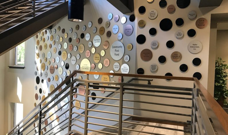
 Take a look at the main image for today’s post above, and you’ll see how The H&H Group helped the Lancaster Chamber thank their generous donors who made their new building possible.
The Founders Wall features 182 individual, highly visible signs just inside the organization’s main entrance in their state-of-the-art facility at 115 East King Street in Lancaster. As we mentioned in our case study about the project, the unique installation of circular plaques—which were designed to complement the Lancaster Chamber’s logo—is hard for visitors to miss.
The plaques are attractively faced with metal and correspond to giving levels so that the most generous donors stand out. Blank plaques were also conspicuously placed to leave room for future donors—if a prospective donor partner walks into the building, we wanted to make it easy for them to envision their name up on the wall with the others.
Incorporating Unexpected Materials
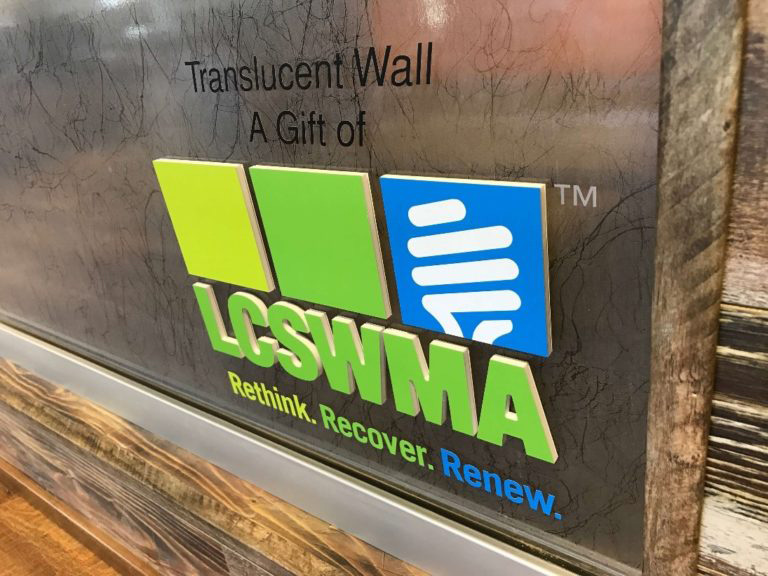
 Also in the Chamber’s building at 115 East King, you’ll find several examples of unexpected materials used to both enhance the overall interior design and provide useful functions. The translucent glass wall, which acts as a room divider between two areas with different purposes, is absolutely one of our favorites.
Surrounded by rustic wood materials, the glass wall brings a dramatic juxtaposition into the overall décor. It’s not just gorgeous, however. It provided another donor recognition opportunity, and the translucent material also allows natural light to flow throughout the space while physically designating different areas in the floorplan.
Storytelling Signage
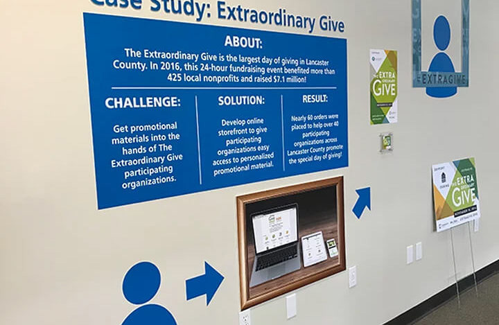
 Here at our own headquarters, we’ve created a mural wall in our lobby to give our customers a visual representation of the work we do. Our case study installation tells a story using a variety of materials, easy-to-read text, and attractive graphics.
Murals don’t necessarily need a lot of explanatory text to be effective, of course. Many are designed to be almost entirely visual—we can help you determine what works best for your unique spaces!
Creative Corporate Identity & Reception Area Signs
It’s true that there is sometimes a bit of crossover between wall murals/purpose-serving wall art and corporate identity signs in your building’s public areas, such as reception. And that’s a-okay!
Displaying your business’s name or address prominently right inside your entrance never leaves your guests, visitors, or customers wondering where they are or who you are—and that signage is often more effective when it’s artful and eye-catching in the way many murals are.
These are a couple of our favorite ideas for creatively branding your business within your lobby, entrance, or other areas visitors where will get acquainted with you.
Try Fabric Signs
There’s no reason that your signage needs to be made from hard materials—even if it’s meant to be permanently installed—but many people don’t realize what’s possible with fabric signs. Spoiler alert: they’re more than just temporary banners!
Coordinated Materials
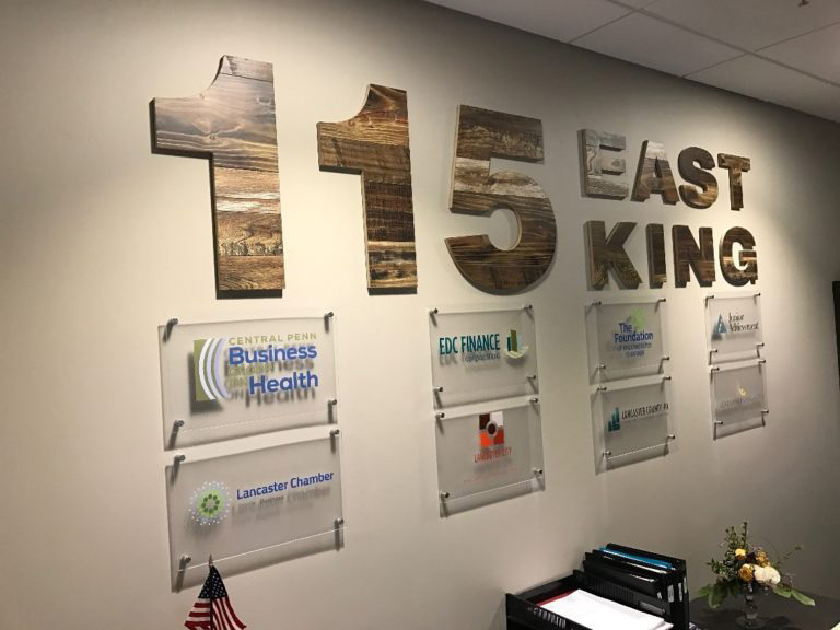
 Let’s look once more at the Lancaster Chamber project we discussed earlier. If you took a spin through our success story of our work, you probably noticed that the client’s spaces use a lot of rustic-looking wood elements in the décor. A great deal of this material is Armstrong flooring (with a heritage of being made right here in Lancaster), which was obviously used as a floor covering, but was also repurposed in unique ways to achieve a cohesive look.
Are you surprised to learn that the large address digits and letters on the wall in the reception area are actually made from flooring? Using this material on an otherwise plain white wall helps to tie different spaces together while clearly displaying the building’s physical address.
Floor Art & Decals
When most people think of signs, they imagine them as standalone monuments or as wall features, like all of our examples so far demonstrate. There’s value in meeting your audience’s expectations by placing signs in obvious locations, of course—especially with wayfinding signs—but, have you considered installing signs on your floors?
That’s right—floor art has become incredibly popular because even though it’s not a new concept, it seems fresh and novel because it tends to draw people’s attention in ways wall signs and art can’t. As we talked about in an earlier blog post, there may actually be scientific evidence to support why “floor-based communications” are effective. It may be that when our focus is drawn sharply downward, we pay closer attention.
Even if that’s not entirely the case for all people, floor decals can be texturized to provide a non-slip surface, which makes them functional in addition to engaging. If you have large open floor areas in your business, you may want to consider your floor decal possibilities—they’re also quite affordable when you work with an experienced design and print resource like The H&H Group!
This article was originally published on https://www.thehandhgroup.com/ which can be viewed here:


