 In today’s digital age, is it possible to achieve both efficiency and creativity while still designing and making custom signage? For one California-based company, the answer has been a resounding “yes.”
Working with top brands such as Dropbox, Reddit, Google, and other retail and technology giants, Tinkering Monkey gears its signage to the stylistic nuances of fast-growing companies.
Founders Paul Chang and Mike Cheung launched their unique business in 2011, one year after Instagram debuted. Featuring high-end photos of their work on their Web site and on their own Instagram feed (which today boasts more than 6,000 followers), they can now call the photo media platform one of their very own clients.
Eight years following its launch, Tinkering Monkey has grown a robust team of diverse staff who has moved from a one-car-sized garage shop to a 3,000-square-foot warehouse in Berkeley. Visitors to the company’s Web site can watch a live video feed of the shop as the team works throughout the day.
While simple signs can be typically ordered on the Internet, there are few viable options for ordering custom signage. This is where Tinkering Monkey has found a niche.
A customer will find the company by either word-of-mouth or a Google search, says Cheung, who works as the company’s production manager. Once they request a custom quote for their project, the company crafts a detailed proposal that the client can easily share with stakeholders and decision makers. Once the client purchases the project or signs off on the quote, the order immediately goes to the production studio.
Upon completion, the sign is shipped, along with detailed installation instructions, necessary hardware, and accessories. Or, if the client requests installation, Tinkering Monkey will arrange that service.
“We make a big effort in showing our past work and keeping that portfolio current, along with making it as easy as possible to order a sign from us,” says Cheung. “Ordering signage is not something a lot of people have done, so we try to take down the barrier to understanding what is possible for a given project.”
This model appears to be working. To date, the company has designed and manufactured more than 3,000 signs for 500 companies across the United States.
Exploring the “how-to” behind Tinkering Monkey’s process shows that the company not only demonstrates success but has fun in the process.
Though they work “out of the box,” many of the materials they turn to are traditional, including Sintra®, HDU, plywood, and others. “We tend to use wood more than the average sign shop,” says Cheung.
The company has also dabbled in 3D printing and laser cutting, while on Cheung’s wish list for new fabrication tools is a simple computer such as Arduino and Raspberry PI that allow non-engineers to learn to code. Using such a computer, he’d like to program and operate illuminated signs. “I’m also interested in some of the smaller automated arms I’ve started to see,” he says. “It would be awesome to assign repetitive tasks like sanding the edges of 1000 wood blocks to a tool that was programmed to do that task.”
When it comes to identity projects, Tinkering Monkey has created halo-lit signs using reclaimed wood. This creates a traditional-looking, classic channel letter that has a modern, rustic look. They have also found that three-dimensional signs are popular where companies need to distinguish their brands.
Donut Shop Sign
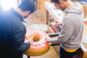
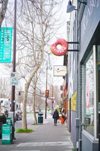 What three-dimensional object would make for the perfect donut shop sign? You guessed it: a large donut, twenty-four inches in diameter and eight inches thick. The catch: This one has a chunk missing, with bite marks to show the evidence.
After modeling the perfect donut on the computer, they programmed their CNC router to carefully cut portions out of HDU foam. They attached all the pieces with fast-curing glue.
Then the sign makers sanded the circle to the perfectly smooth, round donut. “We added a bite mark through carving, which started an internal debate on how many teeth are in a single bite,” says Cheung. “We decided on four.”
Tinkering Monkey then added three to four coats of glossy paint to the donut. They then router-cut letters and sprinkles out of HDU and glued them to the finished donut shape.
To weatherproof this sign for the exterior, the team fully sealed the foam and coated it with Zinsser primer and exterior acrylic paint.
JanSport Backpack Label
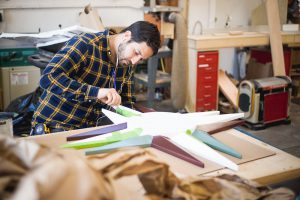 For another project, their client, VF Corporation, requested an interior sign for their Alameda headquarters. Owner of popular outdoor products and apparel brands such as North Face® and JanSport®, the company requested an interior sign for the latter, a popular backpack label. This engraved custom sign was designed as a three-dimensional interior representation of the brand’s logo. It measures about thirty-six inches from end to end and five inches thick at the center.
The company was given a 2D Illustrator file and used that to create a 3D mockup to better illustrate the dimensionality they had in mind. They built the 3D model in Rhino and rendered it with Adobe Dimension.
After plenty of sanding, they used a heavy filler primer to smooth out the texture and prepped it for paint. Matte black graphics and brushed aluminum plate rounded everything out.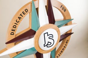
Although the sign finish is mainly painted alder wood, the sign is more suitable for interior display since the clear-coated finishes and components would not fare well outdoors.
Bird in Hand
Unusual products and services call for thinking out of the box a bit more than usual. For Bird, a company that offers electric shooter sharing services throughout the U.S., Tinkering Monkey crafted a double-sided, illuminated wood sign to represent their logo. This large sign measures 72-by-42.34-by-8 inches thick (including the artwork).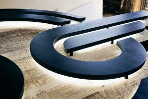
Cheung says that, despite its size, this sign was built for interior use only. “We built it from lightweight birch ply and re-sawn, reclaimed wood that was applied as a thin ‘skin’ to the front and back surface,” he says, noting they did this to shave down the sign and slightly reduce the weight.
Illuminating the sign are flexible LED strips that were cut into the back. “The strips are attached around the perimeter of each part,” says Cheung. “Wiring is all done inside the sign, and the LED driver is incorporated into the sign. It’s actually right on the top wing on one side, exposed to the open air to allow any heat to dissipate. Since we knew the sign would be installed overhead, there was no problem leaving this showing on top.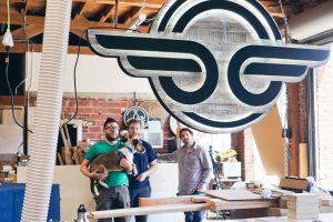
“One of the faces is permanently glued on, and the other is screwed on around the edges. We also painted the screw heads to help blend them into the rustic wood.”
Compass
When real estate technology company Compass approached Tinkering Monkey with a problem they were having in separating lobby space (the front entrance looked into the main conference room), a true architectural signage solution was presented.
The challenge was to create a lobby sign that also doubles as a privacy screen. And to make things more interesting—add an optical illusion to make this a focal point in a rather open space.
Taking cues from the structure of venetian blinds, the team created a nine-foot slat wall that displayed the logo in pieces. As the slats come together, the letters of the logo come together. To prepare for such an undertaking and to note the geometry for the cutter, the team created a 2D projection.
The logo needed to be placed on the sign in a way where it could be read straight-on, yet disappears as the visitor walks right or left. “There were technical challenges as well: sourcing extra-long lumber, making the installation simple (and removable), and most of all—getting all of it done on a tight timeline,” says Cheung.
 Tinkering Monkey repetitiously cut and milled all the wood and then applied cut vinyl to all the pieces. The company made alignment combs to make installation simple. They left all the wood pieces long so they could measure and cut them on site. “This way, each piece followed the deviations on the wall,” says Cheung.
The end-result is a system that made the conference room feel like a separate, private space. Also not only does the logo disappear, but it reappears and comes into place when turning the corner.
Conclusion
In their eight years on the job, the team at Tinkering Monkey has become comfortable with taking risks. After all, in creating one-of-a-kind signage, there isn’t a detailed playbook available for each project. Cheung believes this is an asset, helping them to remain creative and innovative. “Don’t be afraid to step outside your comfort zone,” he advises. “It’s challenging and can be rewarding, despite initial failures.”
The other benefit that comes with exploration and creative in a sign shop is enjoyment. Many of the team members have the opportunity to play with tools and gadgets, experimenting with new concepts and prototypes.
One example of this is the company’s purchase of a 3D printer that they acquired just for fun. “We bought a 3D printer for no particular reason, and since then, some folks have been learning 3D CAD modeling to print parts,” he says. “This has led to us printing custom bits of hardware for signs.”
In considering how other sign companies might infuse creativity into their daily operations, Cheung says, essentially, creativity comes from passion. “Learning and exposing themselves to new things like tools, materials, techniques, design, can foster creativity,” he says. “Also, attending art and design shows, or taking classes for things not necessarily directly related to signage, can help.”
Hiring a diverse team of designers, fabricators, and other skilled technicians and artists also helps to maintain a high level of innovation. “We have people working here that have backgrounds in graphic design, interactive design, and industrial design who both fabricate and send quotes to clients,” says Cheung. “We pull from all those skills on a daily basis.”
Thinking outside the box also helps contribute to environmental graphics that are original and engaging, which ultimately, is what draws consumers to a brand. “I think we do contribute to changing the way architectural signage is thought of,” says Cheung. “Making custom signs to fit into highly designed and branded environments has become more and more of our business.
“I think signage is the thing that bridges brand and architecture; it gives people a sense of place.”
By Lori Shridhare
All Photos: Tinkering Monkey


