Picture this: Customers effortlessly navigating a store with vibrant banners as their guide. Event attendees striking a pose in front of a branded step-and-repeat. Banners are more than just basic signage—they’re versatile, indispensable tools for creating memorable experiences. They also offer your clients the flexibility to update their signage with ease as messaging evolves.
Banners can be a perfect medium for advertisements and event wayfinding. Their durability extends to outdoor use, notifying passersby of the location and letting them know they are in the right place. Retractable banners are ideal for indoor wayfinding because they stand out, are easy to use and don’t take up much space along hallways and entrances. They can also be updated without replacing the entire mechanism, making them a very economical option for customers.
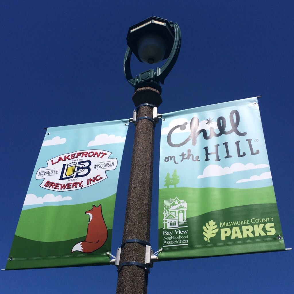
If you want to start offering more banners to your clients, consider these options:
- Vinyl: A tried-and-true choice, durable and suitable for a wide variety of uses—and perfect for custom designs.
- Mesh: Popular among schools, sports teams and churches, these banners can also be custom designed.
- Custom shapes: Unexpected and visually appealing, these signs have limitations when it comes to installation, but are an appealing alternative to the standard rectangular banner.
- Large banners: Offering the same level of visibility as a billboard, logistically, large banners can be difficult to manage. However, in the proper location, your message will reach a larger audience and offer, on average, six seconds of advertising time to each person driving by at a high rate of speed.
- Retractable banners: A sleek way to convey event details such as menu items, schedules and seating arrangements.
- Step-and-repeats: Fun photo opportunities for eventgoers, who will probably share them online or on social media, giving you even more exposure.
Tips for the Effective Banners
- Keep It Simple: To make your banner design simple and eye-catching, use a single–color background with high-contrast text: black or navy text on a white background, for instance. The banner will be easy to read, and a colorful logo won’t get lost or “drowned out” by graphic noise. You can also use a second text color to emphasize important words or letters.
- Design with the Audience in Mind: Banner design is dependent on who will see the signs and where they’ll be. If installed along a roadway, a banner should be large enough to accommodate text and color that someone can read while driving by and at a distance. Step–and–repeats offer a dramatic backdrop for events and photos, but keep in mind the height of potential users and make sure your logos and information are visible; a good size is 7.5 to 8 square feet.
- Take Good Care: When not overly exposed to the elements, a banner can last for years. When you unfold a banner that’s been in storage, place it in the sun and smooth wrinkles and creases while it returns to its original shape. Once colors begin fading or seams begin to fray, it’s time to consider updating.
- Keep It Relevant: The average person sees a message 10 times before reading it, but if you leave the banner too long, it will recede into the background of viewers’ minds. Unlike a permanent sign, which is static, a banner can be easily updated as often as your client wishes. A good rule of thumb is to do so quarterly.
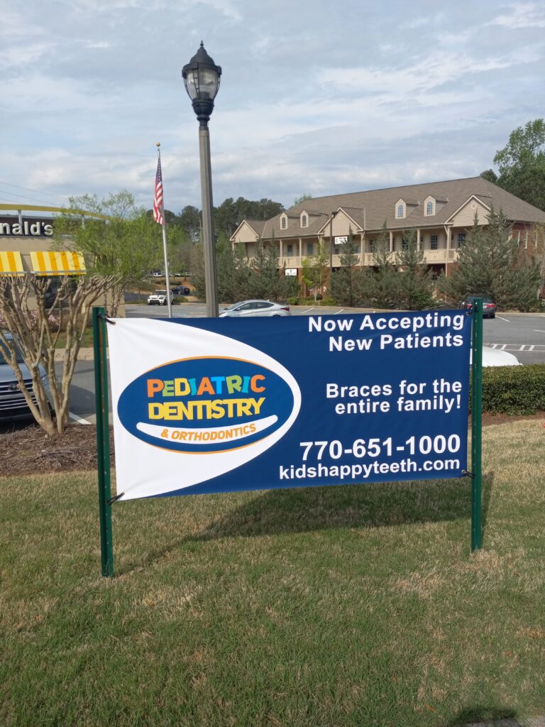
Banners are an effective, versatile and economical sign product for customers in any industry. If you’re not already printing banners in-house, consider adding them to your portfolio as another smart signage option.
Hunter Hammer is the franchise owner of Signarama in Elizabethtown, Kentucky.


