

This feature was originally published in Sign Builder Illustrated‘s August 2024 edition.
The right collaborations can be pretty sweet. Take this playful sign package for Treeline Treats in Winter Park, Colorado, a scenic mountain town outside of Denver. Client Winter Park Resorts commissioned local graphic design firm ArtHouse Design to develop a comprehensive branding scheme for the candy shop, including exterior and interior signage.
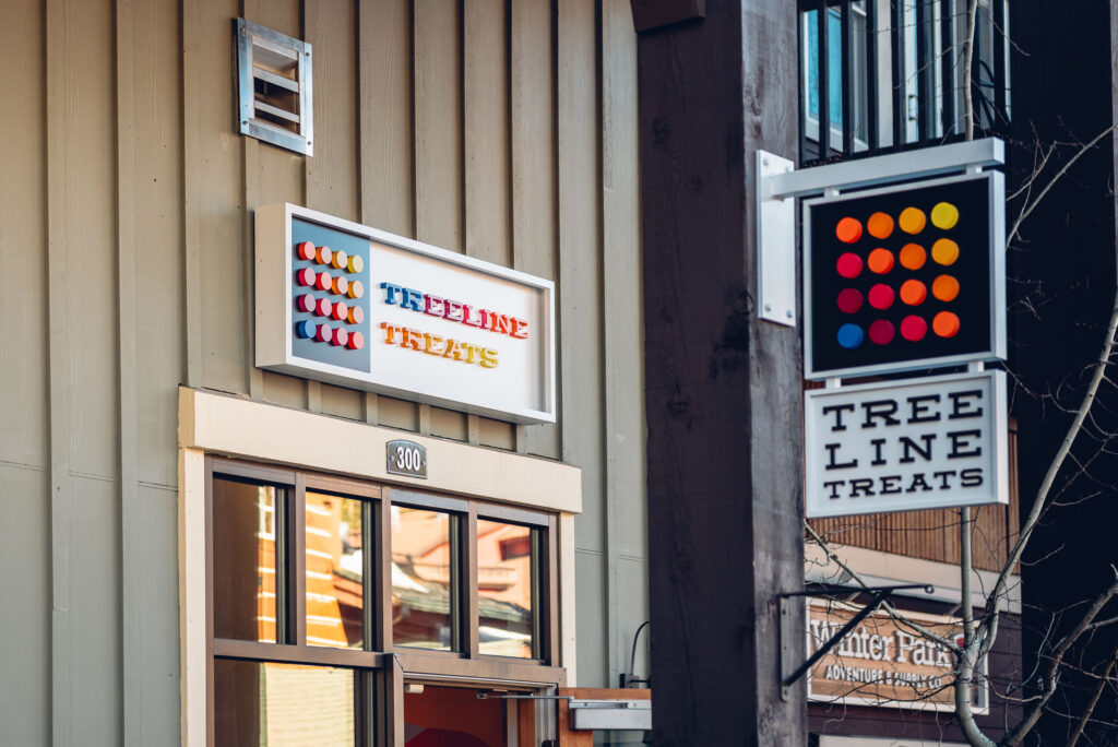
ArtHouse tapped fellow Denver creatives at RiNo Sign Works to fabricate an illuminated wall sign, a blade sign and interior wall graphics. “We have developed a great relationship with ArtHouse Design over the years and they know we love the super challenging and artsy projects,” RiNo Sign Work Partner Willis Wood says.
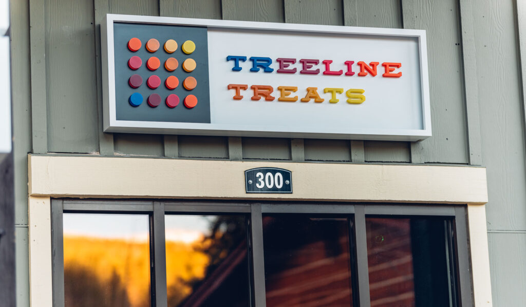
The wall sign pairs a cabinet with face-lit trimless letters. “We started with aluminum sheets and cut them to shape with our Multicam CNC machine, then used our SDS return bender to make perfect corner bends in the frame,” Wood explains. “The letters are actually custom-painted acrylic letters that are pushed through the face of the sign and then illuminated with LEDs from behind.”
Drawing visual inspiration from pieces of candy, the series of pucks are the most unique and memorable details on the exterior signs. Achieving vibrant colors that accurately reflect the design team’s vision required out-of-the-box thinking and several tests.
“We thought we were going to build custom molds and mix different colors of cast acrylic, but those tests did not produce the results we wanted,” Wood recalls. “So our amazing painter, Barry Dunn, suggested custom painting the letters and acrylic pucks. We produced a few samples and they looked amazing.”
Lastly, RiNo’s tested the wall sign’s backlighting to make sure the colors at night matched those during the day. “After several tests, we perfected the LED type to produce the optimal illumination,” Wood says. “In the end, with a combination of custom painting and lots of R&D, we came up with the perfect solution for the client.”
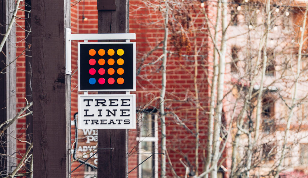
Fabricators used similar techniques to create the complementary blade sign, though the lack of illumination made the process a little less complicated. Featuring black flat-cut letters against a painted white face frame, retainer and cabinet returns, the simple yet effective design plays up the brand’s signature candy-colored pucks.
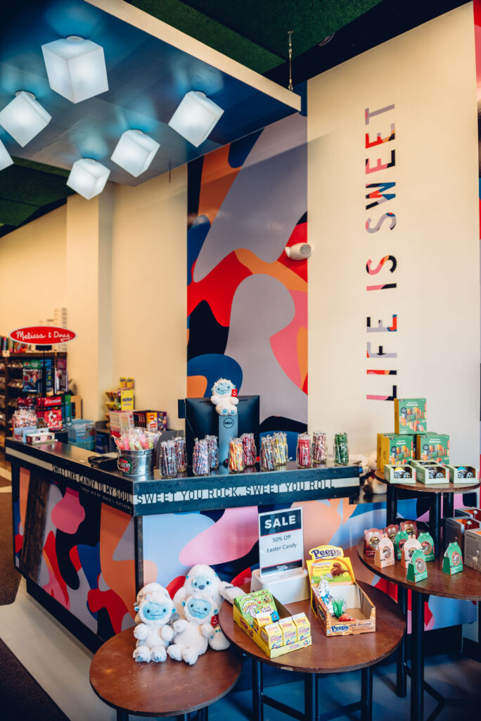
Inside the sweets shop, RiNo’s team installed vibrant wall graphics showcasing organic forms and cheeky copy, which they printed on vinyl in house using an HP Latex 365 large format color printer.
 A clean, scaled-back design must be perfectly executed to make a bold impact. To confirm the signs would reflect ArtHouse’s distinct brand vision, RiNo reviewed multiple rounds of digital proofs and physical samples with the firm to make sure the end products hit the mark. The final concoction is a visual delight.


