Wildwood, New Jersey is a popular summer resort destination known as much for its boardwalk and amusement park rides and attractions as it is for its doo-wop era signs and architecture. You can thank A.B.S. Sign Company, Inc., for many of those signs.
The family-owned sign shop was started in 1964 by current President Randy Hentges’s father. Today the shop handles everything from vinyl graphics and small yard signs to giant LED message center projects. The shop also still services and fabricates neon signs in the area.
“We’re little, but we do a lot of big, cool projects,” says Hentges. “We put a lot of time, effort, and thought into it.”
A recent job that tasked A.B.S. Sign Company with creating a sign for a new rollercoaster required a lot of that thinking and ingenuity—especially on the challenging installation.
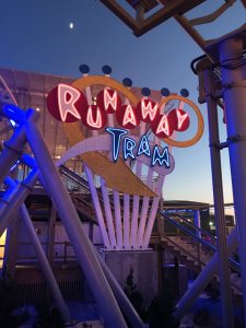
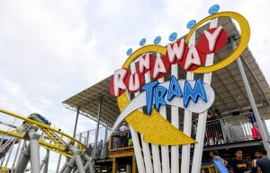
The new Runaway Tram rollercoaster for Morey’s Piers & Beachfront Water Parks is based on the iconic Sightseer tramcar that runs along the boardwalk. A.B.S. Sign Company has worked with the amusement company for years on its ride and attraction signs, and it was brought in to specially create this custom sign.
A.B.S. Sign Company received the design from Morey’s and took it from there. “It was up to us on how it was going to be made, how it was going to be attached, things like that,” says Hentges.
Originally Morey’s wanted neon channel letters to match the local aesthetic. “There’s a lot of neon in this area still, probably more than almost anywhere outside of Las Vegas,” says Hentges.
Since the sign would be surrounded by the roller coaster and subjected to shaking and vibrations from the ride, it was decided that neon wouldn’t be the best choice. “They asked me what to do, and I said, ‘Well we can do an LED push-thru, and from twenty feet away, people will think it’s neon, but it won’t have the breakage issues of neon,’” says Hentges.
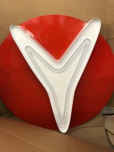
A.B.S. Sign Company has created LED push-thru channel letters in the past but not in such a large size. The letters range from the largest, the “R,” at five-and-a-half feet tall, to the “Y” at about three-and-a-half feet tall.
“It was a lot bigger scale, and we were just trying to figure out how it would scale up and work out,” says Hentges. “In fact, the strokes are a lot wider than they would be if they were neon.”
To create the letters, the sign company hand bent .090 aluminum for the returns. The faces are 1/8-inch-thick aluminum with one-inch-wide strokes where clear acrylic was pushed through.
The shop is small and doesn’t have CNC equipment, so it outsourced the necessary routing on the letter faces, background elements and arrow, and small circles bolted at the top of the poles to Harbor Sales in Maryland.
“We just email them the files, and it will show up in a day or two all routed out. So it’s almost easier to not have my own router,” explains Hentges. “I don’t have to take up the room, have an employee [to run it], have wasted material if things aren’t right or something happens.”
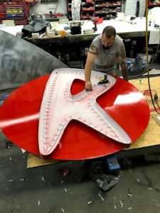
The shop used Principal LED Street Fighter Middleweight LED modules to light up the acrylic and experimented with channel depth, LED placement, and the number of LEDs to find the right combination.
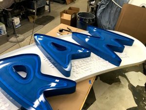
To create a red glow on “Runaway” and a blue on “Tram,” the shop used a combination of translucent vinyls. “On the clear acrylic push-thru, we installed Avery Dennison® UC 900 Pantone® 200C translucent vinyl on the inside of the acrylic. However since the acrylic was clear (using white acrylic would produced a pinkish light and would not have been near as bright), we had hotspots,” says Hentges. “I wanted a smooth, even glow (like neon), so we tried a few diffuser films to even out but not dim the light. Standard white translucent seemed to work the best.
“So we backed all the red vinyl with the white translucent. We did the same on the blue ‘Tram’ lettering using white modules with Avery Dennison® Sultan Blue PR 800 translucent vinyl on the back of the acrylic.”
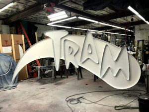
To provide stability, the letters spelling “Runaway” were welded onto circles, and the letters spelling “Tram” were welded onto a swoosh shape. An arrow swoops around the channel letters, and small circles feature at the top of each pole. All of these elements are made from 1/4-inch-thick aluminum.
The letters were welded versus bolted because Morey’s didn’t want any visible fasteners on the sign. After welding, the shop painted the letters and background elements with Matthews Paint—masking off elements as needed. The paint colors were specified using a RAL chart (a European color matching system), so Hentges first had to match up the colors to a PMS chart to secure the right Matthews Paint color.
SolaRay® sequins were applied to the small circles at the top of the sign, the background of the arrow, and the white swoosh behind “Tram” to provide additional visual interest while helping the project stay within budget.
“That was the only thing that their architect, when they sent us over some drawings on the sign, specified,” says Hentges. “They’re all on 12-by-12-inch plastic grids pre-attached, so we had to cut them all apart. Then they’re riveted in there according to the shape we had to match.”
The letters and background elements are all affixed to seven 8-by-8-by-1/2-inch steel poles, which A.B.S. Sign Company sourced from a local steel company. The steel company welded and bolted the pole structure together and then sent it out to be galvanized so that the steel would hold up to the ocean air.
“90 percent of our business is right on the ocean. We’re 100 yards from the saltwater, so on most of our sign projects, we can’t use regular steel—everything has to be galvanized if it’s steel, and it has to be painted well if it’s aluminum,” says Hentges, who explains that 40 to 50 mph winds are also a concern. “Everything’s getting sandblasted with sand coming off the beach. Things have to be made a little better here.”
A.B.S. Sign Company’s shop is small, so Hentges and his team had to fabricate everything in pieces that would go together like a puzzle come install time.
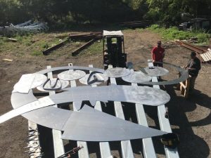
To ensure everything would fit onto the pole structure correctly, Hentges rode out to the steel company and had them lay the structure out in their back field. “We made big, full-sized paper patterns with measurements. We took it out and actually pre-fit just the raw aluminum letters onto this,” says Hentges. “We pre-fit everything, measured everything, and marked it so we knew when we put it up there it would fit and where it went.
“I preplan a lot of stuff in the shop. I try to make life on the road as easy as possible with all my projects. The holes were predrilled. Everything kind of went together like a big puzzle.”
All of the sign pieces were transported to the job site on a flatbed trailer over a few trips. From there, the installation was unlike any other. For one, the boardwalk was open, and the install required reaching over rides and pedestrian areas. So the sign company did early morning installs starting around 6:30 am.
The installation also required Hentges to pivot from all of his original plans. He had wanted to lay the pole structure out on the beach, attach the sign elements, and then mount the entire thing. But the pole structure was installed first and bolted to the concrete footing, which required all the sign elements to be installed vertically.
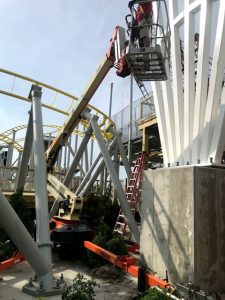
Original drawings had also shown a boardwalk going right up to the base of the sign, so Hentges had planned on using a scissor lift for the install (cranes and bucket trucks are too heavy for the wooden boardwalk).
However, just days before the install, he found out that the boardwalk wouldn’t be built up to the sign. Plus the coaster had already been built, further complicating access, so the sign company had to work around and within the coaster tracks.
The solution was to have Shaw Crane Company Inc., use a crane to lift and drop in a towable bucket lift for the install.
With only quarter-inches to spare, it took about an hour to get the bucket truck into place. The area where the truck was set up had been prematurely landscaped, so the truck had to sit on top of and among the vegetation.
Once in place, the movements of the bucket truck were limited by the tracks of the ride. Half of the sign was installed and then the truck had to be repositioned to reach the other half.
“The poles that make up this rollercoaster go in all different kinds of directions,” says Hentges. “[The truck] would have hit all the poles that support the ride, so we had to lift this thing up and actually spin it around and relocate it.”
To install the letters on the steel poles, the sign company used a combination of bolts and angle.
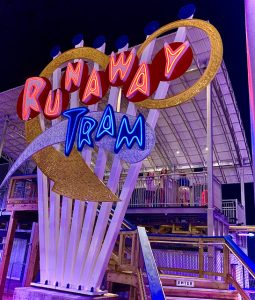
“We welded aluminum angle iron up and down the back of the big red circles behind the letters so it just cupped the pole. When we set them in place, we had the poles predrilled and everything,” says Hentges. “We just thru-bolted it with long, stainless steel bolts. We did bolt a couple through the face on the big arrow and the ‘Tram’ section because they were covered by the sequins anyway.”
For power, the wires were run through the pole structure, and the power supplies were mounted to the concrete base in a metal box for easy service access.
In total, the twenty-four-foot-wide sign took a couple of months to fabricate and install ahead of the opening of the new ride this past July.


