Each year, World Sign Associates (WSA) hosts its WSA Coolness Sign Design Competition, a contest where the association’s sign company-endorsed vendors vote on the most innovative and creative electrical signage projects that have been designed, crafted, and installed by the WSA’s nearly 200 member companies during the past twelve months.
Founded in 1947, World Sign Associates bills itself as a premier trade organization for electrical sign manufacturers and suppliers throughout North America. The WSA’s numerous members represent some of the industry’s top talents in crafting custom signage as well as signs for regional and national programs. They do this by either working independently or by combining the strengths of nearly 200 sign manufacturers and suppliers throughout
North America.
First place winners from four different categories of this year’s WSA Coolness Sign Design Competition were announced in September (with “Best in Show” crowned amongst these four winning entries).
This feature article (also featured in the November 2019 issue of Sign Builder Illustrated) will be recapping the winning projects and how they were designed and put together. For more information about World Sign Associates, call (800) 421-0641 or email [email protected].
Giant Hickory “Leaves” Welcome Visitors
Winner: Best in Show, Freestanding Sign, Greater Than 100sqf
Contributors: Sign Systems, Inc., Wood, Signature Design Collaborative
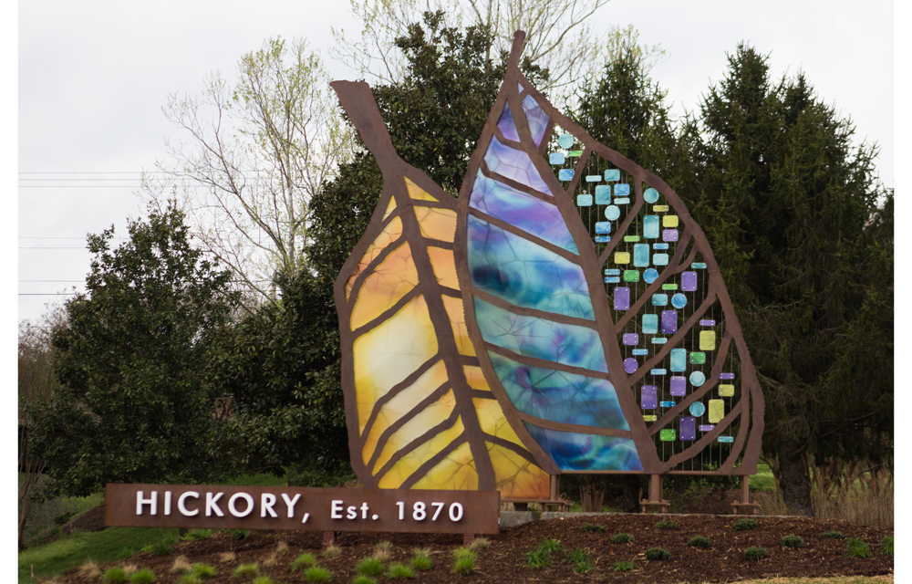
An iconic gateway to Hickory, North Carolina (a city of 40,000-plus located in the western part of North Carolina) required an equally impactful signature sign. Family-owned, full-service Sign Systems, Inc. (also of Hickory) met the challenge with a pair of unforgettable hickory tree leaves installed near a high-traffic location.
Signature Design Collaborative of Atlanta, Georgia started the design, while Sign Systems took the concept from there, figuring out the best materials that would work in the environment and staying within a specified budget.
Towering at twenty-three feet tall, the translucent leaves mimic stained glass, but they are actually made of eighty-six acrylic panels complete with digitally imprinted leaf veins.
Some parts of the leaves contain suspended acrylic panels in various colors, which are designed to shimmer in the southern breeze. The leave’s outlines are defined by rectangular steel tubing with aluminum skins painted with faux rust.
The edges are studded with 6000k white LED modules for dramatic perimeter lighting. The entire structure is backlit for maximum impact day and night.
An offset footing holds a seventeen-foot cantilever sign with twelve-inch channel set letters that spell out “Hickory, Est. 1870.”
The foundation took two days to pour and consists of four 24-inch-diameter-by-12-foot-6-inch caisson footings tied to an offset slab footing with separate rebar cages. The structure is mounted into Transpo breakaway supports according to Department of Transportation right-of-way guidelines.
Not only will the combined finished efforts of Sign Systems, Inc., and Signature Design Collaborative welcome visitors for years to come, but their work here also earned them the “Best in Show” honors in this year’s competition
Blending Art and Function
Winner: Freestanding Sign, Smaller Than 100sqf
Contributors: DaVinci Sign Systems, Inc., Arthouse Design
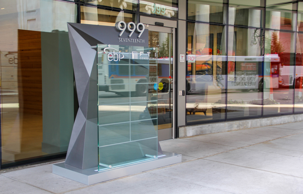
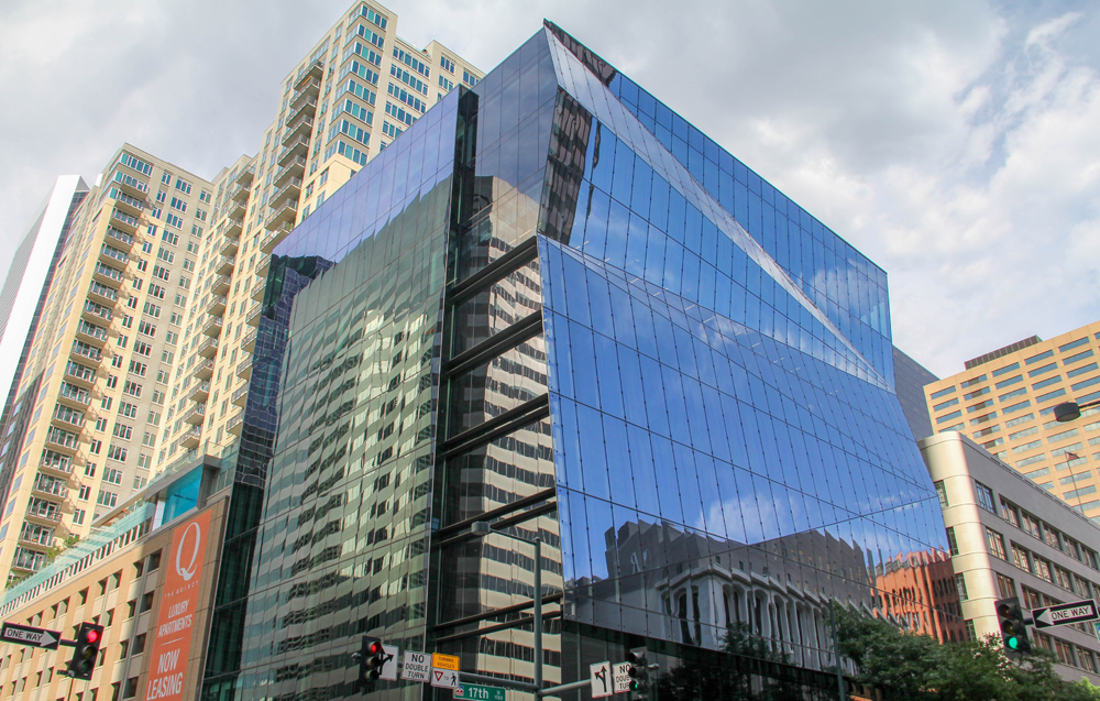
Created by DaVinci Sign Systems, Inc., of Windsor, Colorado, a sleek, modern column marks the entrance to The Prism, a nine-story, 100,000-plus-square foot core-and-shell office building in downtown Denver, Colorado. Taking inspiration from the building’s architecture, this freestanding identification sign contains twenty-four aluminum plate facets crowned with stainless steel numerals, which were custom beveled to match the angle of the sign face.
Just in front of the metal column sits a one-inch-thick tempered glass panel etched with divided lines. Within the rectangles, individual tenants are announced with eight-inch custom standoff letters attached directly to the interior frame.
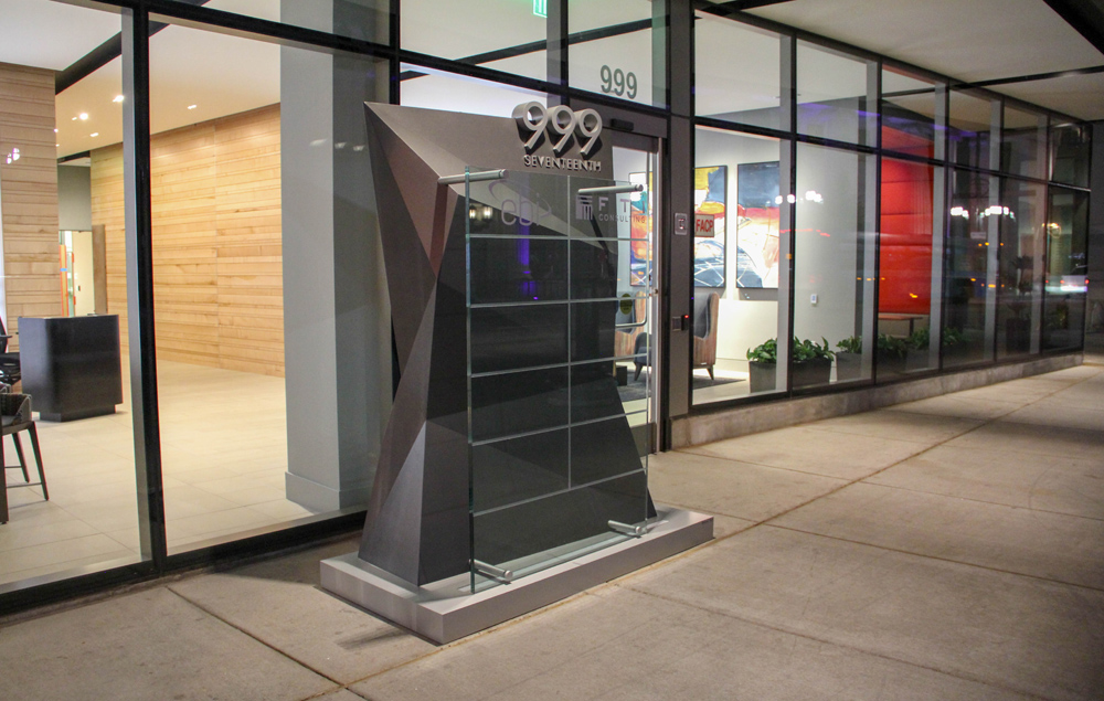
The entire structure glows with white LED halo illumination.
New and Improved Historical Signage
Winner: Wall Sign Category
Contributor: Clear Sign & Design, Inc.
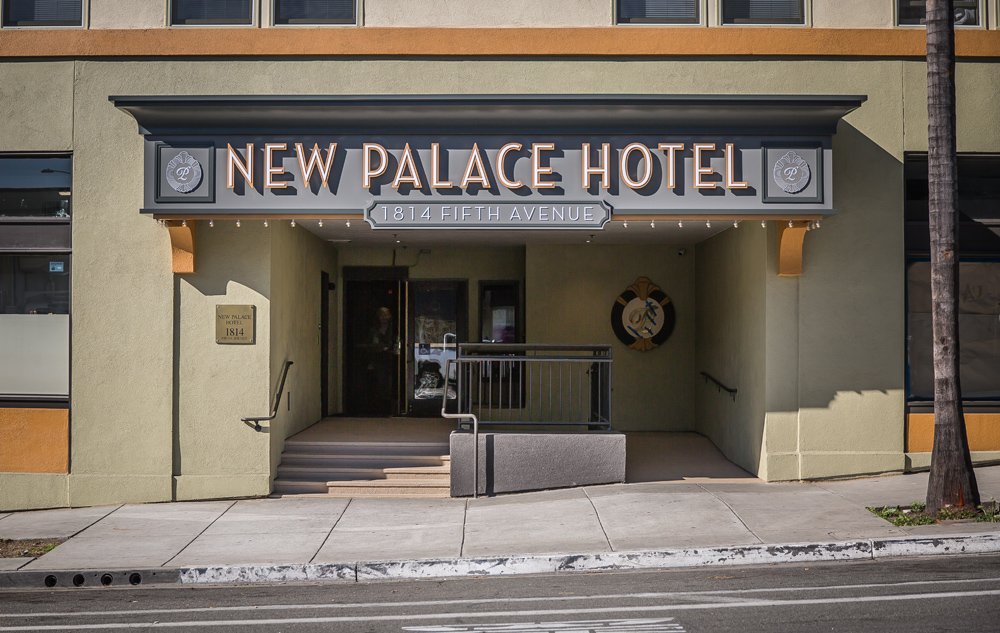
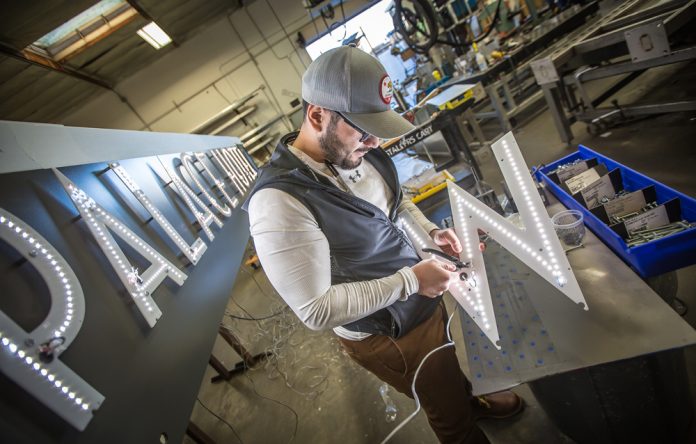
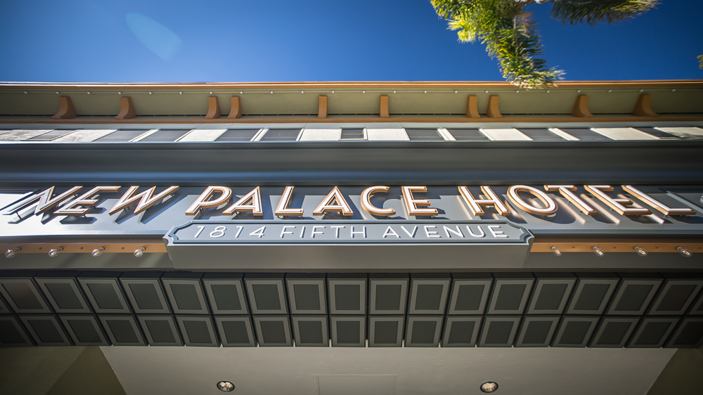
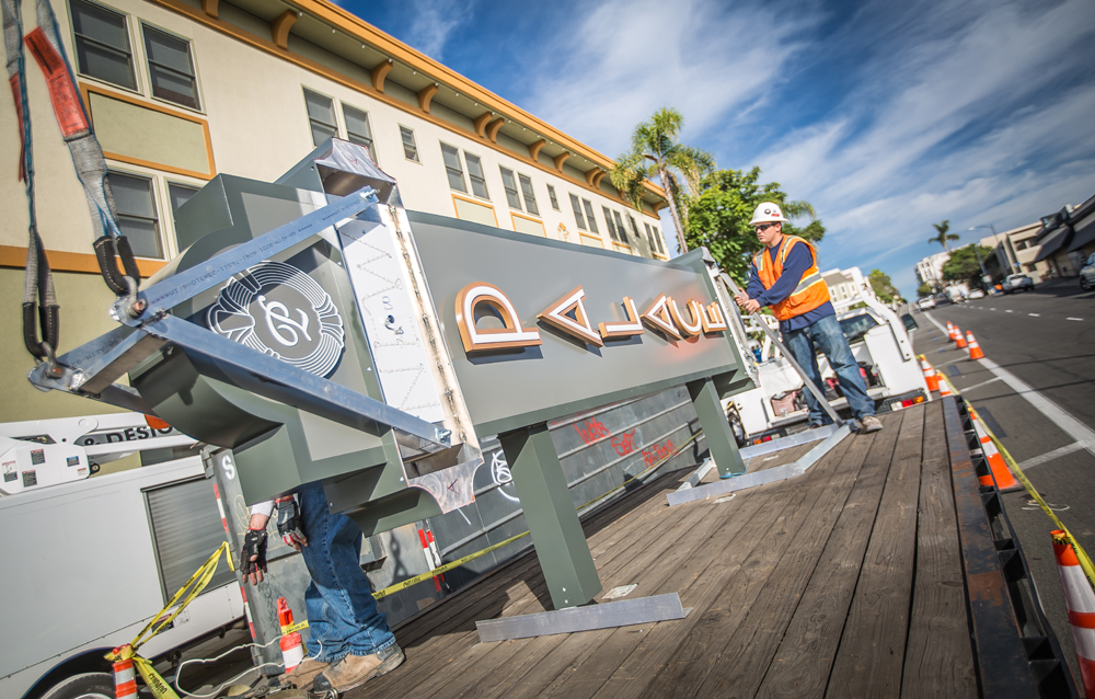
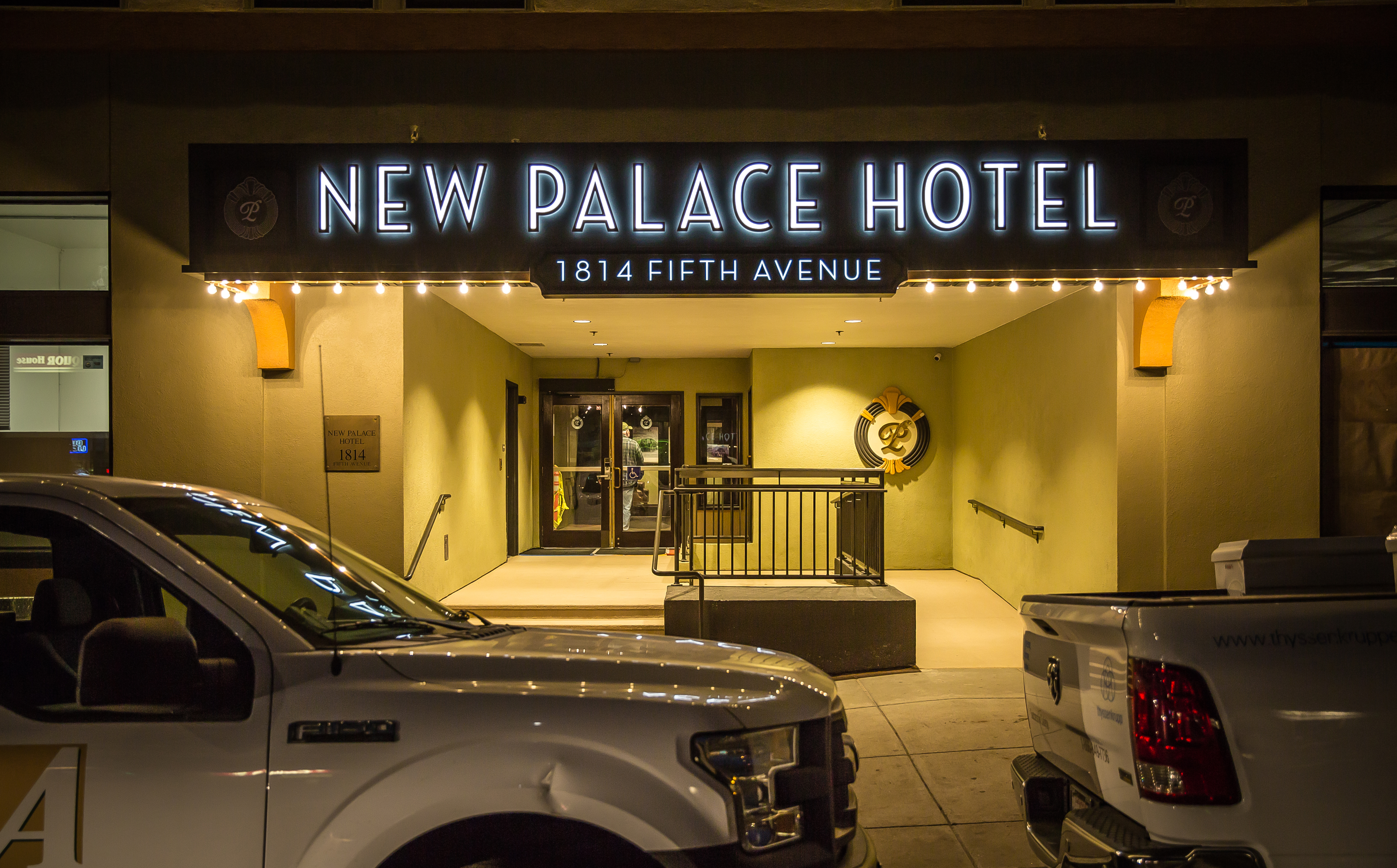
Clear Sign & Design, Inc., of San Marcos, California expertly re-imaged the landmark signage for the New Palace Hotel in downtown San Diego, California, while still maintaining its historical character. Two signs—a 48-inch-tall-by-25-foot wide canopy sign was installed to the front entrance and a 15-foot-tall-by-48-inch-wide blade sign—were vertically attached to the building. Each was carefully engineered to cover the warped one hundred-year-old New Palace Hotel façade.
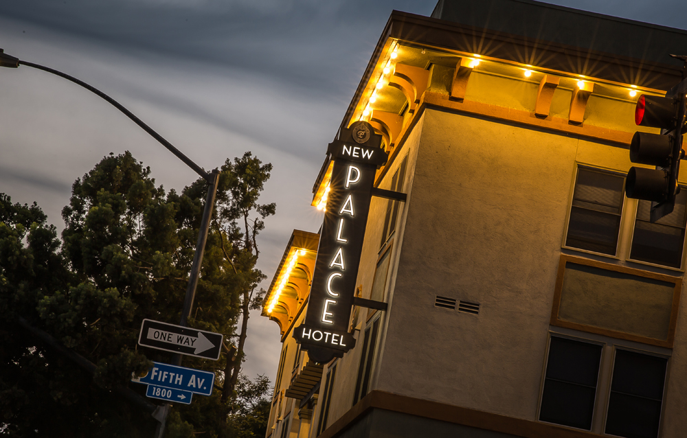
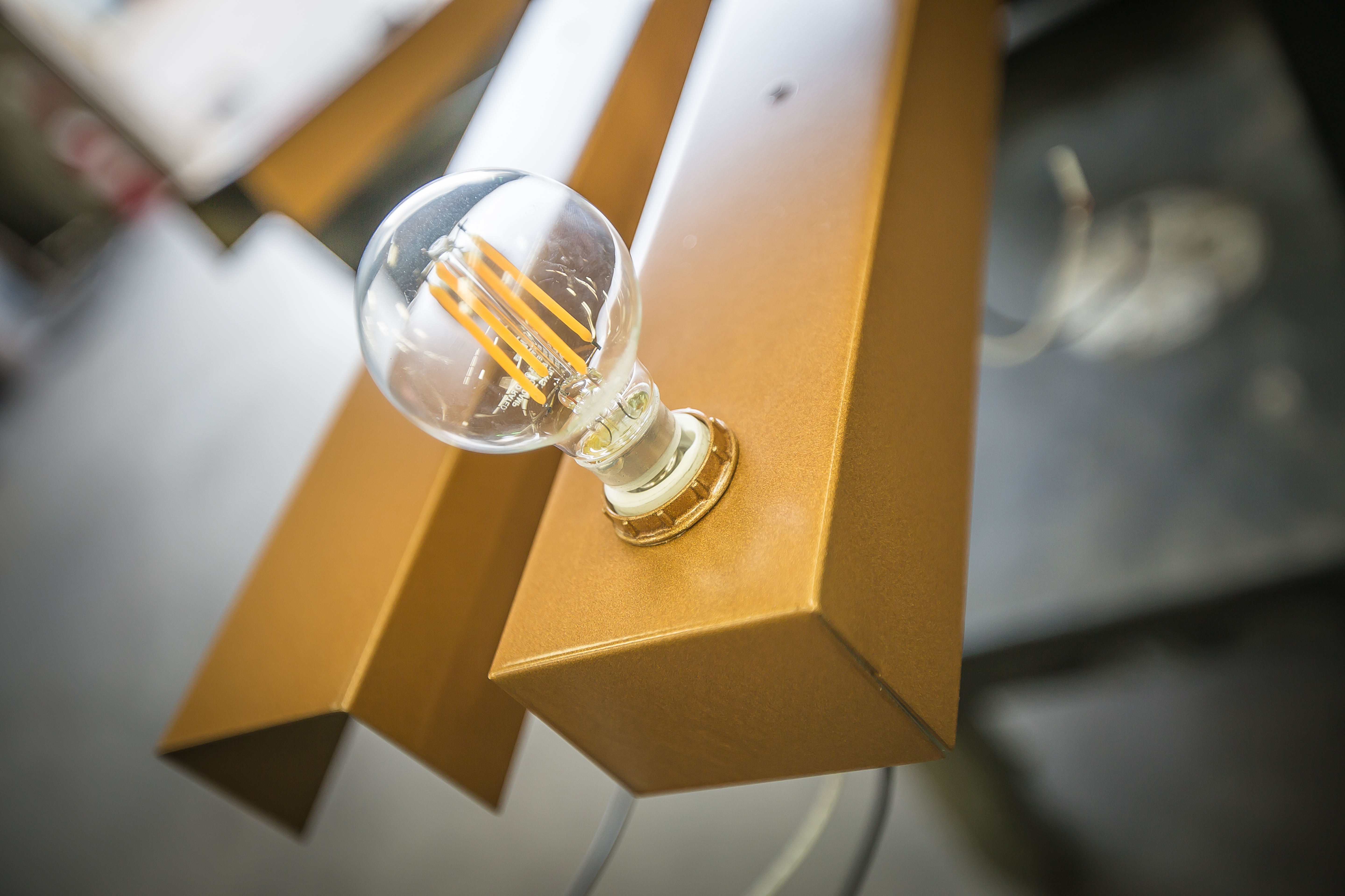
Constructed with antique LED lights for the larger filaments and one-inch dual-lit letters, the signs include a sophisticated circular seal, decorative drop ceiling tiles and a custom-built cornice. The signs are classified as an all-aluminum construction blade and canopy reskin.
The sophisticated art deco replacement is arguably an improvement on the original design. “The original design was period accurate but very underwhelming,” explains Gabe Griffin, general manager of Clear Sign & Design, Inc.
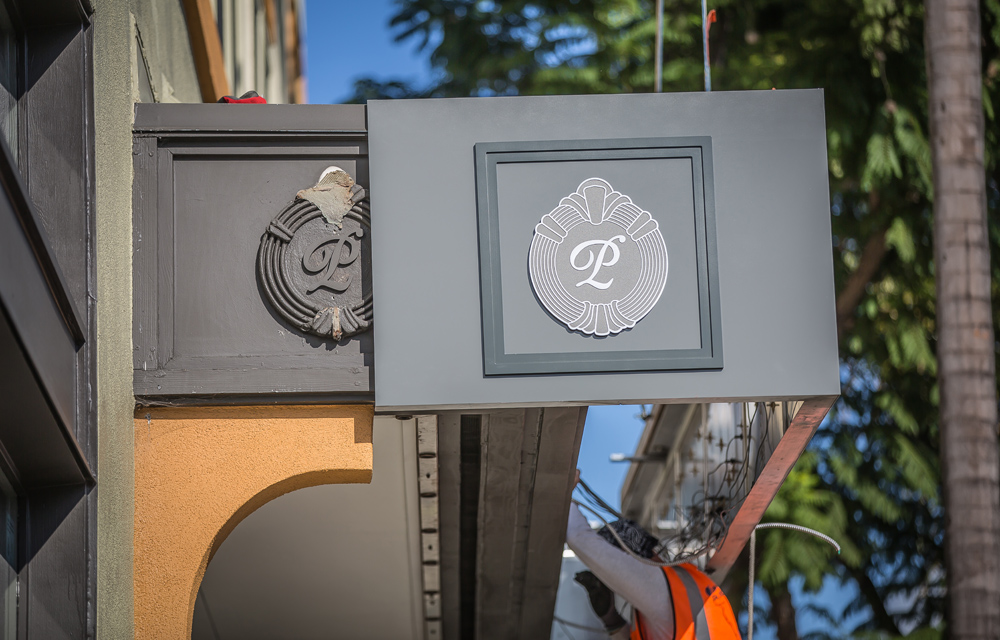
“We drew from the building’s upper cornice supports, existing sculpted logo design, simple window trim and framing, and undermount exposed lightbulbs and blended them with new lighting and construction techniques,” continues Griffin.
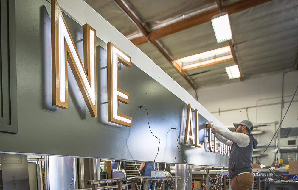
Clear Sign & Design also hand-made a custom cornice and accented the bottom of the hotel entry with a classic 3D panel system to add additional richness.
All the pieces were carefully lifted into place using crane and boom trucks.
A Weathered Tribute Race Car Wrap
Winner: Potpourri Category
Contributor: Love Signs, Inc.
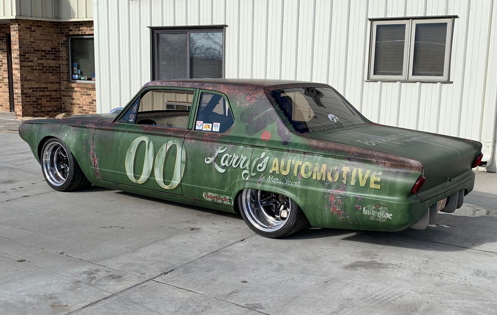
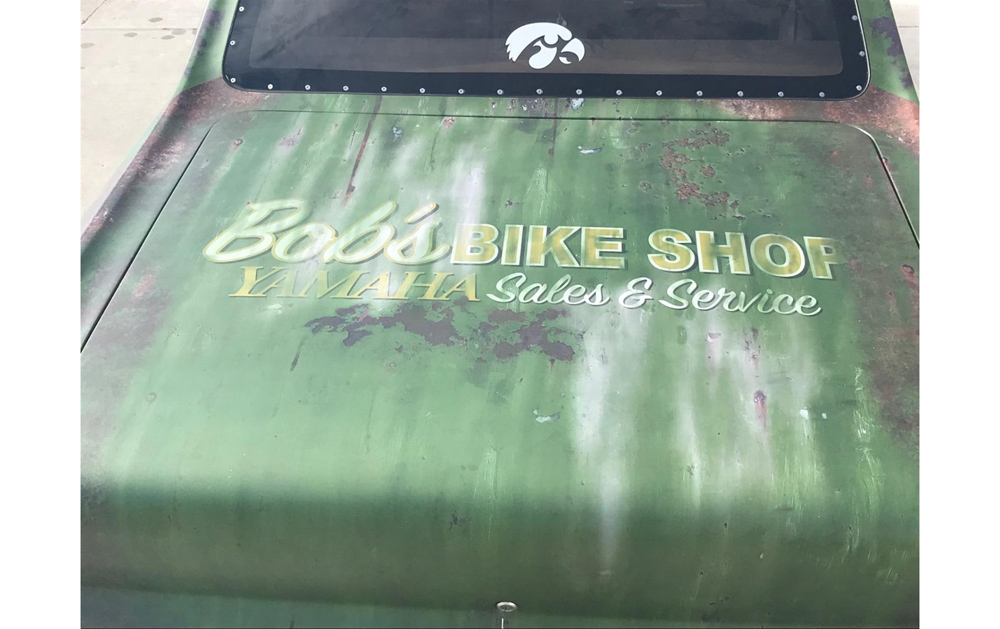
Love Signs, Inc., is a family-owned corporation in its third generation of quality sign construction headquartered in Norfolk, Nebraska. They put their creative skills to the test by designing, printing, and installing a weathered-looking car wrap. Their one request from the customer at the outset of this project: “He wanted it to look like an old stock-car pulled right out of the weeds.”
Love Signs took the mission a step further by incorporating the client’s father’s former business, “Larry’s Automotive,” into the design. Brad Love, owner of Love Signs, started out as a sign painter and was assured of the 1970s look they were going for here.
The full wrap design used on the race car is a 100 percent original developed by Love’s designer. Underneath the wrap, the car is a metallic green, so the shop started by design the wrap by making it appear as if the car was actually painted and had been untouched for over forty years. The race car numbers, the “Larry’s Automotive” business logo, and the rusted and weathered elements were scratch-built from the shop’s creativity and computer software.
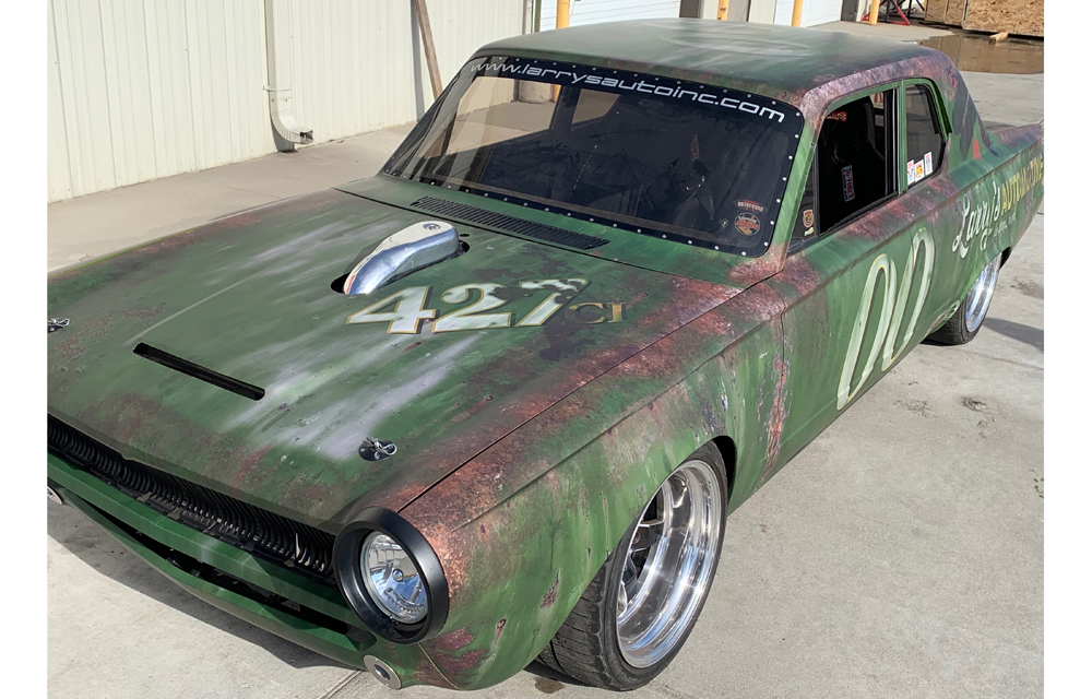
Love Signs printed everything out onto 3M IJ180 vinyl material. “Both the designers and the person who wrapped the car are car enthusiasts so their passion came through on this,” says Love.
The car is currently racing on autocross courses (where traffic cones are set up in a large parking lot or unused airport tarmac to make a mini-roadcourse) and has proven really popular, appearing in motor racing-oriented magazines like Good Guys and Street Rodding.
