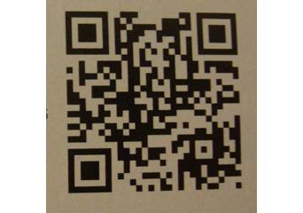
 One of the trends that emerged in 2011 are QR Codes. These Rorschach-like squares are a gateway to Web pages, coupons, advertisements, and virtually anywhere else a company would like to send someone with a Smartphone and the app that reads the codes.
These codes are sure to develop and become more widespread in 2012—especially on various forms of signage—so in the interest of end-of-the-year lists, let’s take a look at some of the QR code campaigns that just didn’t get it quite right.
Mike McGuinness, vice president of Sales for QRblaster.com, recently compiled this list of the Top 5 QR Code Fails of 2011. “There’s still a lot of confusion about how, when, and where to use QR codes at some of the largest, most talented marketing and advertising firms in the world,” says McGuinness. “There were plenty of QR code fails this year, but these Top 5 QR Code Fails made our list for one simple reason—people couldn’t get to the desired location for one reason or another.”
Here’s McGuinness’ top five list. Be sure to learn from this list of blunders so that you and your clients don’t make the same mistakes:
1. Red Bull. This company put a QR code on a campaign in the subway. Sounds great, but no good without a phone signal to access the online content. Make sure it works. Sounds like QR 101, but it is amazing how many codes we see that just plain refuse to scan. Much like an ashtray on a motorcycle, a non-scannable code is just plain worthless.
2. Continental/United Airlines. Like the Red Bull campaign, I’m not sure these guys picked the best place to put their QR codes—in a flying airplane. They made a QR code for their in-flight magazine, linking air miles without having to log-on to online accounts. Pretty cool idea, but when the code scanned (either just before, or just after, the flight), it took people to a page with two buttons. Nothing happened due to a pop-up window, which was mostly off the screen. The airlines threw a lot of money out there to try to do the latest thing, then had a web designer make something that was not mobile optimized, in fact, impossible to use on a mobile phone. These things need to be simple to use and accessible.
3. Washington Redskins. On their Facebook page, their QR code required a proprietary scanner, so only displayed text for most people. What?
4. Esquire Magazine recently placed their code right where the mailing label gets adhered. Um, if you can’t see it, you can’t scan it.
5. Nirvana 20th Anniversary Edition. Their distorted QR Code on the bottom right of their promo materials is just about unscannable. Location counts, but this doesn’t just mean on billboards or a busy street corner building. Make sure it’s scannable. We have seen codes on rotating billboards offering no chance of having time to get out your phone, point, and scan while driving. In the case of the Nirvana 20th Anniversary Edition QR code, it was simply too sloppy to scan from six inches away.
If you’re looking for more insight into QR codes, be sure to check out our article “Cracking the QR Code” by Mike Antoniak in the January 2012 issue of Sign Builder.


