 Mike Antoniak
Over the past twenty-five years, Selbert Perkins Design (SPD) has built its reputation as an innovator in environmental graphics—everything from the symbols people associate with a building or complex to the wayfinding aids that guide them to their destination within that locale.
And the company’s approach to these signage systems is one many can learn from.
“With any project, we tend to approach it at the largest scale possible to understand the entire sequence of movement—from what people need to know when they first arrive there through navigating their way around,” says Clifford Selbert, co-founder and owner of the firm with his wife Robin Perkins. (Note: The pair were recently named the 2011 Fellows by the Society for Environmental Graphic Design, the organization’s highest honor.)
In varied settings, their unified vision imbues functional symbols and signage with visual excitement that serve the visitors’ practical needs and enrich their experience there.
“There’s a bit of whimsy in what we do,” admits Selbert. “We want our work to be memorable and attract people to that location or business.”
It’s a global effort: In additional to the company’s Los Angeles headquarters, it now has offices in Chicago, Boston, Dubai, and Shanghai.
Arrival Signs
Wherever they work, the starting and focal point in their master plans is often a landmark or a monument. Effectively done, it becomes the identifying symbol for that location or complex, a potential photo opportunity in itself. “When people see them, they know they’ve arrived and can use that to orient themselves,” explains Selbert.
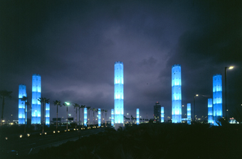
One example is the gateway to motorists entering LAX Airport in Los Angeles. The monument design combines 32-foot-tall letters with 120-foot-tall pylons. Illuminated at night in a series of computer-controlled colors, these towers serve as a visually stunning welcome from both the ground and the air.
To reinforce the landmark status of the city’s Pacific Design Center, SPD conceived a twenty-five-foot-tall illuminated chair and lamp as public art installations that also convey what visitors can expect to find inside.
To direct attention to Atlanta’s World of Coca-Cola museum, SPD created a tower encapsulating the iconic Coke bottle in ice, with flowing water and mist to simulate melting.
For the revitalization of downtown Salt Lake’s City’s City Creek Center, the company designed the streetlight towers, which define the space and evoke some of its history.
 And at Downtown Disney in Anaheim, the firm incorporated traditional bulb lighting and the latest in halo-lit channel letters to arrive at wayfinding and environmental signage that achieves both logo branding and public art.
An Integrated Approach
In every setting, these landmarks contain some visual cues—specific colors, text, or a design element— that are then incorporated into the whole series of environmental graphics. “Our tendency is to build a cohesive whole,” says Selbert, “to start with one concept and build on that through the visual language of the signs used throughout that space. Everything is designed to work together.”
Depending on setting and purpose, the project may also include individual gateways identifying specific locations with interior and exterior signage, vehicle and pedestrian wayfinding aids, and exhibit information.
As Selbert explains, the cohesive whole is a response to the different layers of visualization people rely on when trying to find their way around. That landmark—easily seen and readily recognized—serves as the visual anchor that announces the location from as much as 1,000 feet away. Closer in, signs take over as aids that direct drivers to their designation. Finally, at the pedestrian level, wayfinding stations and smaller signs provide the direct guidance needed.
“The level of detail required changes as people move slower and the signs are closer,” notes Selbert. “It’s our job to help people orient themselves and provide the information that takes them right to the door of their destination.”
Stories and Patterns
Research is critical to the success of these projects. “We’ll dig deep in the history of that business or location to find something that will help us tell the story of that place,” says Selbert. “Every story has a place and every place has a story.”
To determine the best location for signage and navigation aids, project planners study the design and layout of the space or complex, as well as vehicle and pedestrian traffic patterns. “We’ll study the setting with a great amount of detail, trying to minimize the amount of signage but also making sure it’s always available at all the decision points as people move around,” explains Selbert.
One of the challenges in SPD’s work is making the signs and wayfinding aids stand out while also blending in with their surroundings. “These are elements people need to be aware of only when they want them,” says Selbert. “Otherwise they should be invisible.”
As much as possible, the signs are integrated into the overall architecture and design, serving their purpose without dominating. At Cowboys Stadium in Dallas, Texas, SPD’s design uses the team’s trademark star logo, colors, text, and historic photos to assist visitors while conveying the overall sense of space. “We try to make our sign systems redundant, so the message is always clear no matter who is looking at it,” says Selbert.
Men, women, and children all look for and respond to different visual cues. Effective navigational aids take this into account and speak to all through consistent use of color or graphic elements, legible text, and readily recognized symbols.
All photos courtesy of Selbert Perkins Design.


