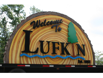
 If you find yourself traveling around East Texas and come across the city of Lufkin (population: 35,000-plus), you’ll really know you’ve arrived, thanks to the recent build-and-install of six distinctive 500-plus-pound entry signs.
But these aren’t just any “welcome” signs. Nope. These 8-foot-tall-by-13-foot-wide signs are also an attempt to bring back some city pride—and in the process, they provided a big sense of accomplishment for the sign makers involved.
Welcoming Ideas for Design
The city had been plagued with not only a rampant case of deteriorating signage but also a distinctive lack of branding and identification. Officials wanted something that would represent (and promote) Lufkin’s unique qualities.
So the Lufkin City Council awarded the project to Signs By Debbie and welcomed their attempt to make them a reality.
Signs By Debbie is a small sign shop in Lufkin. Owner Debbie LaRoe, her two home-schooled daughters, and Art Designer/Fabricator Alan Sims work hard to complete sign solutions—from logo design and ADA signage to vehicle graphics and billboards. They’ve also been using their fifty-four-inch Roland VersaCAMM to wrap everything from baseball helmets to water towers.
Signs By Debbie already had a great working relationship with the city for many years (including creating decals for its garbage trucks and signage for its industrial park). So city officials asked LaRoe to review their initial renderings. “It was pretty standard—two brick columns with a double-faced light box centered in it,” recalls LaRoe.
However LaRoe and Sims thought they needed something outside-the-box instead—something “powerful” that would attract tourists and make them want to stop and take photos. “They also needed something that would make the townsfolk proud,” she adds.
So Sims drafted several design ideas to show the mayor and the city council. “[Lufkin] is known for the timber and steel industries, so that gave us a starting point for art ideas,” he says. “But deciding on a design is always half the battle.”
After many weeks of fine-tuning, a design was finally chosen—a half-circle-shaped log. Its resemblance to the center-cut of a pine tree reflects the logging industry, while its water icons invoke area lakes.
Tapping Further Questions
Yet there were still more details to figure out: How big was too big without looking gaudy? How do you incorporate all the small ideas that say “Lufkin” into one sign and keep it from looking too busy? And how does a small sign company pull off something like this and keep everyone happy?
Another question: How do you light the signage without costing the city a fortune to drop power to each remote site? Their answer: Solar-powered LED-illuminated letters. “The city wanted these to light for five consecutive nights without needing to be recharged by sunlight,” says LaRoe. “The challenge came in trying to figure out how bright and how far the visibility should be without knowing the exact location of each sign, as each property had not yet been purchased at the time.”
Eventually LaRoe and her team decided on powder-coated, backlit, canned lettering. “We painted the interior of each letter white for better light reflection,” she says. “The clear acrylic backing would make it easier to remove or add to the LED modules and wiring, as well as for future maintenance.”
Barking Up the Right Tree
Knowing they were going to need some help to replicate the pine tree look of these six identical signs, LaRoe contacted Signs By Benchmark in Watertown, South Dakota for help. “Over the years, we’ve been asked to create several projects that had a rustic faux-wood or faux-log look,” remarks Matt Frey, division manager at Signs By Benchmark, “but this was the first time we’d been asked to create a cut-log look.”
{2j_imageviewer 14}
Signs By Debbie provided Benchmark with photos, color charts, and even a color rendering showing detail and conduit location that was printed full-size on banner material! They worked closely with Frey to make sure the right type of pine tree was selected before the prototype was manufactured. “The ‘bark’ had to be perfect,” says LaRoe. “The hand-painted rings had to look like those of a very old pine tree—not too symmetrical and just the right color.”
After doing the proper research, Benchmark imported the color rendering into AutoCAD software and created the CNC cutting files.
The signs started out as shapes CNC-cut from cellular plastic (EPS expanded polystyrene). “They were assembled from a series of smaller parts that fit together to create one large shape,” explains Frey.
All the “bark” was hand-carved to achieve the desired look. The challenge was to carve and color it so that it would look good from a distance. “In focusing on making it look good from a distance, it’s easy to create a design pattern that doesn’t look correct up-close,” says Frey. “This can be avoided by stepping back about fifty feet from the piece several times while carving, to make sure things are progressing correctly.”
For the tree growth rings, Signs By Benchmark closely examined several fresh-cut log sections. “We created 1/8-scale models of the log and sent them to Signs By Debbie for approval,” details Frey. “These models were our practice canvases to try our tree ring ideas on.”
After the first attempt, they soon discovered that creating realistic-looking tree rings was harder than anticipated. “But we didn’t get discouraged,” says Frey. “We persisted and ended up nailing the process on the fourth sample sign.”
Once the prototype was approved, production immediately began on the large signs. Creating multiples of the same design is common for Benchmark, so fabrication went quickly. “Creating the bark was really the only time-consuming part of the entire assembly,” says Frey. “We had to hand-carve, in order to give each sign a unique, individual look.”
The need to add solar-powered, reverse-lit LED channel letters proved challenging also. “Usually channel lettering requires very little space inside a sign to house a transformer/power supply and manage the low-voltage wiring,” says Frey. “But because of the width and depth of these signs, we had to create the access space large enough for a person to stand in.”
To ease the wiring installation for each channel letter, Benchmark pre-drilled the holes and installed pass-thru conduits in each sign prior to coating them. “This would significantly reduce the install time on the job site,” explains Frey.
Finally the sign pieces were moved to a spray booth, where they were coated with the company’s signature polyuria hard coat for strength and durability. Benchmark then applied acrylic stucco and hand-painted them to match the customer’s rendering. “We then finished with a flat clear coat,” says Frey.
Planting the Seeds for Installation
Signs By Benchmark shipped their portions of the signs back to Signs By Debbie via private carrier truck. Signs By Debbie loaded the six finished signs onto their flatbed trailer and headed out in a caravan of sorts.
{2j_imageviewer 15}
Installation of all the signs was scheduled for one weekend. “Early on, everyone agreed that it would have a more dramatic effect if they were all in place for Monday morning traffic,” explains LaRoe. “Our plan was to achieve a natural look. We wanted the tree slice to look as if it is stuck in the ground with sawdust and grass growing around it.”
Thanks to careful pre-planning, installation went smoothly. “We numbered each sign and each set of letters to coordinate, so that the pattern we drilled in each sign would fit perfectly,” says LaRoe. “No two sites were alike, so we just continued to pray that things would go smoothly.”
Signs By Debbie started with the closest and most easily accessible site and, over the course of two days, worked their way around the loop. On-site they used a tractor to jockey the massive signs around. “We secured each sign to the forks of the tractor and gently eased the first sign over the steel pipes that were secured in the concrete,” explains LaRoe. “As each sign was set, holes were drilled in the sign cavity and expanded foam was added to secure them to the posts.”
Next the letters were attached to the sign. Then city crews then came in behind them and added the LEDs and connected the solar panels to the battery banks housed inside the signs.
One thing LaRoe is adamant about is working closely with city engineers and officials to keep them abreast of any changes and progress. “It gives them peace of mind that everything is staying on schedule,” she says.
 Pride Restored
The signs currently stand at U.S. Highways 59 and 69 North and South, as well as State Highway 103 East and West, and Lufkin officials believe these new monument signs are already a hit. In fact, the city recommended “Have your photo taken in front of one of [these] new city signs” in their recent “100 Things to do while in Lufkin” list.
“We are so blessed to be able to do what we love to make a living,” says LaRoe, “and we are so proud to have been a part of this project. We take great pride in being a part of beautifying our community.
“And of course, we hope that this project helps our business continue to grow.”
—Jeff Wooten


