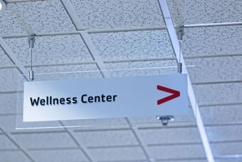
When we think of wayfinding, we often imagine a one-way stream of information: The sign directs the traveler or visitor, and this one-dimensional relationship continues until the journey is complete.
For their wayfinding portfolio, Indiana Signworks of Fort Wayne, Indiana has a strategy to marry the range of their offerings to create viable solutions in this field. Understanding what a “sense of space” means to the designers and visionaries behind the signage gives them a good sense of the output. This helps especially as the company evolves and works increasingly with highly educated and informed clients.
“Our clients are sensitive to creating a sense of place,” says Director of Marketing and Communications Sarah Chesebrough, “so we keep in mind that signs can be either intrusive or disruptive in that process, or they can be very effective ways to not just communicate information but [also] to create an emotional response to the space.
“Maybe it’s a by-product of the amount of time we all spend in public spaces or maybe it’s because of public discourse on inclusion and inclusivity, but we’re discovering more customers concerned that people who interact with their spaces find them welcoming and are aware of the impact that signage has.”
One trend Indiana Signworks is seeing is an increased emphasis on aesthetics. In the past, says Chesebrough, customers focused simply on function. Now customers do their homework and are even ordering signage by product name.
“Our clients no longer just want a sign or a sign system that helps [visitors] navigate their building or campus,” she says. “They’re aware that signs no longer blend into the background; they’re a conscious part of the overall design of a space.”
In starting a wayfinding project, Indiana Signworks begins both small and large projects in a similar fashion.
“We sit down, get to know the customer’s needs and wants, talk budget and delivery dates,” says Chesebrough, “and then we go back and create the plan on how we’re going to get there.
“Although there are production differences between smaller jobs and large jobs, at the end of the day, it’s about directing people easily through the space.”
Deciding on complexity for the wayfinding system points to the end-user. Chesebrough says that industries such as travel and entertainment (think convention centers or high-end hotels) would be much more likely to use intelligent, complex wayfinding solutions than those industries where the extra touch is not needed (a strip mall or enclosed industrial complex).
“A small medical center is more of a cut-and-dry project,” she says. “Basically you’re thinking about the users of the space—they’re expecting the signs to direct them to their intended destination.
“You don’t want to mix things up too much—just get them to the right doctor’s office. If you’re doing the interior wayfinding too, make sure they understand how to navigate the lobby, lab, and exits.”
Chesebrough adds that there’s a certain test that can add the “check” to the box that the job was done right. “It might be fair to say you’ve done the job right if people don’t stop and take notice of the sign,” she says.
For a sizeable complex such as a zoo or a large museum, the wayfinding project becomes more intricate.
“You have visitors of different ages and backgrounds interacting with the space, based on a range of interests for being there, multiple destinations to go to, and varying abilities to understand and interpret information,” Chesebrough points out. “A zoo or a museum is much more likely to request that the space be designed child-friendly or that it fit into a unique design aesthetic. In this situation, we’d most likely be working with a contractor or design firm, in addition to our client.
“Depending on that relationship, this could add another layer of complexity to the job, although this usually ensures that we get the art we need to produce the signs the customer desires.”
With so many variables to consider in designing a wayfinding project, a choice of materials and technology comes in handy. Chesebrough says that much of their wayfinding systems are constructed out of aluminum frames and posts. “The faces could feature translucent polycarbonate or aluminum, depending on whether they’re illuminated or not,” she says.
The first concern Indiana Signworks addresses is typically durability, with consideration given to the customer’s budget.
“No one wants to put a lot of money into a sign that won’t stand the test of time,” says Chesebrough. “It’s actually amazing to drive down the street and realize that people do just that though.
“Hundreds of thousands of dollars on a sign that isn’t using tempered glass doesn’t seem realistic in the face of northern Indiana winter storms and snow plows, but we’ve seen it happen.”
She stresses that, depending on the use or the environment where the signs will be located, Indiana Signworks strives to use the best materials in order to make the longest-lasting signs possible.
According to Chesebrough, each application requires different substrates. “If the signs are indoor, we prefer an engraved plastic material that’s UV-stable,” she says. “Exterior signage needs to be able to stand up to the elements, so a material like aluminum or Max-Metal® ACM is great.”
Of course, the company works closely with the client’s budget in choosing materials and added features or technology.

“We try to decide on the overall look the customer is trying to achieve and then go from there to materials,” says Chesebrough. “The technologies we use to manufacture range from rotary engraving or laser engraving to digital printing or metal fabrication. We also incorporate sublimation where necessary.”
Chesebrough stresses that it’s important to avoid materials that will break down or warp over a few years. “This doesn’t mean that the signs will cost more either,” she says, “but we are definitely looking for the best long-term value for the customer, based on the parameters they’ve given us at the beginning of the job and conversations we’ve had along the way.
“We always listen to the customer and do everything in our power to give them exactly what they want. But sometimes we need to provide a stronger opinion on materials and guide them a bit more, especially if they insist on using a material or process that isn’t going to meet their needs.
Other areas that are usually covered in client conversations include recognizing traffic flow (whether vehicular or foot, exterior and/or interior); determining how the building is laid out (especially electrical and access to the sign for updates or repair); surveying aesthetics (including landscaping and interior design colors/materials); and deciding on the purpose of the sign (i.e., grabbing attention on a busy street, welcoming guests, directing them clearly and quickly to an exit, etc.).
“We also discuss the client’s likes and dislikes, as we try to find out the corporate culture,” notes Chesebrough. “Are they progressive and cutting-edge or are they conservative and traditional?”
Thanks to the added benefits of technology, the new thinking concerning wayfinding systems goes something like this: How do we receive information back from the traveler? What messages can be tailored to the visitor at specific points in their journey?
Chesebrough has been probing these questions, as her company investigates innovative solutions. “We’re not just seeking to push information out,” she says, “but to also develop new and better ways to gather incoming information, synthesize it, and put it to use.
“What if our signs come to reflect that? What if different messages could be displayed for the various individuals interacting in a space, depending on their needs? What if signs talked with our devices?”
These and other promising possibilities offer a glimpse of the new wave of wayfinding—its potential slowly becoming manifest.
By Lori Shridhare
Photos: Indiana Signworks


