After twenty-five years of training outside of Boston, the NHL’s Boston Bruins returned to the city this past September thanks to the opening of the Warrior Ice Arena, built and owned by New Balance®.
The Bruins’ new training and practice facility boasts a 75,000-square-foot rink with seating for 660 spectators. The arena will also host public skating hours, local high school teams, and the professional women’s ice hockey team, Boston Pride.
Adjacent to the busy Mass Pike, eye-catching channel letters were a must for the new facility. Bids went out, and sign companies faced off to get a chance to work on the high-profile project.
Poyant Signs in New Bedford, Massachusetts, had been tracking the project and talking with the design team, and in the end, they made off with the puck—and the job.
Poyant is a full-service, family-owned business with a history that stretches back to the 1930s—almost as far back as the 1924 inception of the Boston Bruins. On this job, Gary Bolduc, account executive at Poyant, served as the point of contact.
It took a team effort to pull off a win on the Warrior Ice Arena project, and these are the players who took to the ice to get the job done:
- Gary Bolduc, account executive, Poyant Signs
- Jason Fredette, design, development, and prototyping, Poyant Signs
- Matthew Mansfield, production management, Poyant Signs
- Whitney Perkins, environmental graphic designer, associate principal of Roll Barresi & Associates
- Leo F. Rusk, developer, project manager at The HYM Investment Group, LLC
- Jay Rourke, senior project manager, NB Development Group (New Balance)
- Samantha Hand, project engineer, John Moriarty & Associates, Inc.
- Elkus Manfredi Architects, Boston, MA.)
- J. Freeman, Inc., Dorchester, MA, acrylic vendor
 The first hurdle to the goal line was the design.
The new arena didn’t want just any channel letters—they wanted letters that looked like they’d been carved from ice (without the worry of them melting in the August heat of a Boston summer).
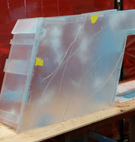
Poyant got to work on some mock-ups using pictures of various types of ice as inspiration. They experimented with multiple effects on acrylic by using spray paint, diffuser films, grinders, and lighting to find the right look.
“We made lots of different mock-ups,” says Jason Fredette, director of Sales Operations at Poyant Signs. “You can have ice that’s more blue, you can have ice that’s more white, or you can have ice that’s scratched a lot and really scuffed up. You can have it where it looks like it’s been cut out of the pond with saw marks on the side and very extruded looking.”
When Poyant had settled on a look, they invited the client out to their shop to view the mock-ups.
From there, Poyant created a larger mock-up—a six-foot sample “I”—to bring to the Boston Planning & Development Agency (BPDA) for approval, along with conceptual drawings.
“[BPDA] knew of the project and kind of had already blessed the idea of having a name on the side of the building but needed to see how it was going to be executed,” explains Fredette.
Once Poyant got approval, they created architectural drawings in Illustrator and got to work on fabricating the letters.
Aside from looking like ice, the letters are unique because they’re made entirely of acrylic—1/2-inch clear P95 acrylic faces with a matte finish and 3/8-inch clear 3030 P95 acrylic with a matte finish and second-surface diffuser for the returns.
To form the curves of the letters, Poyant turned to their acrylic vendor, J. Freeman, Inc., for advice. (Note: All the letters had curves except for the two “E”s and “I”s.)
The sign shop ended up creating custom MDF forms (or jigs) in the shapes they needed for the letters.
The acrylic had to be heated to 180°F to 185°F, pushed into the form while still hot, and clamped into position. As the letter cooled, it retained the shape of the form. It took two to three weeks to form all of the letter curves.
 Once the curves were created, certain finishes were applied, like skate marks.
“We actually have cut marks across the front of the letters so it looks like someone skated across the entire sign,” says Fredette. “The skate marks go across one letter to another to another.”
The six-foot-tall letters were then assembled. The attachment process was something Poyant spent some time working on as acrylic expands and shrinks in temperature changes, and with Boston temperatures ranging from -20°F in the winter to 120°F to 130°F in the August sun, the attachment method had to account for that.
Through some careful research, Poyant was able to make the save on this part of the fabrication.
“These faces were all methylene-chlorided together,” says Fredette. “When you use methylene chloride to bond acrylic, you’re actually doing a chemical weld, so you’re melting the acrylic and it rehardens.
“The face is bonded to a return, and the return is bolted to a frame. So that bond between the face and the return has to be really strong. We did a bunch of research on it and figured out the coefficient and expansion and contraction for acrylic.”
With the letters put together, the rest of the ice finishes were applied, including applying paint and distressing the letters. Poyant used pylon spray paint here versus traditional sign paint because they were aiming for a light, more varied misting rather than a heavy, uniform look.
Illumination also played a role in the icy effect of the letters, and Poyant used white LEDs from GE to achieve the right glow.
The placement of the LEDs, however, required some fancy stick work from Poyant.
The shop knew that when the P95 acrylic got wet in the rain or snow, it would reduce the matte, frosted appearance of the acrylic. The letters would become more optically clear, which would make it easier to see hot spots from the LEDs.
So Poyant played with the distance and depth of the letters to avoid hot spots.
They settled on a twelve-inch-deep acrylic letter with a one-inch-deep, brake-formed LED tray mounted behind the letters. A 3/16-inch piece of matte Lexan® with white, translucent vinyl graphics was applied to the LED tray to help soften the LEDs.
“That gave us extra depth and allowed us to make it so that the LEDs could be serviceable easier,” says Fredette. “We never really have to open up the letters; we just pull the back off. And it diffused the lighting.”
A galvanized box houses the LED power supplies on the backs of the letters.
Poyant also built an aluminum angle perimeter frame for each letter, as well as a .063-inch aluminum back that was curve-cut to follow the letters’ curves.
The channel letters were bolted via steel angle with 1/2-inch-diameter through-bolts to two 6-by-6-by-3/16-inch structural steel horizontal tube supports.
The letters, attached to the horizontal rails, were then loaded on a flat trailer and driven to the install site in four sections ranging from twenty-eight feet to thirty-two feet.
Onsite the sections of letters were unloaded from the trailers, and then two of the four sections were joined via the horizontal tubes on the back using vertical connections to form a sixty-two-foot piece. This was repeated for the remaining two sections.
One of the sixty-two-foot sections was picked up with a large crane and put into place. The horizontal tubes were then welded to angle that is welded to stubs that come out of the building, which are welded to steel inside of the building.
The sign could only be connected to the building in four places, and all of the steel work was done prior to the installation of the letters.
“It took us four days to put the supports welded to the steel inside of the building, to locate them perfectly, and to make sure they were good,” says Fredette. “Getting all that lined up was pretty important.”
The second section of letters was installed next and vertically connected to the horizontal tubes of the first piece to complete the 124-foot-long sign.
Despite being in Boston, installers were able to work during normal business hours since it was already an active construction site, and the building front was on a service road pertaining just to the arena.
The installation was performed by Sign Erection and Maintenance Inc., and the letters were put up in about three days.
What made the entire installation process more difficult is that the building façade leans forward and a bit to the left.
“To get the letters in place, it was pretty tight,” says Fredette. “The glass at the top is forward of the letters. So when we were actually using the crane, we came about three inches away from the glass.” Talk about being right on the goal line!
The client was pleased with the icy results, and Poyant secured a win on this five-month channel letter project.
By Ashley Bray
All Photos: Poyant Signs.


