The former Nokia Theatre in Los Angeles, California has hosted such glitz and glam events as the Oscars, the Primetime Emmy Awards, the ESPYs, and the American Music Awards.
But when Microsoft acquired Nokia in 2014, the 7,100-seat venue and 40,000-square-foot open-air plaza had to be rebranded to Microsoft Theater and Microsoft Square, respectively. Doing so called for a signage overhaul.
Enter Signtech, a full-service sign company in San Diego, California that has been around since 1984 and strives “to be the best sign manufacturing company in the United States.”
Andy Schwartzkopff, vice president of Branding at the real estate investment management company Jones Lang LaSalle Inc. (JLL), brought Signtech onto the project, since the two companies have enjoyed a trusted relationship and a history of successful projects together.
On this job, Signtech was tasked with providing forty to fifty interior and exterior signs (including blade signs, entrance signs, wayfinding signage, and ADA signs).
The project also included two very visible sign types—a 50-by-50-foot illuminated Microsoft logo on the rooftop, and four eyebrow signs featuring an illuminated Microsoft logo and channel letters spelling out “Microsoft.” All the signs were designed to minimize any visible fasteners and to make all the signage elements appear as if they were floating off of the building.
Lighting in a Lead Role
Signtech worked with JLL, building owner AEG, Yusuke Ito (architect with Gensler), and Ron Sasaki (head of Design at Microsoft) on the sign designs.
One of the biggest hurdles during this phase was finding the right material and the proper color temperature for the LED lighting to accurately reproduce the true color of Microsoft’s logo in the rooftop sign and channel letters.
The team tested a few different lighting and material combinations before Microsoft settled on SloanLED’s V180 Large LED modules. The product was chosen for its brightness and because its Kelvin temperature accurately reproduced the colors of Microsoft’s logo.
Special Achievement on a Rooftop Logo
The 50-by-50-foot rooftop logo is to be viewed by cameras in helicopters flying over events, and it is the largest logo in Microsoft’s history. Fittingly Signtech had some pretty big hurdles to overcome in its design and installation.
Because the logo is flat on the roof, Signtech had to contend with the puddling of rain on the surface, water drainage, and its serviceability. “They didn’t allow us to tilt the logo, so we had to make it so that the faces would shed the water,” says Art Navarro, vice president/partner of Signtech. “We went through multiple plans before we were able to get the water to actually shed and drain properly.”
The solution was a proprietary system with a flexible substrate material supported by clear rigid supports and trusses to allow for water runoff and proper face illumination.
With this problem solved, the logo was built modularly using 3M Panaflex with 3M first-surface vinyl and the accompanying UV overlaminate.
“There are four sections in the Microsoft logo,” says Patty Soria, production manager and partner at Signtech, who was in charge of overseeing the production of all signs to make sure everything exceeded the clients’ expectations. “Each section was built in two pieces and brought up on the roof and then assembled up on the roof. The faces were then stretched in the field on the roof of the arena.”
The theater’s structural engineer was consulted to approve that the roof could hold the oversized logo and that the attachment methods could withstand high winds.
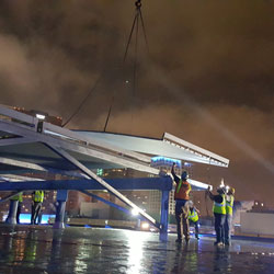
To get the logo pieces onto the roof, Signtech had to rent a large hydro crane and close down the street while they were unloading the pieces onto the roof. Because of the disruption, this part of the installation had to be done in one night. From there, it took about a week to assemble the logo and bolt it to a steel structure on the roof.
Signtech made sure future access for maintenance would be easy. “These faces are so big [that] we actually installed all the LEDs on a track so they’re all able to pull out,” says David Schauer, president of Signtech. “Every row of LEDs is on its own individual track. We can access all the transformers and all the LEDs without having to remove the faces.”
Outstanding Channel Letters in a Supporting Structure
Signtech also faced a design and installation challenge on the eyebrow sign spelling out “Microsoft.”
The clients wanted the letters to appear as if they’re floating off the side of the building. To achieve this, Signtech created a custom steel bracket system to hang the six-foot-one-inch-tall letters.
“We had to hide and custom-fabricate all of the structural supports so that they contoured to the letters and then contoured those to the building itself,” says Navarro. “Aesthetically they didn’t want to see any visible structural components. Even the dot on the Microsoft on the ‘i’ has a bridge to make it appear as if it’s floating.”
To further contribute to the floating effect, Signtech made the letters modular and built them without trimcap so there are no visible seams. The letters and logos have Lexan® faces.
For the installation, Signtech used a crane and had to work during off hours—midnight to 7 am—since they had to shut down the square and work around the events going on at the venue. In addition, they had to put special booties on their trucks’ and lifts’ tires, as well as plywood beneath their outriggers, so as not to mark up the concrete.
Critical Acclaim
All in all, the project took about nine months to complete, with three of the months tied up with permitting and engineering hurdles.
Everyone was impressed with the end-result though. “We had good input from all, and we worked as a great team, even though we had complexities due to the permitting and then scheduling all this work around a very busy schedule for the venue itself,” says Schwartzkopff. “The finished product exceeded expectations, and although this was a nine-month project, it was a lot of fun and a great experience.”
Signtech was also pleased with the finished product. “This is one of the largest single site rebrandings we’ve ever been part of,” says Schauer. “It’s rewarding to see our work showcased in such a high-profile venue.”
By Ashley Bray
All photos: Signtech


