When I think of the greatest signs in my lifetime, signage like Vegas Vic with its moving arm welcoming visitors to Las Vegas, or the famous Times Square Camel Cigarettes billboard that blew smoke rings for twenty-five years down Broadway, come to mind.
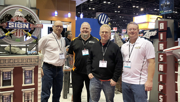
These signs were my inspiration for a mechanical sign I created for this year’s Sign Invitational Competition hosted by MultiCam at the ISA International Sign Expo in Orlando, Florida. For the third year in a row, this competition has brought together award-winning creative sign professionals to show off their talents in front of the 20,000 attendees at the convention.
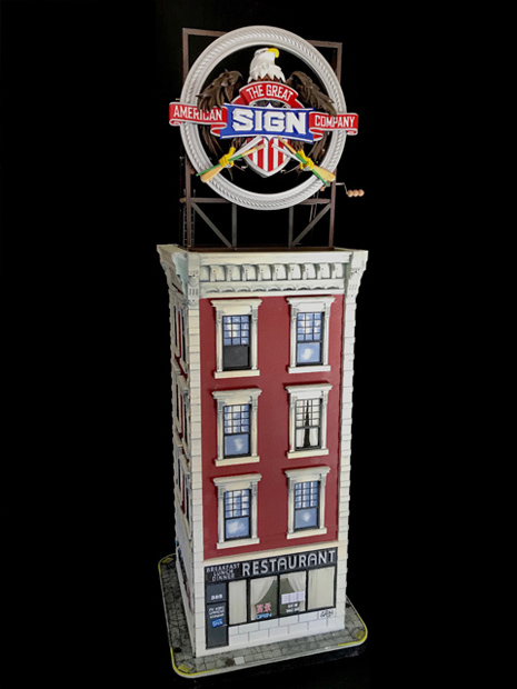
“Marvelous Machines” was this year’s event theme, which gave me the opportunity to create the kind of monumental, awe-inspiring sign I have always wanted to make—just in 1:14 scale. I knew this piece would also make a knockout addition to my showroom.
After being invited in October to participate by competition organizers Dan Sawatzky of Imagination Corporation, in Chillawak, British Columbia, and Jim Dawson of Synergy Sign in Canton, Ohio, I was stoked to get started. I had about five months to prepare, and as it turned out, I needed every second of it.
It was at this point that I really wish I had paid more attention in physics class because I had no idea how to put together gears, levers, ratchets, pulleys, or cranks to make my idea a reality. I had never worked on a car or repaired a damn thing in my life.
Luckily a museum just down the road had a permanent collection of automata (mechanical robots, dolls, toys, and music boxes that can dance, perform tricks, or even draw).
I further researched automata on Google and YouTube, discovering a wealth of information from great, modern-day artists in the U.S. and U.K., like Matt Smith, Philip Lowndes, Rob Ives, Michael Croft, and Dug North. I picked their brains, read their blogs, watched their videos, and even bought a few of their mechanical toys/sculptures to understand how they animated their creations.
My idea was to animate my logo and place it on top of a building in the style of nineteenth and early twentieth century factories (many of which can still be seen here in New Jersey). Competition guidelines limited the size to two-by-two-by-six feet, setting the scale of my creation to 1:14.
I researched New York City buildings of this era via the Internet. I was looking for something ornate but easy to mimic. I did not want to spend so much time making the building that there would be no time left for the mechanical sign on top.
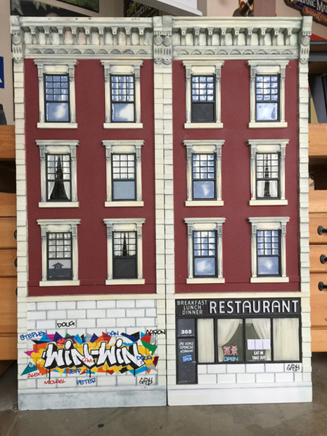
A building I saw on the corner of 6th Avenue and Waverly Place fit the bill. It was decorative, but all the elements were repeatable (the windows, cornices, and ledge details). I just needed to create one and repeat however many were required. Rather than exposed brick, the surface was plastered, which would be easier and quicker to carve, paint, and age.
I originally planned on the first floor store being my shop (The Great American Sign Shop), but I changed my mind when I realized that this building, in fact, housed the famous Waverly Diner in Greenwich Village. The sign for this restaurant was so typical New York and so compatible with the time era that I didn’t have the heart to change it.
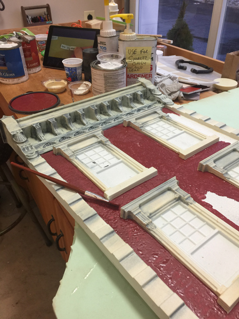
The building didn’t require any hand carving; it did though require approximately thirty hours of machine carving using a 1/8-inch-round bit with a 90 percent overlap on my MultiCam 3000 CNC. To get the necessary speed to achieve the quality I was aiming for, I used four different CNC software—ArtCAM, OMEGA, EnRoute, and Vectric.
Because this project was not going to be a moneymaker, I made it almost entirely from scrap pieces of CORAFOAM®, Precision Board®, and Sign•Foam® HDU materials.
The building is essentially a rectangular box of HDU reinforced with 1/2-inch MDO. The sides of the building slot into the sidewalk baseplate and are further held together with KOMACEL PVC braces on the inside and a PVC cap that forms the roof.
The building was painted with Benjamin Moore® exterior latex paints and aged with glazes.
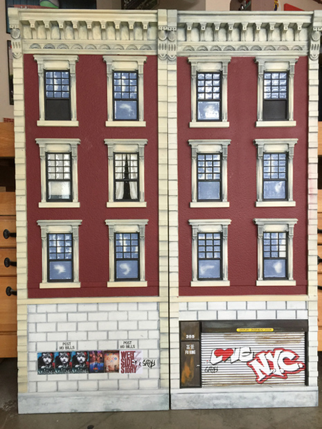
The lettering and graffiti on the walls and doors were printed on a Gerber Edge® and cut out with a Gerber enVision™ plotter. (Note: I would have liked to hand-paint everything, but there just was not enough time.)
Once the building was completed, I was free to work on the mechanical mode to be placed above it. Due to time constraints, I kept the mechanics simple. I decided to animate only the eagle’s head and wings and the S-I-G-N letters.
The logo, like the building, was carved from HDU with a plywood backer. The most difficult parts to carve were the wings and head. I needed to create a double-sided, fully rounded eagle head from a single-sided 3D image. I achieved this by mirroring the original right-facing artwork and adding a wedge of filler HDU in between and blending together the three pieces through hand carving.
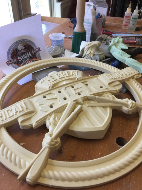
The wings required a considerable amount of hand carving, since they both pass below and behind the “American/Company” banner. It took a considerable amount of reconfiguring of the original artwork and a serious amount of hand carving (with some trial and error thrown in) to make this part operate as I had envisioned.
The S-I-G-N letters also proved to be a tremendous challenge. Unlike the eagle head and wings that could be tinkered with, these four moving letters had to be precisely engineered.
The logo was primarily painted with Modern Masters® Metallic paints. The scaffolding holding the sign was naturally aged steel angle (which also served as the framework for the mechanics).
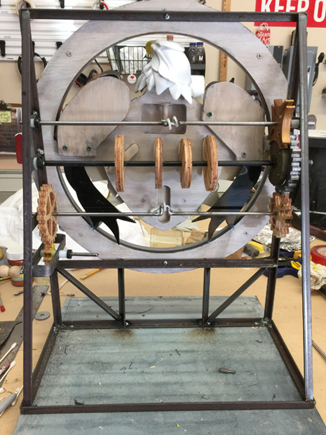
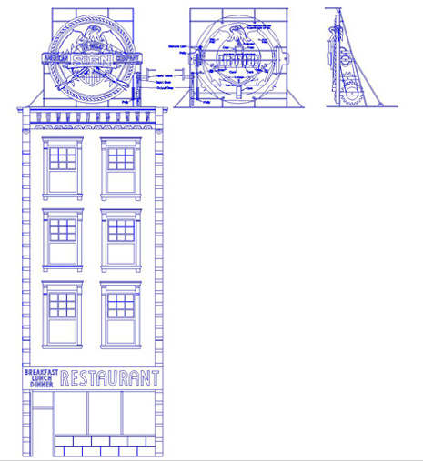
The logo is animated by the turning of four axles. The first axle is activated with the turning of a simple hand crank. On that axle is a small gear with just seven teeth that turns a larger gear with twenty-one teeth on the second axle above it. This 1:3 (7:21 teeth) ratio serves to gear down the speed of the main axle. Most people (and especially children) tend to turn the crank way too fast, so this was very important to get the speed of operations where I wanted them.
This second axle operates the movement of the wings by pulling a string with the help of a center crank and gravity. On the other end of the axle is a seventeen-tooth gear that rotates a twenty-one-tooth gear on the third axle, slowing down the operations a bit more with another gear reduction.
This third axel turns the four cams, which control the forward and back movements of the S-I-G-N letters. A cam is like a gear but has no teeth. The cam is useful for converting rotational force into an up-and-down or forward-and-back action.
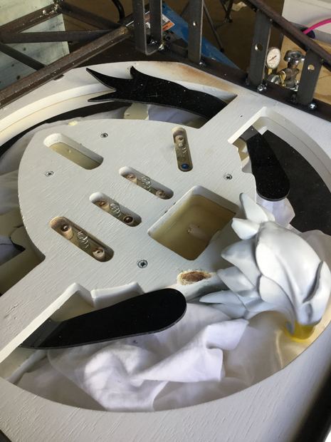
Essentially these four letters are designed to operate like a push button. Each letter has two dowels connecting it to a push button with a spring in between. Oval-shaped cams each offset from the one next to it by 45 degrees and push the button forward, creating the wave-like forward and back action of the four letters.
The final axle at the top operates the turning of the eagle’s head with a fantastic device called a Geneva gear, which allows this axle to reduce speed to just a 1/4 rotation for every turn of the third axle, in turn, reducing the continuous rotation of the third axle to an intermittent one. A center crank in the axle with two springs turns the head back and forth.
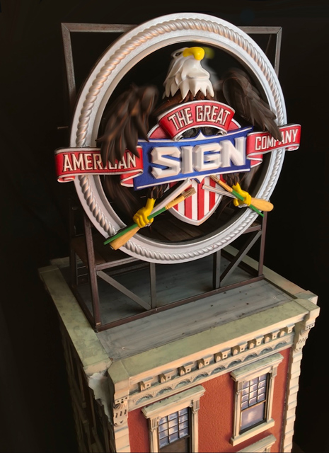
The mechanics required a lot of tinkering and improvising in order to get every part to operate smoothly and in unison. A little grease, oil, and candle wax—as well as a lot of luck—were important components.
Participating in this competition was a really fun and challenging learning experience. I came away with a basic knowledge of mechanics that I can apply to future projects and a kick-ass display for my showroom, along with a lot of great memories and people I had the pleasure of meeting along the way.
—Gary Johnson
Gary Johnson is the owner of The Great American Sign Company http://www.greatamericansign.net in Basking Ridge, New Jersey.
NOTE: This article originally appeared in the July 2018 issue of Sign Builder Illustrated magazine.


