The historical, retrofit West Side district of Cookeville, Tennessee hosts lots of shops, studios, and restaurants that are endowed with more creative and artist-driven aesthetic sensibilities. One of these is Acme Industrial Thinking, a fabrication studio/metal-woodworking shop that “pairs the latest in CNC mill technology with the individuality of hand-craftsmanship.”
Co-owned and operated by married couple Bob and Jen Rhea, Acme Industrial isn’t a “big box” shop; in fact, the two work on everything from custom signs to furniture to movie props to garage doors to anything else unique.
While the shop’s name takes inspiration from animated Looney Tune™ “Wile E. Coyote, Super Genius,” Acme Industrial’s real-world creations are the complete opposite of any engineered Road Runner disasters.
“We generally do ‘art’ or ‘boutique’ signs with dimensional elements,” explains Bob Rhea (pictured, left), noting they do no can signs and very little vinyl. “People come to us because they want something out of the ordinary—and we really don’t know how to do anything else.”
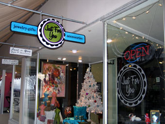
Take, for example, the multi-piece 18-by-44-inch dimensional sign Acme Industrial created for Just For You (JFY), a designer gift shop also located in the West Side district.
The owner of Just For You, Marcie Ferran, loved the exquisite building-mounted identification sign Acme Industrial had done for nearby interior design firm Lenhart Design Company. This sign featured a “classic, antique feel” that complemented the building’s architecture and lighting—complete with steel elements, matching paints, and fancy-script dimensional letters mounted off the sign panel via stand-offs.
 Ferran had been leaning a plain piece of Coroplast with a printed JFY logo decal in her window; however she wanted a fun, sculptural piece that could stand out from underneath an awning (and stand out from her neighbors’ signage).
So Ferran handed the Rheas her business card and a copy of her circular logo. “We immediately knew the space and height under the awning dictated a horizontal sign,” he says.
The owner also wanted to include her tagline (“jewelry, gifts, & accessories”) on the sign, so Rhea decided to add wings with this copy to the circular “Just For You” centerpiece.
Rhea checked out the store site to keep the sign consistent with branding. “I try to take in the environment as a whole, before we start doing colors,” he explains, “so I looked around at the signs already on the street and everything else in the environment. We didn’t want [the sign] blending in with the surrounding area. If there’s a lot of black, red, and green around, I didn’t want to make a red, black, and green sign.”
Rhea also took cues from the atmosphere and merchandise inside the store, as well as its Web site design. “[Ferran] said she wanted something unusual, ornate, and very colorful, and it was my job to make sure she got it,” he says.
Next Rhea created various color samples of the sign design in a proof for Ferran to review. She wanted to keep the turquoise, purple, and green colors as they appear in her logo, but Rhea convinced her to tone down and turn up some shades and combine some of the colors to make a sign that would really “pop” on the sidewalk. “We picked those colors based on impact and distance,” he explains. “Because of the surrounding visual clutter, I wanted her sign, no matter which end of the block you were at, to be the first thing your eye would notice.”
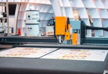
With the proof approved, Rhea turned to construction and his trusty ShopBot® PRSstandard CNC router. “The ShopBot affords me the use of digital tools that I was already trained on, coupled with efficiency, repeatability, and speed,” he says. “I can program the mill to drill alignment holes in all of my parts for a surgical fit [Ed. note: which he also did for this project]. My signs go together like a model kit, which speaks to my background.”
(Note: Rhea believes the key with any production tool is to push it to do things that most others aren’t doing, while at the same time not letting it replace your creativity. “We’re not doing anything super-complicated on paper, but when you put it all together, the results can be pretty amazing,” he says.)
Taking into consideration that this sign would be positioned under an awning, Rhea decided to use PVC for the black “Just For You” letters (placing them on aluminum stand-offs) and Extira® exterior treated panel for the remainder. “PVC cuts like butter on the CNC and renders a sharp, color-fast product,” says Rhea. “Extira is also easy to cut, but it’s also easy to paint and glue and is fairly stable outdoors. It was very cost-effective for this project.”
 Before cutting, Rhea first had to completely rebuild the JFY logo using the SolidWorks® CAD program. “The mill can be a finicky thing,” he says, “and when customers give us artwork, it’s generally not clean enough. If there are a bunch of little squiggly lines in the design, the CNC is also going to cut every single one of those little squiggly lines.”
After cleaning up the design, Rhea exported the image over to PartWorks CAD/CAM software, where he created all the text and verbiage for the sign and wrote the cutting program. He then sent this file to the ShopBot PRSstandard for clean, precise cutting.
Each side of the sign features nine pieces stacked up on one another, so Rhea stepped each of them. He first cut the background pieces, which took a little bit longer (and required a little more post-processing) because they feature the engraved words “Jewelry” and “Accessories.” Rhea then cut the structural base pieces next, then the frilly pieces, the cog gear designs, and the letters.
Acme Industrial applied five colors of paint to the pieces. To make it pop, they used high-gloss satin and flat Sherwin-Williams® A100 exterior-grade paints and XIM varnishing primers. (Note: For other jobs, they’ll also use TJ Ronan and 1-Shot paints, but never house paints.) “This was pretty time-consuming,” says Rhea, “because we had to let one layer dry before we could add the next layer.
Assembly of the individual sign pieces into a whole was made quicker by the milled locator holes. “A little gluing, a little welding, and it was complete!” states Rhea.
Rhea describes the “six-minute,” on-a-ladder, crack-of-dawn install of this sign as a “dream.” He used threaded rod “sandwiched” through the center of the sign and then utilized U brackets with the existing awning structure.
 “It’s located in a windy corridor, so I didn’t want to hang it from chains or anything that caused it to move around a lot and get mangled,” says Rhea. (Note: Since the sign weighs twenty-two pounds and because it was originally attached to a tubular awning frame, he later returned and installed a custom-made bracket to help support its weight.)
Because of the many different elements, Acme Industrial ended up working on building and installing this sign over a three-week period—a little longer than normal. “There was quite a bit of mill time for each of the parts, as well as the carving,” says Rhea. “Then because of the elaborate color scheme, we had to wait for the paints to dry.”
But in the end, Just For You now has a unique, one-of-a-kind sign that stands out and can be enjoyed (and noticed) by everyone!
Photos courtesy of Acme Industrial thinking.


