For most sign professionals involved with graphics, color is central to success. Incorrect printer output can cost a shop a job and tarnish its reputation.
But even if your shop has mastered the color management process, there are still a few things you need to be aware of that have evolved over the past year.
The first is the push towards a more gray balance focus with digital inkjet printing (G7, as the process is known).
“G7 has been around for a while, and it is gaining more traction in the wide format printing arena with more providers taking the time to become a Certified G7 Professional,” says Ray Weiss, digital imaging specialist for the Specialty Graphic Imaging Association (SGIA). “For those doing ‘brand’ printing, it is coming closer to a requirement.”
(Note: You can find out about the process of becoming G7 certified at the IDEAlliance Web site.)
Weiss adds, “The M1 Measurement Illumination Condition, found in ISO (International Organization for Standardization) 13655:2009 is also becoming more prevalent. M1 is designed to reduce variations in measurement results between instruments (spectrophotometers) that can be caused by fluorescence, either by optical brighteners in paper or fluorescence of the imaging colorants.”
We spoke further with Weiss to help shops better understand the important process of color management.
What advice do you have for print providers when it comes to color management in the printing process?
Ray Weiss: Process control is so important in color management. Taking the time to establish procedures to follow is the first step in this process. Even something as simple as printer maintenance and calibration (often overlooked) will make a big difference in your color management process.
Regular linearization of the printer, so that you’ll have a baseline to return to over time, is critical. You’ll need a spectrophotometer device for this, but it’s an investment that’s well worth it. Don’t try to evaluate color visually.
Understanding how spot colors are set up and managed with your RIP manufacturer is important; some have built-in PANTONE® libraries.
Lastly I would include some form of print verification in my procedures. Whether it’s to print a color bar on every print or to run an evaluation once a day, just to know that your printer is performing properly will ensure more accurate and repeatable color.
Tucanna’s RapidCheck and ColorMetrix’s ProofPass are two verification softwares that are offered by SGIA members, and each do a great job in giving feedback regarding the print condition of the output device.
Do you have any advice regarding document saving or manipulation?
I would suggest a Portable Document Format (PDF) workflow, if you aren’t already there. A PDF is designed to look identical on every platform (print, proofing, and online). ISO came out with ISO 32000-1:2008, which is a standard that is for the exchange and viewing of electronic documents.
It is important to note that there are now subsets of PDFs.
For the graphic technology/prepress industry, PDF/X (PDF for Exchange) is the one to focus on and specifically PDF/X-4, which supports color-managed, CMYK, gray, RGB, or spot color data along with transparency and layers.
The only caution with PDF/X-4 is that some RIPs don’t support it, and in those cases, I’ll back-save to PDF/X-3. However more and more RIPs are getting up to speed on PDF/X-4, so this will become unnecessary in the future.
What are the challenges involved with ensuring proper color management with an inkjet printer?
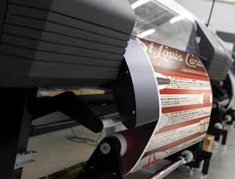
When you get into the inkjet arena, you open up a world of different ink sets—solvent, eco-solvent, UV, latex, aqueous, not to mention the world of dye-sub. There’s also a myriad of material choices—fabrics, vinyl, papers, backlit, etc.
Using solvent and eco-solvent inks brings heat into the equation. And with mercury arc lamps (still used by some UV printers), you need to factor in lamp temperature versus the newer LED lamps.
All of these options introduce variables that need to be controlled to ensure good color management across your devices.
What mistakes can shops make when it comes to color reproduction through inkjet printing, and how can they prevent them?
In the interest of space, I’ll focus on three of them:
(1.) Managing color at the output device as opposed to having good process control is a big mistake. There are a number of organizations that do just this—they ask their device operator to play with the color, or they have a dedicated prepress person doing “color matching.”
Managing color at the output device is a huge material- and time-waster and a disaster waiting to happen. Without a standard process, the likelihood of duplicating these efforts down the road is practically impossible.
Having a color-managed workflow where you control the variables and know what your printer is capable of producing will streamline this process and ensure that you’ll be able to hit the colors your printer can hit, time after time.
(2.) Viewing conditions or lighting is another mistake that is easy to fix, yet few take the time or effort to do it. Having a viewing booth or light wall will allow you and your customer to view the proof in the same lighting conditions.
If you have fluorescents in your shop area and the client is going to be displaying the print in a retail environment with different lighting (incandescents, for example), the likelihood that the print will look different is almost certain.
With some light booths, you can recreate different lighting conditions so that you and the client can view and approve the proof in lighting that’s a better match to where it’ll be displayed.
(3.) Understand the importance of targets or input/source profiles.
There are a few RIP manufacturers that still use SWOP (Specifications for Web Offset Publications). If the RIP is using SWOP, this target has a reduced gamut map as opposed to GRACol (General Requirements for Applications in Commercial Offset Lithography). Using a target with SWOP means that you’ll most likely be limiting the ability of your digital inkjet printer by mapping it to a smaller gamut, resulting in fewer available colors that you’ll be able to hit.
Remember when I talked about people trying to manually manipulate colors earlier? The reason some are doing this is because they’ve handicapped their printing device by selecting the wrong target. So they spend time and materials “tweaking” their colors and settings when they might easily hit the color they want if they had the right target selected.
And be sure to understand rendering intents (colorimetric, perceptual, saturation) and know what it means when you have one selected.

What advice do you have for making colors match the design proof when it comes to inkjet output?
This question goes back to having a process or standard and knowing what targets are being used. Knowing the reference print condition (was the proof made to SWOP or GRACol?) and the color space (did they use sRGB or Adobe RGB?)—or knowing whether either one was used at all—will at least get you on the path towards matching a proof.
If you know the reference print condition, you can set your printer up to match that print condition. (Note: See “Calibrating Platforms” sidebar on opposite page.) And if your printer has been color managed or even just gray balanced, then you have a good chance of matching the proof.
Any final thoughts?
If you don’t understand what is going on with your printer’s color management, take the time to become informed. You’ve invested a good deal of money in your digital inkjet device, why not invest some time and money in making sure you know how to get the most out of it?
And remember, color theory is just that—a theory. There will be differing opinions that guide RIP manufacturers in establishing what they determine are the best or ideal settings for managing the color on your digital inkjet device.
Don’t let that stop you from establishing a process or standard that works best for you. Having a process is half the battle, and having a process that you follow will put you ahead of the curve.
Color management is not some deep dark secret that only a few know about. It’s a process that, once understood, is relatively easy to put into practice for reliable, consistent, and repeatable color.
By Lori Shridhare
Photos (top to bottom): AP Photos/HP; Craftsmen Industries.


