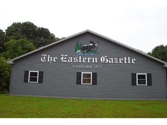
The Eastern Gazette newspaper had been operating out of an old warehouse in Dexter, Maine, for the past 160 years. However when ownership decided to recently relocate to a much-more-modern, two-story, freestanding building, instead of taking their old sign with them, they opted to invest in a more-stylish identity sign upgrade.
The solution: A brand-new 480-inch-wide sign package featuring twenty-seven-inch-tall prismatic letters carved out of one-and-a-half-inch-thick Precision Board HDU and bonded to 6mm Alupanel, as well as a router-cut moose wading in water. All the identity signage would be installed just above the first floor on the roadside portion of the building.
Eastern Gazette management turned to Tom Stade, a second-generation owner of one-man custom sign shop Moosehead Signs in nearby Greenville, Maine. Stade has long enjoyed carving dimensional signage—but doing so in ways that bring artistry back into the process that some might deem “lost” in today’s cookie-cutter sign world.
They sent Stade a copy of their font and moose logo to set up the template. Noticing that “Eastern Gazette” was employing an Olde English-type font, Stade suggested using prismatic letters, feeling this would make them stand out even more.
Since his father ran a sign business out of the glove box in his truck, Stade has also carried over some of these traits. He doesn’t spend a lot of time over-analyzing things during planning. “It’s always interesting how, all of a sudden, the right idea or technique of how to do something ‘pops’ into my head,” he says. Being basically a one-man operation, it does not take but a few jobs to keep him busy, customers typically aren’t always dropping by and distracting him.
And since Stade had developed a great reputation for his artistic and sign-making skills in the area, many of his clients don’t get too involved in the design process—trusting Stade’s design skills to come up with something that’s best for them.
However the supplied artwork and fonts weren’t clean nor were the thicknesses of the strokes consistent. So Stade restructured the visuals on his computer to make the finished lettering consistent and stronger. He then altered the graphics as needed in vector format and processed it out to his Gerber CNC router, adjusting the structure of the thinner strokes.
{2j_imageviewer 53}
One reason Stade used one-and-a-half-inch-thick HDU was because the wider strokes in some letters required this thickness. Yet since some of the strokes were so thin (some as little as 3/8-inch-wide), he programmed his router to leave a web on some of the fonts to provide stability when handling the letters.
He also came up with the idea of applying the HDU letters to black-painted Alupanel panels, also cut at a slightly larger size on the router. This added a clean outline and extra stability.
Meanwhile Stade router-cut the moose section and two separate ripples of water out of a piece of four-by-eight Alupanel.
For mounting, Stade used a marker to put dots onto the letters and moose where studs would be placed and drilled with a countersink bit. Then positioning the letters over a paper pattern made on his Graphtec FC5100 plotter, he marked the holes onto the installation pattern. Stade then slipped 18-8 flathead SS screws through and tightened the nuts onto the back.
After scuffing the Alupanel backboards with a Scotch-Brite™ pad and performing additional chiseling and sanding, Stade primed the HDU letters with Jay Cooke’s latex primer. He then applied Sherwin-Williams bonding primer to the Alupanel before applying the spray-painted latex colors.
{2j_imageviewer 54}
Stade latex-painted the Alupanel pieces black and masked and sprayed the different colors onto the carved moose panel using Gerbermask Ultra II (black printing on the liner). “Not only is latex paint durable,” he says, “but it dries quickly.”
Once he finished painting the white onto the HDU letters, Stade cut off the extra web supporting some of the letters and sharpened some of the radius corners.
He then traced the outline of the HDU letters onto the Alupanel backboard with a white Hydro Marker to guide placement. He applied high-performance Neoprene contact cement to the HDU and Alupanel for bonding.
Installation via ladders only took a couple of hours this past summer. Each of the letters was installed onto the building individually, as well as the moose and ripple water portions. While Stade was drilling the holes for HDU placement, he called on his brother Lynn to apply silicone to the back of the Alupanel for additional bonding. Lynn also helped out lifting up the letters and graphics to Tom.
The biggest project challenge: Stade had to delicately handle the letters due to their strokes being so super-thin in spots. “It wasn’t just setting them up on the router and cutting,” he explains. “I had to carefully handle them after removing them off the table [and] while hand-chiseling the transition the router leaves when going from thinner strokes to thicker, as well as certain corners.”
There were a few accidents where super-thin portions of the letters were broken, but Stade was able to glue them back together. In fact, when dealing with carving fonts of this style and putting them together, he recommends that experienced sign makers with really good skills here should probably attempt these more than novices.
Overall this project took about three weeks to draw up, build, and install, which was right in line with the schedule Stade gave his client. Stade always tries to stay within deadlines but he’s also upfront with them that since he’s a one-man shop, he may need an extra week or so. “If I see that I might be headed over-schedule, I’ll keep them up-to-date,” he says. “I might even send them a picture showing them where I’m at and let them know. My customers have been very good at accepting this.”
—Jeff Wooten


