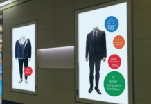
 An artistic form of dimensional signage is wayfinding, which allows for creative potential, movement, digital technology, and a sense of play incorporated into the environmental design.
Cima Network of Chalfont, Pennsylvania was founded by Keith Denny and Bill Lockett in 2008. While some companies experienced a downturn during this period, Denny and Lockett saw an opportunity to leverage their past successes for their new business plan.
Currently the company works on everything from channel letters and illuminated columns to directional signs and themed interior spaces. “We are always thinking about our audience and what type of impact our signs have on their overall experience while adhering to brand integrity,” says Ken Olschewske, director of wayfinding, whose sixteen years’ experience in planning and designing within the built environment continues to inform his work today.
When it comes to materials, Cima Network works with a versatile array of materials—metal, stone, plastics, fabrics, glass, and wood. “I feel it is important to not rule out any material when considering solutions for a client and to always be conscious of the environment in not only the materials chosen but with the processes we utilize,” says Olschewske.
The company always has its eye on new technologies that enter the market. Most importantly, it determines which clients would respond best to these add-ons and at which stage in their design plan they make sense for them. “We utilize digital displays, smartphone integration, and tools such as QR codes in some of our designs to give our audience the option of becoming an active participant or a passive viewer,” says Olschewske. “We want our signs and designs to display their immediate message, but we also want the experiences to resonate and endure far beyond the time they spend in a given space.”
As the possibilities for creative options increase for dimensional signage, they’ve expanded beyond their traditional roles as static forms.
In the past, they were manufactured solely to identify entrances, buildings, and rooms. Now, says Olschewske, the more modern spin is to use this type of signage to create destinations and experiences. “We try to leverage new and existing technologies, with our focus always on being economical, efficient, and eco-aware, all while delivering great quality products and solutions to our clients and their environments,” he says.
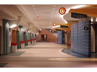
One example of the broad potential of this sign medium is a project Olschewske worked on for the Atlantic City Boardwalk Hall in New Jersey. The project involved a range of professionals who worked with the design team (including architects, historic preservationists, sculptors, interior designers, and civic officials). The goal: to transform the building into a state-of-the-art entertainment arena for shows, sporting events, and concerts.
{2j_imageviewer 26}
“The idea behind the project was to create a concept that was sensitive to the Hall’s historic environment, while still providing a unique visitor experience,” says Olschewske. “We designed wayfinding, themed retail, and identity signage that incorporated icons, custom fasteners, and nautical shapes with lighting elements that were playful but appropriate.”
Incorporating a blend of different acrylics, metals, paints, finishes, and lighting techniques was both a high point of the endeavor and one of its biggest challenges. “It was difficult to combine all of these elements together within a color palette that complemented the diverse historic colors and paintings throughout the hall’s architecture,” says Olschewske. “We needed to be sensitive to the architecture during installation.
Olschewske cites this project as an example of how strong collaboration at every stage of the process is critical to the overall success. “We were dealing with historic integrity in some areas and new construction in others,” he says. “The surfaces and materials we installed these signs into were just as diverse as the design process and materials.”
Two additional Cima Network clients that add to the spectrum of design and implementation considerations are Regal Cinemas and Pep Boys. There are unique challenges in handling national accounts that vary in visual complexity.
{2j_imageviewer 27}
Cima Network works closely with Regal Cinemas to create memorable destinations that are exciting for visitors. “Designing for the theater market allows us to push the creative envelope at every stage,” says Olschewske. “Regal’s goal is to have each theater reflect the community where it is located.”
The Cima Network design team works with architects and Regal’s signage team and marketing professionals to achieve this goal. “Most people think creativity is just happening at the design stage, but we feel it should be considered at every stage of a project,” says Olschewske. “Encouraging your team to explore different approaches to common solutions allows for opportunities to utilize newer technologies, methods, or formulas. Taking this stance lets us capture the spirit of both the brand and the destination in a coordinated way.”
Pep Boys is a great case study for how Cima Network adheres to a corporate structure that depends on visual consistency across a diverse set of building and location applications. “Having a solid infrastructure in place for managing the process from inception to completion with open lines of communication at every stage is absolutely essential,” says Olschewske.
Olschewske advises that it’s essential to utilize experienced fabricators and installers. “Even the most routine installations encounter problems, so having people in the field that are both knowledgeable and attentive to detail is critical,” he says. “Make sure your crew has a game plan before arriving on site: Know who is the point of contact, consider any site restrictions, prepare in advance for all local municipal codes, review accuracy of surveys, take before and after photos and make certain the client sees what you see when you take these photos.”
—Lori Shridhare


