 By Jeff Wooten
Sometimes sign makers also act as storytellers, particularly those who combine graphics and verbiage to inform. That’s the basis behind interpretive signage—to brand an attraction or exhibit and help the viewer better understand it.
With interpretive signs, the ability of a sign builder to effectively “show-and-tell” is crucial to a program’s success, as a few firms recently demonstrated out in the middle of the desert.
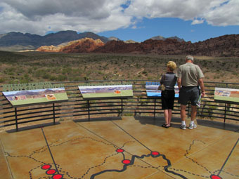
Red Rock Canyon is a national conservation area located near Las Vegas. The locale features natural geological wonders and a long-standing cultural history that’s enjoyed by its annual one million visitors—such as breathtaking rock formations and sandstone peak vistas, camp sites, hiking trails, horseback riding paths, etc. The Red Rock Canyon Visitor Center acts as the starting point for visitor orientation toward its miles and miles of activities, wildlife, vegetation, and history; however it was over twenty years old and outdated for the amount of visitation it was getting. So last year, the installation of nearly a thousand new pieces of interpretive signage not only updated the center’s look, but it improved its function as well.
Origin Story
The Bureau of Land Management (BLM) is in charge of providing Red Rock Canyon materials and services to the general public, and thanks to previous success collaborating on an interpretive signage project for a park in Wyoming, they again contacted Hilferty Museum Planning/Exhibit Design in Athens, Ohio about designing the interpretive signage for the center.
Hilferty is well versed with these types of projects. Since 1971, the company has used “meticulous workmanship, vivid communication, and faithfulness to a shared client-designer vision” to bring interpretation to life at museums, visitor centers, parks, and zoos.
 In conjunction with Line & Space Architects in Tucson, Arizona, the BLM explained its signage vision—everything from traditional reader rails to graphic panels and interactive pavilions to large sculptures. “Often shapes and configurations were envisioned to evoke subject matter,” says Sam Van Nostrand, a senior designer at Hilferty. “For example, the Earth sculpture we designed is comprised of folded, oversized graphics of different stone types fashioned sculpturally to create a walk-through environment that represents large Earth formations.
“Other times, graphics were composed and orchestrated to create and enhance shade structures, carve out programming spaces for large groups, frame and interpret views, or bind together desert habitat and garden spaces with learning environments. We even have some crawl-through experiences for the younger audience, where kids can learn more about desert burrows.”
According to Athena Sparks, assistant executive director of the Red Rock Canyon Interpretive Association, her organization sat down with Hilferty and requested an indoor-outdoor concept of panels and sculptures that would present a complete picture of Red Rock Canyon and encourage and inspire exploration. “So many people come through on a tour bus or as a windshield tourist and never leave the vehicle. We wanted to let them know what they could be experiencing,” she says. (Note: Sparks acted as technical advisor on this project from its beginning through completion.)
To accomplish this, Hilferty had to keep several design factors in mind:
Provoke discovery. “We wanted to let visitors get excited about the landscape and commit to finding out more about the environment—such as exploring the thirteen-mile loop and network of trails and sites around Red Rock Canyon,” says Van Nostrand.
Evoke the visceral qualities of the desert. “The interpretive themes and storyline had to shape the physical reality of the exhibit and its structures,” states Van Nostrand.
Engage the visitor’s keen desire to explore the beauty of nature. “Rather than recreate the desert, we needed to find artful ways to reveal what visitors may be surprised to find in this environment,” says Van Nostrand. “We wanted to mix literal and metaphorical constructs. For example, we have a realistic bronze sculpture of a Gila monster juxtaposed with an [artistic] sculptural representation.”
The signage was arranged into four themes based on the four elements: Earth, Air, Fire, and Water. “All the interpretive panels combine minimal text with a liberal use of dynamic illustrations and photography; this allows a wide range of visitors to grasp the subject matter intuitively,” explains Van Nostrand.
For example, a sign panel showing the image of an area lizard also features information about the animal, its lifestyle, and its habitat. “Activities, reveal panels, sliders, climb-through environments, and mechanical activities offer a wide variety of ways for visitors to learn more here,” says Van Nostrand.
 Material Considerations
When finished with its design work, Hilferty sent detailed contract documents and specifications to the BLM to turn into production-ready art. Then BLM forwarded these files to exhibit fabricator and installer H.B. Stubbs based in Warren, Michigan. (Note: H.B. Stubbs also boasts quite a history working with signage for zoos, aquariums, and visitor centers.)
Because of the wide variety of interpretive signage designed for Red Rock Canyon, H.B. Stubbs also recognized the need for a wide variety of installation methods. “Some panels are freestanding, while others are wall-mounted, attached to exhibits, or inserted into metal and powder-coated steel bases,” explains Business Development Executive Candi Baranski.
Since the Red Rock Canyon Visitor Center is located in the Mojave Desert and a majority of its interpretive graphics were to be installed in outdoor applications, H.B. Stubbs advised Hilferty to consider a material that would hold up to searing heat, huge windstorms, and penetrating sunshine in the summer and extreme conditions in the winter. They also needed materials that would prevent heat buildup on touchable surfaces and corrosive build-up on operable parts.
David Hancock at H.B. Stubbs suggested its long-time supplier iZone in Temple, Texas. “We specified a long-lasting, durable, and colorfast phenolic that would perform in the desert environment for the longevity of the permanent exhibition, and iZone met those qualifications,” says Van Nostrand. “We also chose perforated metal as a major material to allow air to cool the structures as much as possible.”
H.B. Stubbs developed all the digital files for the panels and uploaded them to iZone via an ftp site for production. “In the meantime, we began to manufacture of all of the bases that would hold the panels,” remarks Baranski.
David Glorioso, national sales manager for iZone, explains that it doesn’t matter how the art files are sent to his company (ftp site, CD-ROM, memory stick, etc.), it’s the resolution that’s most important. “The higher resolution we can get, then the better image that we can print and press,” he says. (Note: iZone also has plenty of experience in the field of interpretive signage, producing panels and graphics for museums, zoos, parks, hiking trails, and parking garages, to name a few.)
Basically iZone prints the graphic with water-based inks and lays and presses it via heat and pressure with environmentally friendly, 100-percent recycled paper (phenolic resin treated paper) as the core, turning it into a high-pressure laminate board (DHPL). Since iZone does everything in-house, this leads to excellent lead-and-delivery times for signage (usually inside of three weeks). “We don’t have to send graphics out to a third-party laminating service and wait for them to squeeze it into their cycles,” states Glorioso.
The art files sent to iZone not only featured the imagery for this project but also the special angle cuts that had to be performed. “We had to do a lot of pre-drilling and pre-threading of holes off the design cut files,” says Glorioso. “We were trimming and cutting here in Texas and then shipping to Las Vegas for installation, so we had to make sure the holes were precisely in the exact location the file designated, because [H.B. Stubbs] was going to attach it to the substrate, post, pedestal, etc.”
 Glorioso continues, “The bulk of the installation at Red Rock Canyon used 1/2-inch materials. However there were also some 3/4- and 1/4-inch boards created for this project.” (Note: For additional size specifications and handling details, visit www.izoneimaging.com.)
Glorioso explains that thickness size factors into a couple of considerations—such as a particular look or feel the designer wants to achieve or the available substrate mounting capabilities. “If the designer wanted to have a freestanding panel but not have any kind of framework around it (instead opting for concealed fasteners from the backside), we’d go with 1/2-inch or thicker,” he says. “But if they wanted a look that was framed in or had metal edges to hold something in, we’d go with the thinner material, because it’d be more cost-effective.”
iZone produces its panels with three finishes: matte (featuring a subtle, narrow grain structure), satin (which produces a high sheen), and ice (a very finely beaded texture that minimizes smudges and finger marks). They used matte and ice finishes for this project. “The interior and exterior graphics feature protective coatings. We also add UV inhibitors to protect against color fade for the exterior panels,” says Glorioso.
Overall iZone finished the multitude of panels about two months before their final installation. Delivery spanned an eight-week period, spread out over twenty-two shipments.
The Story Behind the Installation
H.B. Stubbs performed the installation in four phases over the course of nearly a year. “Initially it was scheduled to be completed over the course of one or two phases, but the general contractor kept pushing the deadline back,” remarks Baranski. “On a big project (such as this), you can typically expect delays.”
ADA compliance also played an important role. “The reader panels are sitting at a certain angle and at a certain height. This allows for knees in wheelchairs to be able to get up-close underneath them,” says Baranski. “We also had to make sure the corners were rounded and featured no sharp edges. Meanwhile the size of the fonts featured on the panels also had to follow ADA-compliance regulation.”
With all the different types of signage and pieces involved, Baranski delivers high praise of Hancock’s efforts to organize and manage this job. “[David] broke each component down into schedule parts, organized everything from the get-go as to who was going to do what and when, and monitored progress to make sure the project was always on-schedule,” she explains.
Since the firms involved were located in different parts of the country, Glorioso participated in email, one-on-one telephone conversations, and group conference calls with the others. “The number-one reason [for this communication] was to coordinate shipments to where the installers were in the process,” he says. “You didn’t want something getting put aside and lost or damaged just sitting there.”
 Concluding Statements
Baranski found the project’s goal of telling a story about the area, its geography, its culture, and its history fascinating. In similar-type projects, she suggests sign makers ask questions about the mission and the purpose of what the client wants to convey.
“There’s a myriad of decisions that have to be made before putting pen to paper to figure out what the interpretive signs are going to be about,” offers Baranski. “One important considerations is determining the level of aptitude of visitors the signage will be addressing. For example: Is the signage intended for use at a children’s museum or at an exhibition geared more toward adults?”
The interpretive panels and sculptures are playing an effective role in communicating the Red Rock Canyon story. “Visitors are extremely impressed with the finished project,” says Sparks. “They’ve never seen anything like it. They leave lots of positive feedback in the comment book we keep on-site.”


