Jim and Susie Taylor, the owners of Oscar’s Frozen Custard & Sandwiches casual dining restaurants, recently wanted to upgrade the older single-color, text-only electronic message center on their existing double-pole sign at one of their locations in West Allis, Wisconsin.
Through collaborations with sign makers and the community officials, the Taylors would end up with an iconic sign that not only acts as an area landmark but also serves as an example of how a sign ordinance can be successfully modified to favor a business.
Michael Dlugi, sales account manager at custom sign manufacturer and installer Sign Effectz, Inc. of Milwaukee, Wisconsin, discussed sign ideas with the Taylors, after learning from them that their message center had been experiencing service issues. “I learned that they also wanted the new sign to resemble their popular homemade-waffle cones,” he says, “which makes the most sense visually.”
So Dlugi visited the West Allis restaurant and took digital photos of the three-foot-tall cones mounted on the interior walls, drew an initial thumbnail sketch of the “waffle cone” sign, and returned to his design department with them.
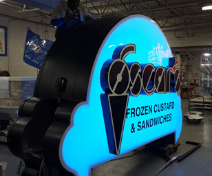
The dramatically improved twenty-two-and-a-half-foot-tall, double-sided custom pylon sign that Sign Effectz built for them features (in descending order):
- A five-inch-deep, #2283 Red Acrylic face-lit cherry formed with 0.063-inch-thick aluminum and painted PMS 485 C Red with internal light baffles;
- Three-inch-deep, 0.063-inch-thick aluminum “Oscar’s” channel letters with one-inch black trim cap and 0.125-thick #7328 White Acrylic faces with 3M™ 3630-22 Matte Black vinyl and 3M™ 3630-33 Red Translucent vinyl;
- A white, 0.177-inch-thick polycarbonate face resembling an ice cream scoop supported by a custom-routed aluminum retainer and internally illuminated with Ecolocity® Super Nova color-changing RGB LEDs;
- Non-illuminated “Frozen Custard & Sandwich” letters with 3M 3630-22 Matte Black vinyl applied to the first surface of the “scoop”;
- A 10-1/2-inch-deep cabinet featuring 1-by-1-by-0.125-inch-thick supporting aluminum tubes and 0.063-inch-thick aluminum returns painted with Matthews Paint Satin Black with custom-routed retainers;
- A Daktronics Model AF-3550-32×128-20-RGB-2V Galaxy® 20mm RGB Outdoor LED Matrix Display with a standard cabinet separation up to eighteen feet;
- A pole skirt resembling a waffle pattern formed with 3-by-3/8-inch-thick aluminum and painted Matthews Paint Gold Ochre and featuring a white LED strip between the waffle cone layers;
- An eight-inch-diameter steel pole set in concrete, three inches Below Grade with 5/8-inch rebar footing; and
- 120V Primary Electrical Connection to the existing power source.
In addition to doing a better job of identifying their product offerings, the Taylors wanted to use this new sign to also help reduce energy consumption compared to the dated standard sign cabinet they had been using. So Sign Effectz installed white SloanLED V-Series modules in the channel letter interiors and the light trough at the base of the sign and employed red LED modules inside the cherry. The 12V power supplies for the LED lighting are located in the pole cover.
Initially Oscar’s Custard wanted to use just the full-color EMC to announce their flavor of the day. However Sign Effectz convinced the owners to also employ color-changing LEDs inside the ice cream scoop cabinet to help identify this flavor.

Sign Effectz looked at the Oscar’s flavor menu and came up with a base of twelve colors, ranging from light purple to reds to blues to greens. “The colors are phased in-and-out on a rotating basis—whites for vanillas, browns for chocolate, reds for strawberry, and then the flavor of the day (green for mints, purples for raspberries, etc.),” says Dlugi.
This lighting system is based on a Wi-Fi system. The managers access an app on their phone or tablet to change the color component of the ice cream scoop.
Sign Effectz built the individual letters using an Accu-Bend, but they had to figure out how to mount channel letters to a color-changing acrylic face when the internal LEDs of the letters stay white.
They put stand-offs above the ice cream cone cabinet with plates and then sandwiched the acrylic face between the stand-off with the plate and the back of the letter. Those letters are anchored to the back of the ice cream cone cabinet rather than to the face.
In the end, the Taylors loved the EMC upgrade and sign design idea at West Allis so much that they had Sign Effectz build similar freestanding identity signs at their Brookfield and Franklin locations.
However there was a big obstacle that had to be addressed in the design stages before Sign Effectz could begin building anything: The nearly-twenty-three-foot-tall sign didn’t meet the city ordinances limiting sign heights to only ten feet.
Going in, Sign Effectz already knew about these height and square footage restrictions, so Dlugi pursued what it would take for variance requests at these other municipalities to build, install, and use these signs. “We kind of reverse-engineered it and said that, in order for these signs to be effective, the message center has to be this big and the letters have to be this high,” he says, “and let us design around that.
“What we ended up with was a twenty-two-and-a-half-foot-tall structure.”
Meeting with city officials, Dlugi stressed that they were going to create a “landmark” that would be linked to the city—and one that would be business-friendly by attracting customers not only for Oscar’s, but also the surrounding business community. “The new sign will help drive customers into the city,” he says. “These visitors will spend more money in the community and will support nearby businesses.”
One question the municipalities asked Dlugi was why couldn’t they cut off the sign to fit their height restrictions. He countered by asking them where they would do this. “Are you going to take it from the base? If so, it would just look squat,” says Dlugi. “Even they admitted that wouldn’t look right.”
When the city asked about shrinking the sign proportionately, Dlugi explained this would reduce the size of the sign so much that it would be a danger to drivers because they would have to slow down and/or stop to recognize what the sign was actually saying.
At a meeting with municipalities, Dlugi also brought up International Sign Association reports that talk about letter height and contrast. “Those explain that you need to get ten seconds of readability and visibility for a driver to execute a safe driving maneuver to turn into a business or exit a freeway,” he says. “So we weren’t creating something that’s just pretty and big, but we’re also trying to be safe in driving more traffic into the city.”
Dlugi credits the Taylors for being accommodating with the city’s lighting restrictions, in order to get the landmark sign they wanted.
However different municipalities had different standards.
While the Town of Brookfield allowed the additional height and square footage because of the iconic design and visibility concerns, the Town of West Allis’ unique sign code required architectural review boards to review signs that fall outside the standard sign criteria (creative design, unique properties, etc.) before granting exceptions. “We had to show them why this was creative and why it represented the business and what they did,” says Dlugi.
Amazingly the City of Franklin actually brought in the state attorney to rewrite the ordinance procedure so that the governing body could grant height exceptions via variance. “They realized that, in their actual ordinances, they allowed a grant up to a 20 percent increase in square footage via their variance, but there was no variance provision to allow for additional height,” says Dlugi.

All three signs almost follow the exact-same design. The City of Brookfield requested Sign Effectz eliminate the brick planter base used at the other two spots. “They wanted the cone to extend down the additional two-and-a-half feet, because the sign was going to be placed in a very small corner on the lot,” says Dlugi, “which they thought was overpowering aesthetically.”
Installation at each site took only a day. Sign Effectz shipped the sign to the site in pieces. They first removed the existing sign and then used their crane truck to drop down the base and anchor it in. They then dropped down the cone portion followed by the message center portion, the upper component of the ice cream itself, and, literally, the cherry on top.
“The city planning commissions appreciate how the unique design of the new sign [enhances] the restaurant’s business and attracts new customers,” says Dlugi. “Everyone involved with this landmark project is thrilled!”
By Jeff Wooten
All photos: Sign Effectz, Inc.


