Brad Manning Ford in DeKalb, Illinois is a family-owned automobile dealership that has been servicing the area for ninety-five years. They recently added a brand-new auto display showroom to their existing facility, and the current owners wanted to use this space to play up their family history within the business, as well as their dedication to the DeKalb area.
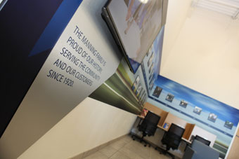
The result is Speeding Through Time, a massive, multi-component wall mural featuring a sixty-one-foot width of vinyl, Eifel grilling between posts, and reproductions of photographs of Manning Ford’s history and offerings.
Getting Up to Speed
The Manning family began this project by contacting Banner Up Signs, a sign production and installation shop in Sycamore, Illinois. Owner Jon Kuhn is very familiar with family businesses, as his father founded his company. He learned the family had only a history wall concept in mind but not much else.
Kuhn, in turn, reached out to OC Imageworks of DeKalb, Illinois, about getting involved in designing this high-speed project. (Note: Over the past four years, Banner Up Signs has partnered with OC Imageworks in printing, wrapping, and displays.)
In the early 2000s, OC Imageworks started out as a large format print company, but five years ago, they realized they could profit more by focusing on their expert design capabilities. So OC Imageworks then morphed strictly into creative services (including video production).
“Since our focus is project-based, we’re able to really dig into what our clients want in a design,” says Brian Oster, creative director, Concept and Project Management, at OC Imageworks. “We use our collective experience and knowledge to provide exactly what they need.
“Even if they don’t know what questions to ask, we provide the answers.”
Collaboration with a client throughout the entire design process is important for OC Imageworks.
“We never do cookie-cutter projects,” explains Oster. “Whether corporate or small business, educational or non-profit, we get to know our clients and their industry-unique challenges.”
Kuhn, Oster, and OC Imageworks Art Director Erin Nolan met with the Manning family, and it seemed each family member had their own vision of what they wanted.
Trying to arrive at a consensus solution amongst a large group with individual opinions can prove taxing. However Oster stresses that they allowed everyone’s input to be heard here.
“Then we proceeded to what’s achievable within their budget and timeframe in order to narrow down the possibilities of what we could do for them,” he says.
During pre-production, OC Imageworks follows a documented intake process that’s customized for each client. And on every project, no matter how large or small and whether video or design, they start discussions with their client on three topics—Audience, Distribution, and Purpose (ADP).
The ADP drives nearly every aspect of a project, such as: What colors to use? How large (or small) are the photos? What font will be used? What elements should be included?
“As we did a walk-through with the client, we took photos, as well as area measurements, to be used for the digital mock-ups we created using Photoshop® and Illustrator® CC,” says Nolan.
After finishing the ADP, OC Imageworks quickly reviewed comparable projects with the family.
“This told our creative team what the family liked and disliked regarding style, geometric shapes, lines, colors, patterns, depth, etc.,” says Oster. “We could have the most beautifully designed wall graphic or vehicle wrap, but if we choose a color that our client absolutely hates, it’ll be nearly impossible for them to review it without a bias, let alone approve it.”
They found that the Manning family all agreed they wanted a look that could be deemed “professional” and “fast.” They thought the use of the Ford Blue color throughout would make an immediate, eye-catching impact on a customer walking into their showroom.
They also wanted directional signage to make navigating their large showroom easier.
Finally the family requested wall art along with a history wall outlining the important dates from their business that has been passed down through four generations—the genesis for Speeding Through Time.
OC Imageworks reviewed comparable designs with the family that ranged from museum timelines to city histories.
“Although we didn’t really run into too many surprises along the way, our pre-production research and concept planning was intense, which is how we prefer to have it with every one of our projects,” says Oster. “We want to walk through all of the details on the front end with the client and any vendors involved, so nothing catches us off guard.
“No one likes making or paying for change requests, so we focus hard on pre-planning and pulling out all the information we need in Phase I and II of a project.”
Setting the Display in Motion
The Manning family gave them original antique photos of the family and their work, as well as newspaper articles of the dealership and their past advertisements for scanning. The best image from each decade was chosen for clarity and context. White gloves were used when handling the delicate pieces, and the scanner was cleaned thoroughly with microfiber fabric to create a dust-free scan.
“We scanned each piece at 600- to 1200-dpi, depending on their size,” says Nolan. “Smaller images were scanned at higher resolutions to allow for better print quality when enlarged. We also de-screened the newspaper images, in order to remove the halftone.
They then sent these EPS files to Banner Up Signs to produce this “timely” display.

Making a Trip Through Time
Speeding Through Time is made up of nineteen individual display panels. Banner Up Signs produced them using 6-mil (1/4-inch-thick) black PVC ranging in sizes from 10-by-10 inches to 10-by-16 inches.
The year line between the rows of photos was produced out of a total of four strips of 6-mil PVC.
“We combined the year strips and the history panels onto a four-by-eight-foot canvas size when printing,” says Kuhn. “We then mounted the print to the PVC and sent it through the table router to cut everything out.”
For the triangular portion on the far left of the display, Banner Up Signs utilized 3-mil (1/8-inch-thick) Alupanel solid-center composite aluminum purchased from Wensco Sign Supply.
“Due to the size of this piece and its shape, we knew we were going to need something pretty rigid and stable,” says Kuhn.
Banner Up printed the background graphic onto ORAJET® 3105HT with ORAGUARD® 290 Matte Laminate via their HP26500 Latex Printer. They printed this decal out in seven pieces with vertical seams and overlap. (Note: Overall 165 square feet of material was printed for the wall.)
“During installation, we constantly checked to make sure the decals were level and that the overlap was exact,” says Kuhn. “The most difficult part was applying the decal around a built-in desk in the wall.”
The date line and individual event panels were custom-routed from a four-by-eight-foot sheet of 6-mil black PVC panel with ORAJET® 3165RA digital media and ORAGUARD® 210 Matte PVC laminate applied to the face.
The PVC panels were attached to the printed background with one-inch 3M™ foam tape. Lines connecting these panels to the date line were created from black ORACAL® 951 film and applied directly to the ORAGUARD 290 laminate.
The multi-dimensional, angled “Our History” panel on the far left of the display complements a television set on the wall. Two sheets of 3-mil Alupanel (one in brushed silver and one in black) were fed through a flatbed router and cut to shape.
“In regards to the wording, we cut out the word ‘Our’ from scrap material, since it was its own dimensional item,” explains Kuhn. “Then we reverse-cut ‘History’ out of the main brushed shape.”
Two blue background decals were printed from ORAJET 3165RA with ORAGUARD 210 matte laminate and then applied to the routed triangle black pieces.
“The brushed silver panel was applied overtop the blue triangle with 3M VHB,” says Kuhn.
Banner Up Signs installed 12-mil black PVC cleats onto the back of the large triangle that line up with cleats anchored to the drywall.
“The display was cut precisely to fit around the television mount and simply hangs in place,” says Kuhn.
With a tight turnaround on this project, Banner Up Signs wanted to ensure the vinyl was adhering to its fullest potential within the first twenty-four hours.
They first wiped the PVC with a damp cloth to minimize the static and get rid of any large dust particles. They then washed the panel with a 90/10 mixture of Isopropyl Alcohol and water. This allowed for a dust-free surface in which to apply the laminated vinyl.
Employees squeegeed the decal using a crescent-shaped felt squeegee from Fellers. They then ran a heat gun over surface and did one last squeegee before sending it to the table router.

Bringing Everything Home
According to Oster, the tight deadline proved particularly challenging on this project.
“We had less than five days once the mock-up was approved by the Manning family to put this together and send to [Kuhn] to produce and install for the grand opening,” he says.
Meanwhile Kuhn cites working around the wall-mounted TV set as another challenge.
“There were so many wires behind the unit that we determined it would be more complicated to remove it,” he says. “Instead we decided to go around it. We measured twice and cut one and the display fit perfectly!”
In the end, not only were Brad Manning Ford and its customers at the grand reopening impressed with Speeding Through Time, but so too were the sign makers and designers.
“I enjoy that two local, family-owned businesses completed this project for another local, family-owned business,” says Nolan.
By Jeff Wooten
Photos: OC Imageworks


