Callahan’s was a family-owned hot dog restaurant in Fort Lee, New Jersey that started up back in 1950 and was, for the following decades, a primo destination that seemingly everyone in the surrounding Tri-State area had to visit. Thanks to their success, they even expanded to multiple locations over the years.
But eventually (and unfortunately), the family decided to shut down the last of its restaurants back in 2006, and that was that. Or was it?
Last year, the founder’s grandson, Daniel DeMiglio, realized a life-long dream to reopen Callahan’s—this time as a traveling food truck.
However the food truck concept ended up being so successful (long customer lines, frequent sell-outs, etc.) that DeMiglio knew the time was right to finally bring Callahan’s back as a storefront restaurant. So he leased vacant space in Norwood, New Jersey.
The Callahan’s catchphrase is “So Big! So Good!” Because of this, DeMiglio knew he was going to need the remodeled interior environment to reflect this motto as well.
Enter KDF Custom Graphics of Rockleigh, New Jersey. This highly creative sign shop is proud to dream up and build projects that other sign shops aren’t able to do.
DeMiglio met with KDF President Stephen Hoey about his interior signage needs and told him that he wanted to incorporate a feeling for the old Callahan’s while also reflecting that this was a brand-new Callahan’s.
KDF was already familiar with Callahan’s, since they had also created and installed DeMiglio’s food truck wrap. For it, Hoey’s wife, Nanette, designed a super-bright, super-fun wrap featuring historic photographs, the Callahan’s hot dog logo and tagline, and loud colors that reflected the original restaurant’s style.
DeMiglio’s initial thought was to just incorporate the same graphics that had been used on the truck inside the restaurant. But Hoey had bigger thoughts. “We wanted to do things that would blow people away when they walked in through his door,” he says.

So KDF ended up designing, building, and installing several types of cool, new retro signage: Timeline wall murals, 3-D lampposts and bottle caps, and the highlight—the recreation of the back end of a 1957 Chevy Bel Air.
Timeless Wall Murals
The design of the food truck wrap inspired the mural that’s found on all four walls of the new Callahan’s. This mix of vinyl and 3D signs and panels tells the story of Callahan’s in a timeline style from 1950 to today.
DeMiglio supplied Hoey with lots of old photographs of the original hot dog restaurant, as well as shots of his grandfather. “We scanned the old pictures and enlarged them in our design program,” says Hoey. “We also made certain to highlight a few key years that were important to the Callahan’s history (its opening in 1950, its closing in 2006, its reopening as a food truck last year, etc.).”
KDF printed the images onto 3M™ Scotchcal™ Graphic Films with Comply™ Adhesive IJ35C-10 vinyl material via its Mutoh printer. They used a matte laminate throughout to prevent any glare.
Some elements of the mural are actually a half-inch off the wall. “We printed those graphics onto the face of black PVC using a flatbed printer and then cut them out and attached them to the wall,” says Hoey.
Also featured on the wall that patrons see as they enter (and as part of the mural) is a 3D version of the restaurant’s hot dog logo and lettering, as well as a miniature version of the wrapped food truck bursting off the sign panel.
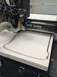
The hot dog piece and sign panel were cut out of fifteen-pound Precision Board™ HDU using its MultiCam 3000 CNC router and then painted with bright colors. KDF crafted the miniature food truck out of Precision Board by creating a relief for it using the 3D model program and router-cutting it.
They printed the original wrap design at a smaller scale and attached it. The letters, hot dog, and food truck were then glued to the painted sign blank.
Nostalgic Street Sign
During the initial site-survey discussions at the then-empty storefront location, DeMiglio mentioned to Hoey how important Palisades Avenue was to the original Callahan’s. (Note: This was the address for the first restaurant.) He wanted a section of the mural to feature this street name.
However DeMiglio was only thinking 2D. “I knew it would look cooler coming out of the wall,” says Hoey, “so we came up with the idea of fabricating a full-scale lamp post and attaching it to the wall instead.”
KDF router-cut the Palisades Avenue sign out of fifteen-pound Precision Board and its sign frame and the lamp post out of Dibond®.

They employed the flatbed printer to direct-print the “distressed” look onto the panel. To further enhance the distressed appearance, they used steel wool to scratch up the sign frame and lamp post and painted them using Modern Masters Steel Metallic (and Modern Masters Silver on top of this for highlights).
Retro Bottle Caps
Hoey also notes that DeMiglio was fixated on the soft drink bottle caps that were a mainstay at the original Callahan’s. So he suggested creating larger-sized versions for the wall as well.
The two drinks most associated with Callahan’s were YooHoo® and Pepsi®, so the KDF team researched the logos featured on these bottle caps during the late ’50s/early ’60s time period and recreated them using design software.
On their MultiCam 3000, KDF cut the bottle cap shapes out of 1-1/2-inch Precision Board. They then painted these modified blanks with Modern Masters Silver paint and finished by flatbed-printing the retro logos onto these painted bottle caps.
They populated white LED modules along the inside perimeter of the back of the bottle caps. They poked a wire through the wall to attach the LEDs to the power supply on the other side.
Next KDF added a Dibond plate with a keyhole cut into it to the back of the caps. This helped them easily hang these caps to the screws on the wall (and make them easy to move around later, if desired). The bottle caps stand about an inch off the wall, which creates a nice highlight effect with the LEDs.
Classic Chevy Bel Air
Speaking of bottle caps, the crème de la crème of the new Callahan’s has to be the recreation of the back end of a ’57 Chevy Bel Air positioned over a drink cooler. Its bumper houses a bottle cap opener.
DeMiglio’s original vision consisted of just a bumper mounted to the wall alongside some other chrome components and brake lights he had purchased. But to make this prop really stand out, Hoey knew he was going to have to put the pedal to the metal.
KDF decided to create an entire back body to match the bumper and the lights.

Designers downloaded a 3D model of this car and sized it to try to get it to fit as perfectly as possible within the bumper.
But the model wasn’t exact. “The bumper fit but the lighting parts that come up the back of the fin weren’t even close to fitting properly,” laughs Hoey. “So either the 3D model was off or some of the aftermarket parts were.”
KDF Business Development Manager Brian Hamilton ended up sanding and Bondo®-ing the parts, reshaping them until everything fit properly.
In order to disperse the weight between the car and its components, KDF built the car body as two separate metal pieces.
Hamilton welded a frame inside the car, while KDF mounted a separate frame to the wall for the top of the car and a steel beam at the bottom to mount the welds coming out of the bumper.
KDF painted the car body using Modern Masters Candy Apple Red Metallic. “We experimented,” says Hoey. “While the Metallic looks a little darker than Bright Red, it more resembles an automotive paint job,” explains Hoey.
KDF swapped out the real bulbs in the brake lights with red LED modules. They also used LEDs to highlight the custom-made HDU license plate. “And we placed a string of LEDs along the bottom of the car,” says Hoey, “so as you’re removing the bottle cap, you’re looking down at a nice glow of blue on the top of the cooler.”
The finished car piece weighs about 175 pounds. Surprisingly this back end is actually pinned to the wall instead of screwed.
“There’s a pin that goes right through from the top steel frame to the bottom steel frame, pinning the two together,” explains Hoey. “If they’d ever want to take it off the wall (for whatever reason), they pull one pin and the entire piece comes off.”
More on the Menu
The new Callahan’s storefront reopened this past April, and patrons are relishing the great food, the great memories, and the great signage. Other cool pieces that KDF created and installed include:
• Weathered “Callahan’s” channel letters. These appear as if they’ve been pulled off the original building. KDF painted them with Modern Masters Metallic and stud-mounted them to the main timeline wall mural.
• A 106-by-20-inch menu board. This was made from an MDF piece and black chalkboard paint. KDF flatbed-printed the graphics on top of it with a “vintage” gas station-style menu board made from PVC.
• A seven-by-seven-foot cut-vinyl sign. This graphic featuring the Callahan’s name and a hot dog and was applied to the inside wall of the kitchen.
By Jeff Wooten
All photos: KDF Custom Graphics.


