 Jeff Wooten
When it comes to channel letter projects, LED is a prominent item on the lighting component menu list. Whether used for retrofits or new installations, sign makers are finding red-hot opportunities with this technology.
In fact, for one recent application, the end-result was absolutely en fuego!
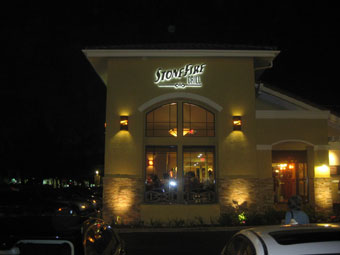
The Stonefire Grill is a unique, fast-casual establishment that currently boasts five locations across California. Although they’re a fairly new chain-type restaurant, they lean more toward the upper-scale side.
Earlier this year, the owners were preparing to open up a new location at a prominent shopping plaza in Thousand Oaks, California. But thanks to a disappointing experience with the visibility and effectiveness of its signage at another spot in Pasadena, they knew properly designed and illuminated identity signage needed to be a top priority.
The owners contacted Vogue Sign Company, a long-time business based in Oxnard, California. “We’d also worked on a lot of the other signs in that plaza, so we have a good reputation in the area,” says Regional Sales Manager Kirk Hamilton.
The Stonefire Grill owners brought their frustration with its Pasadena signage (performed by another manufacturer) to Vogue Sign’s attention and requested a solution that would generate good visibility. They thought a good starting point would be to incorporate the “blazing, on-fire” font they use in all their advertisements.
Vogue Sign drafted some sketches involving a red-yellowish flame effect and worked up ideas of incorporating them into building- and monument-mounted channel letters. Once approving this plan, the Stonefire Grill provided them with their font design in a vector format for manipulation.
As mentioned previously, Vogue Sign had already manufactured some of the plaza’s other signage and was already familiar with the shopping center’s sign criteria concerning what could—and could not—be used. “We spent a little more time in the design process to make sure that their new signage would provide the visibility they were looking for while, at the same time, giving them a unique ‘flame’ effect that would stay within the guidelines dictated by the plaza,” says Hamilton.
The plaza strictly states that any wall-mounted signs have to be reverse pan halo-lit letters. They also have an allowance on the total square feet of signage for the frontage of the building that can be created and installed (with the monument also included in this figure).
And it just wasn’t the plaza regulations that the Stonefire Grill and Vogue Sign had to follow; the City of Thousand Oaks prohibits the use of transparent faces on a monument. “Once we understood what Stonefire wanted and what the plaza and city officials would allow, the design was pretty straight-forward,” says Hamilton.
Vogue Sign came up with the solution of offering push-through letters and a stylized bottom border using 3/4-inch acrylic to create a face-lit, halo effect on the monument. The letters spell out the restaurant’s name and (on the monument) the phrase “a fresh approach to family dining.”
The “Stonefire” letters featured on the building façade are twenty-three inches tall, while the “Grill” letters are twelve inches tall; meanwhile on the monument, “Stonefire” measures fifteen inches tall and “Grill” twelve inches tall.
The main concern was being able to create the desired flame effect on the letters. The “S” features a jagged edge, so that it appears as if flames are coming off the top. Vogue Sign figured using multi-color LEDs would work best in enhancing this effect. Their initial instinct was that red and amber LEDs would create a better fire look than employing just one color. The sign company decided to provide a sample to the Stonefire Grill demonstrating how the LEDs would achieve this appearance. Vogue Sign used its waterjet to cut out a smaller, flat “S.” “Basically we put together a couple of little pieces with a background effect, so I could show them what the red and amber LEDs would look like together,” says Hamilton. “Since we were going to attempt to mix colors, this would be more difficult to do with neon.”
Vogue Sign soon learned with the sample that, although red and amber provided a nice effect, it was a bit too subtle. With Stonefire Grill still smarting from visibility issues at its Pasadena location, the sign makers opted to use white LEDs instead, since these would make the letters show up more.
Since fabricating a reverse pan letter with the intricacies of a flame wasn’t viable, Vogue Sign designed basic letter shapes out of aluminum with an oversized waterjet cutter. To create the flame style, they elected not to use a trim cap nor a return on the edge of the letters; in fact, it was slightly oversized.
Vogue Sign attached SloanLED Mini White modules to the backs of the pan letters using 3M™ VHB™ tape. (Note: Practicality and effectiveness dictated the use of standard fluorescents for the monument, so to create the red-yellow flame effect here, they applied 3M™ Scotchcal™ graphic film vinyl.)
Since the prior tenant’s monument was still standing, Vogue Sign decided to use the existing mounting posts and footings. “We manufactured an aluminum frame with .090-inch aluminum faces, in which to attach the 3/4-inch clear acrylic push-through letters,” says Hamilton.
It took a full day for the two-man Vogue Sign crew to install the building and monument letters. (Note: A bucket truck was employed to attach the letters to the building façade.)
By working with the building contractor ahead of time, Vogue Sign was able to simplify the installation process by having access doors installed behind the sign. “This allowed our installation crew easy access to the backside of the wall for electrical hookups and mounting hardware,” says Hamilton, noting that the power supplies were attached to a nearby J box. “It will also simplify any future maintenance of the sign.”
Probably Vogue Sign’s biggest challenge was getting the sign manufactured and installed inside the customer’s already-tight timeline before a scheduled pre-opening press preview. The company had to “prioritize” its in-house manufacturing personnel and installation crews. “Keep in mind that we needed to get renderings and production drawings finished, have it approved by the city, and get everything up and running. And getting approval from the city is no easy feat,” says Hamilton. Still Vogue Sign Company was able to finish everything on time.
Reaction to the finished signs has been positive—and has further solidified the Stonefire Grill’s faith in signage after its Pasadena setback. “The owners are very happy with their new signage,” confirms Hamilton. “Even the City of Thousand Oaks has expressed their pleasure with the new [letters].”
Photos courtesy of Vogue Sign Company.


