The annual Sign Invitational competition invites sign makers to submit proposals of dimensional signs following a certain theme for entry, with the best-of-the-best selected to participate (“Quite a Contraption,” July 2016). Since this year’s contest was going to be held in Las Vegas, event organizers—James Dawson, owner/creative director of Synergy Sign & Graphics in Strasburg, Ohio, and Dan Sawatzky, owner of Imagination Corporation in Chilliwack, British Columbia—decided “magic” would be the ideal theme (think David Copperfield and Criss Angel).
Each creation had to fit inside a specific build envelope (24 inches long-by-24 inches wide-by-72 inches tall) and be built in two sections—the sign sculpture and the shipping crate base beneath it. Each sign had to have the words “sign” and/or “magic” integrated in it in some fashion.
There was no limitation to tools or substrates used. Motion was prohibited in last year’s entries, however that restriction was waived this year. Electric/battery power could even be integrated into the creation—which led to some amazing entries!
In addition to sculptures from Dawson and Sawatzky, other pieces included Peter Sawatzky (Imagination Corporation); Doug Haffner (Haffner’s Fantastic Creations of Wyoming, Illinois); Aubrey Gealsha (Synergy Sign & Graphics); Douglas Hancock (Sign Pro in Alachua, Florida); and Janey Freid (Atlas Signs and Plaques of Lake Mills, Wisconsin).
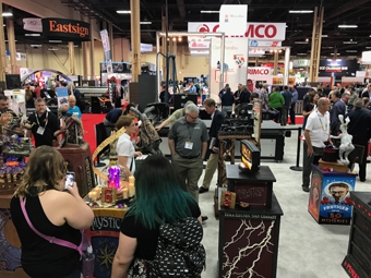
Like last year, the event was held in the MultiCam USA booth at ISA International Sign Expo. (Note: MultiCam USA, Coastal Enterprises, SAi EnRoute, and Laird Plastics were some of this year’s sponsors.)
After more than 900 votes were cast by show attendees, only twenty-five votes differentiated First and Second Place.
First Place: Magic Train—Dan Sawatzky. As the contest approached, Sawatzky thought about his early days in the industry painting historical murals.
“I often heard people marveling how these giant images seemed to come right off the walls, even though they were flat,” he explains. “I used every trick in the book to make that illusion of dimension through perspective happen through my work. It is real ‘magic.’”
{2j_imageviewer 99}
Many of these murals featured Sawatzky’s favorite subject—steam trains. “I thought it would be fun to have a sign painter painting a mural with the steam train busting through the billboard,” he says, noting that the sign painter featured in the bosun’s chair was inspired by a painting by one of his favorite artists, Norman Rockwell.
Frames were built from plasma-cut and welded steel. The train was routed out of thirty-pound Precision Board HDU using a MultiCam CNC. All the paints and glazes were hand-brushed acrylic.
Sawatzky found the vertical build envelope particularly challenging as there wasn’t much space at all. He also had to consider the piece not only surviving a long trip but also the many guests at the show handling and touching it.
“The key here was to build a strong internal structure of steel,” he says. “All the detail was hand-sculpted using Abracadabra Sculpting Epoxy, which is extremely tough.”
According to Sawatzky, the key to completing a world-class piece of this size and detail is to start early and work on it a few minutes on a very regular basis. “I would sneak five or ten minutes to design a file, cut some pieces, or do a little welding and sculpting,” he says. “Those few stolen minutes each day really add up in a hurry!”
Second Place: Tesla Electric Sign Company—Douglas Hancock. Hancock didn’t want to do a typical “rabbit-out-a-hat” sculpt, so he explored different “magic” ideas.
Wanting to keep his piece tied into the sign industry, Hancock thought about inventor Nikola Tesla. “He invented wireless induction lighting, which is pretty direct to our industry,” he says, “so we started thinking about ways of demonstrating that.”
Someone at his shop tossed out the idea of levitating a sign with no wire attachments. “We all thought it was a great idea, but then you have to figure out how to do that,” laughs Hancock.
He researched some new methods that had been developed over the last couple of years to balance an object over the top of a magnetic field and found a way to execute something within the appropriate size and scale for the contest.
The top floating portion of the sign is made from fifteen-pound HDU. Its faces are made from 316 acrylic. It also features 23k gold leaf, LED string and puck lights, and acrylic paints. The two-piece base was made out of PALIGHT® PVC.
“We chose paint colors and textures that would provide the look of iron and rust to achieve an 1800s look,” says Hancock, who also came up with a backstory and Web site (www.teslaelectricsigncompany.com) for the Tesla sign shop. “Given the choice between gold paint and gold leaf, we think Tesla would have chosen the gold leaf every time.”
Bas relief designs were pulled from actual Nikola Tesla patent diagrams, fed through software, and routed out on a CAMaster Stinger II.
Keeping the weight as low as possible was important, so that meant milling the HDU material very thin. “There was a lot of double-sided machining and a lot of interesting toolpaths to get us what we needed weight-wise,” says Hancock.
Hancock nested a magnetic levitation unit and a magnetic ring underneath the base of the sign that repels the HDU sign up top.
Through the process, Hancock learned they couldn’t wirelessly light the sign because the magnetic field wasn’t strong enough to transmit enough power the distance they needed.
“Had we increased the power, it would’ve done harm to credit cards and pacemakers nearby,” he says, noting that they opted instead to use battery power.
The levitating sign is currently hovering in his storefront showroom. “We’re using it to show what’s possible for customers,” says Hancock, “and if someone wants to buy it, they can.”
Third Place: Poe’s BBQ Pit and Pendulum—Jim Dawson. Dawson had come up with the idea for the Poe’s BBQ Pit and Pendulum mash-up sign during discussions with his designer awhile back as a lark, so he figured the Invitational would be an ideal time to finally follow up on this.
Dawson carved everything from thirty-pound Precision Board, while a few elements were created via Smooth-On Free-Form Habitat epoxy clay. “We also used a fair amount of 1/8-inch steel that we plasma-cut,” he says.
A 12v reduction motor placed on the top powers the swinging sign, which is powered from the same power supply running the 12v LEDs on the piece. “It was a super-slow 5rpm motor made for remote control cars,” explains Dawson.
The actual pendulum was just weighted and mounted on a sealed bearing. “We push it so that it undulates back-and-forth for twenty minutes, before needing to be pushed again,” says Dawson.
A big challenge was being able to generate smoke for it. “We didn’t want anything that would dissipate quickly, but with the Invitational in a show hall, we also didn’t want something that would bring the fire marshal over,” says Dawson.
Their solution: an ultra-sonic fountain piece that generates water vapor instead of smoke.
Conclusion
Next year’s contest theme will be “Marvelous Machine,” and it will be held at ISA International Sign Expo in Orlando, Florida in March. The build envelope will remain the same, and movement and special effects will still be permitted. You can even include your shop’s name in the piece.
If interested, visit thesigninvitational.com and click the “Apply Now” button on the home page to submit portfolio pieces. These will all be reviewed before invites are sent out in early August.
“The whole reason we’re doing this is so that shops can show people what they do,” says Dawson.
“We have a huge passion to see this event grow, in order to inspire and encourage even more creativity in the sign industry,” says Sawatzky.
—Jeff Wooten


