

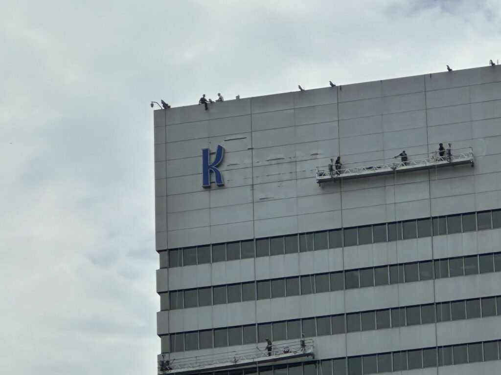
Kroger, one of the nation’s largest grocery chains, is switching up the branding at its downtown Cincinnati headquarters. Kroger’s Director of Storytelling and Visual Communications Sayer Crompton recently shared on LinkedIn that this will only be the second time the company has updated its branding on the prominent Cincinnati skyscraper since the 1950s.
Photos from Crompton’s LinkedIn post show workers removing the former signage from the building.
Crompton thanked Ann Baker, VP and Senior Relationship Manager at Nashville-based signage company Cummings Resources, as well as David Overberg of Overberg Construction Inc. and Chris Richter of Kroger Real Estate Development for making the new sign project a reality.
The revitalized signage will feature a new blue shopping cart to the left of the blue “Kroger” letters. Named the “Fresh Cart” icon, the graphic combines two of Kroger’s core principles, “innovation and fresh,” according to the company.
Cincinnati WCPO reports the actual design of the new cart icon was created using the curve of the logo’s letter “K” and looks like a citrus wedge to signify the nation’s largest supermarket chain’s commitment to freshness.
“It’s not every day that we get to change an iconic part of Cincinnati’s skyline…” writes Crompton. “Keep an eye out over the next month for our FRESH and bold new logo and signage being installed that will be visible from absolutely anywhere in the city!”


