The small town of Durango, Colorado is a four-season destination for visitors interested in everything from outdoor sports and nature hikes to arts and events. The area’s largest airport—and the first thing most see when arriving in Durango—is the Durango La Plata County Airport (DRO).
This rural, regional airport serves the Four Corners area of southwestern Colorado, northwestern New Mexico, northeastern Arizona, and southeastern Utah. Unfortunately the airport itself had a drab look and feel that didn’t provide travelers with a great first impression or a true representation of the uniqueness and beauty of the area.
I approached the management at the Durango Airport in October 2009 to inquire about the possibility of our FASTSIGNS® shop fulfilling the airport’s visual communications needs instead of Clear Channel when the contract was up for renewal. In April of 2010, after multiple meetings and presentations, the airport released the project for bid, and I was given the chance to submit a proposal. In July of 2010, we were awarded a five-year contract for a marketing initiative intended to create a visual communications program that would engage, educate, and entertain airport visitors.
Specifically, the program needed to accomplish three goals:
* Create a more aesthetically pleasing experience for airport visitors;
* Promote and position the regional area in a positive manner; and
* Improve economic growth for businesses in the community.
Taking control of the airport image on October 1, we were under a tight deadline to have everything completed and running within six weeks, due to the seasonal rush that comes every year with the Christmas holiday and snow skiing. In addition to the tight timeline, we had to overcome a couple of key challenges.
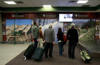
The first was determining the best way to reenergize the atmosphere and add personality to an aging airport with low ceilings, dim lighting, and unusual foot traffic (see photo below).

The airport required a clean, streamlined feel, and although they wanted digital signage, they didn’t want a visually overwhelming look—nothing too “Vegas.” The idea was that having a “product” that appealed to visitors would then, in turn, increase advertising revenue from local businesses.
So the second challenge was educating the local business community about the changes being made at the airport, the value of digital signage, and the reason why they should become advertisers. During the prior three years, advertising at the airport had been declining. While some of the decline could be attributed to the sluggish economy, the majority was due to unattractive advertising fees, limited advertising venues, and a lack of community interest.
When our FASTSIGNS was awarded the project, twenty-two advertisers were under contract with the airport. Advertising options then included various-size non-LED backlit signs (see photo below) and rack card display boxes for printed materials.
In a short period of time, my team and I had to determine how to redesign the airport advertising layout from the various 36-by-48-inch non-LED backlit displays to our new, more updated vision for the airport. We had to determine what displays, players, and software to use and how to best manage the process.
Choosing the equipment and software was the easiest aspect, thanks to the partnership FASTSIGNS International, Inc., has with NEC and Scala. Due to this partnership, my team and I were able to focus on the actual cornerstone implementation and layout of the project: a four-display digital screen bank, large wall murals, and an LED backlit display.
The contract with the airport required that the Advertising Concessionaire (FASTSIGNS) cover the cost of the infrastructure that would generate revenue, while the airport would provide the power, the lights, and the network. In total, FASTSIGNS spent $60,000 on infrastructure: $45,000 in digital display hardware and software, and $15,000 for custom-built display cases and backlit signage. Advertisers were responsible for covering the cost of their monthly advertising fee.
This advertising program needed to be profitable for us—covering the cost of equipment and the minimum annual guarantee to the airport—while remaining affordable to our small resort town advertisers.
Like most airports, DRO sees high levels of foot traffic and activity. But for a place that’s the first stop for many before being surrounded by art and nature, it was no longer looking the part. This is why we decided to make the look and feel of the airport coordinate with the look and feel of the town.
 Our first step was to remove all of the non-LED backlit displays and the white wallpaper from the walls. We designed and produced nine floor-to-ceiling wall murals to replace them. The murals visually highlight the pillars of our local economy: ski resorts, training, our historic hotel, our children’s museum, the regional hospital, the tourism office, the local social media company, and our local university.
Using the murals as the backdrop, we installed video banks that use four digital screens acting as one large dynamic screen in the baggage claim and departure areas. Advertising on these video banks was open to any advertiser.
We integrated fifty-two-inch digital displays into two wall murals dedicated to those specific advertisers and one into a wall mural that we created as a home living wall (which was open to advertisers focused on anything to do with the home). We also installed a forty-six-inch digital display above the custom-built rack card display case as an upgrade option for advertisers to display a seven-second static image highlighting their business. (Note: Advertisers were responsible for covering the cost of their wall mural.)
 Our contract with the airport holds us responsible not only for updating the look and feel of their visual communications but also for managing the content. So installing the wall murals and digital signs was just the first step for us. We also had to sell and manage all of the advertising shown on the digital sign system.
When putting the advertising program together, we made sure it would have elements and budget options for all types of businesses interested in reaching an airport traveler. Starting with marketing collateral for the rack card displays, we created pricing packages that also included static ads on the digital signs above the rack card displays, packages for those who wanted to be included within the wall murals, and packages for those interested in advertising on the digital display banks.
To provide everyone with an equal opportunity for purchasing advertising, we sent the pricing packages to all of the vertical markets (restaurants, hotels, retail, etc.) at the same time. From there, we followed up with phone calls, making sure the deadline would give us enough time for everything to “go live” prior to the busy winter season.
Knowing that we would have reoccurring revenue from this project, we began investigating how to properly handle the accounts receivable activity involved. We were able to tweak our point-of-sale system to track the reoccurring revenue and established a relationship with our credit card processor that allows us to set up automatic debts to customer credit cards. Through this system, advertisers are able to pay us monthly for their specific package. This allows us to better handle the high volume of transactions each month, and reduce the confusion and administrative costs that come with that type of accounts receivable activity.
Now more than a year after program launch, we have tripled the number of advertisers. Visitors are now more aesthetically informed about the Four Corners area, and advertisers appreciate the exposure this new program has brought them. This project has also opened up other areas of opportunity for us, which we continue to pursue.
Laurie Sigillito owns and operates FASTSIGNS in Durango, Colorado, and will be participating at Digital Signage Expo 2012 being held March 6-9 in Las Vegas, Nevada.


