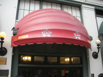
As commercial real estate development continues its emphasis on pedestrian-scale mixed-use projects, retail businesses must consider their signage needs in locations that often don’t accommodate freestanding signs. In these places, awnings and other traditional sign forms represent an increasingly important tool available to the creative designer and sign company.
But several additional challenges arise with this opportunity.
For example, many municipal sign codes are ill-suited for businesses that require visibility but use an awning as their primary signage. And then some sign designers don’t always fully consider the unique obstacles and opportunities presented in awning projects.
In this article, I’ll discuss four unique awning issues to be aware of here.
Adding an Awning
In some buildings (especially multi-story office buildings), awning placement is specified as part of the site plan required to be filed with the municipal permitting office. In these instances, adding an awning, changing the color, or applying signage to a specific surface other than as previously designated could require an amendment to the approved site plan.
Modifying an awning may be considered a change in the building’s architecture. In Arlington County, Virginia’s pre-2012 regulations said that amending an approved master site plan could require an application fee of several thousand dollars—and that’s just to file.
To their credit, County staff identified the code’s inflexibility and limited creativity in a presentation delivered at the 2012 American Planning Association (APA) conference. The new regulations, which passed in June 2012, greatly simplify this process and now allow for staff approval.
Measuring the Awning Sign Area
Last year, the International Sign Association (ISA) developed a Web video, along with supporting materials, to explain the limitations of certain methods that are used to measure sign area (“Measuring Sign Area”).
Many cities measure the area of a sign by drawing a rectangular box around the outer edges of any copy or logo. Others utilize a more accurate method.

For example, Baltimore, Maryland measures “the entire area within a single continuous perimeter enclosing the extreme limits of writing, representation, emblem, flag, device, or other figure of similar character, together with any frame or other material or color forming an integral part of the display or used to differentiate the sign from the background against which it is placed.” Baltimore’s method doesn’t punish the use of arched text or offset logos.
Additionally some cities base their allowable awning signage on a percentage of the area of the larger background. Indianapolis restricts awning signs to 45 percent of the area of the awning, which is further defined as “limited only to the area of the awning or canopy which contains the graphics or sign.” That distinction is crucial, because it may exclude the valence, face, and/or side panels from the calculation.
Restriction on Location of the Message
Sometimes awning signs are subject to regulations that appear illogical and confusing. Most often, this occurs when the overall regulations are a combination of a citywide ordinance (written by planners) and overlay regulations (maybe written by a historic preservationist).
An example of this phenomenon can be seen in the Georgetown neighborhood of Washington, DC. Much of Georgetown is regulated by Historic Preservation overlay guidelines, because it’s a historic neighborhood with very narrow streets and buildings over 250 years old.
Generally businesses here are encouraged to use hanging or blade signs mounted 90° from the building front and perpendicular to primarily pedestrian traffic. But awnings (retractable shed-style only) may not have signage on their sides (which can project out only sixty inches). Instead all signage must be placed on the front valance—with letter height no larger than twelve inches.
The overall effect of these mismatched Georgetown regulations is that the preferred hanging signs are visible to approaching pedestrians, while awning signage (including street numbers) is parallel to approaching traffic and can only be seen as the viewer is in front of or passes the business.
Illumination of Awnings
Some cities disapprove of the aesthetic appearance of backlit awnings, often believing that it transforms the entire building into signage.
In Minneapolis, the City discourages backlit awnings by applying a penalty to the area calculation: “When signs are incorporated into awnings, canopies, and marquees, the sign area shall be determined by computing the area of an imaginary rectangle drawn around the sign. Backlit awnings and canopies, with or without signage, shall be considered a sign and shall be included in the calculation of total permitted building sign area.”
In Indianapolis, the City specifies a minimum distance from residential uses or historic areas: “Illuminated awning or canopy signs shall be located at least six hundred (600) feet from a protected district.”
Other cities (such as Jonesboro, Tennessee) prohibit illuminated awnings entirely. The preferred means of lighting is where “the fixture shall be designed, fitted, and aimed to place the light output onto and not beyond the sign.”

This means that, if a business wants to illuminate its awning sign, gooseneck lamps must be installed. While this easily can be accomplished from an engineering and design perspective, the result may present interesting challenges for relamping and maintenance without the use of a bucket truck.
Conclusion
Awning signs present several unique challenges based on their treatment in the municipal sign ordinance. Depending on the specific rules, using them as part of a corporate identity program may be discouraged.
But understanding how to examine the ordinance will help you design an awning sign that best serves retail and business customers.
Kenny Peskin is State & Local Government Affairs Manager at ISA, and works full-time assisting member sign companies with local regulations and developing improved sign ordinances.


