The Prairie Stone Center in Fargo, North Dakota opened in 2014 and has not only generated buzz for the stylish housings of its twenty restaurants and retailers, but its brand-new, colossal 24-by-24-foot pylon sign featuring acrylic stucco and EIFS stone finish is attracting its own amount of buzz.
The centerpiece of this sign are two 16mm full-color RGB Watchfire electronic message center displays encapsulated within both sides of the pylon columns. They feature a very narrow pixel pitch that allows items featured on it to appear in lifelike high-resolution.
The sign is situated on one corner of the 61,000-square-foot Prairie Stone Center property along a wall traveled road, so to say that it’s getting noticed may be the understatement of the year.
The initial sign company responsible for this stunning achievement is full-service Indigo Signworks, with headquarters in Fargo, North Dakota and offices throughout the Upper Midwest.
Indigo Signworks had a prior relationship with the retail center developer, so they were already familiar with what the sign shop could do for them when it came to custom signage and EMCs.
In fact, the sign company were brought onboard to brainstorm sign design ideas that would draw attention along that busy roadway. Indigo Signworks started out developing a logo sign—with the idea of putting some letters over the entryway.
“However they told us that they wanted something with a little more exposure,” says Greg Nelson, lead designer at Indigo Signworks. “They thought an electronic message center (EMC) would give better exposure to all the businesses at the shopping center.
“We didn’t want the finished sign to look too gaudy. We thought it would look best simplified with a main emphasis on the EMC.”
Another design request from the owners was that the finished pylon sign also tie into and complement the architecture of the surrounding on-premise buildings so that it wouldn’t look out of place.
Sales Manager Jill Gustofson began the project by taking some photos of the site, so Nelson could match up the pylon sign columns, base, and caps with the existing building appearances.
“We also surveyed the spot where the sign was going to be installed to make sure it was far enough away from the street and that we were under the maximum height according to the city ordinance,” says Gustofson. (Note: Indigo Signworks also didn’t want the sign to take away from the shopping center itself, nor block the stores or the tenants.)
Before deciding on the double columns, Nelson played around with several other designs. “We tinkered with a single pole design at one point to see if that type would fit in better, but it turned out to be too high for the shopping design,” says Gustofson.
Nelson created the vector artwork for the sign using Gerber Omega Composer software. He then exported this file into Illustrator and cleaned it up. He imported this sign design into Photoshop where he added the stone overlay work via clipping maps and other assorted tricks.
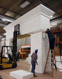
To match the stonework of the surrounding buildings, Indigo Signworks knew expanded polystyrene would work best. One of the reasons for using this lighter weight material here is because it’s easy to hand-sculpt and hand-finish in order to mimic the stone-like appearance of the surrounding buildings.
“Expanded polystyrene fits well with doing it on-site in a turnkey application because it can all be done in an interior controlled environment and brought to the site and easily installed in sections,” says Jeff Douglas, Engineering/Estimating at Indigo Signworks. “So it’s visually striking and helps the budgetary process.”
Douglas devised a wind load analysis for the surface of the sign area and developed a plan for the sign to stand on a two-column structure encased within the polystyrene base. Indigo Signworks then proceeded to build the steel framework that would host the expanded polystyrene columns.
Meanwhile since Indigo Signworks had already contacted wholesale sign supplier Signs By Benchmark during the initial design phase of the sign—mainly to see what would work for something this large—they reached out to them to handle the expanded polystyrene portion of the project.
Signs By Benchmark has enjoyed a long and healthy relationship with Indigo Signworks, having worked with them on approximately 140 projects over the last seven years.
“Obviously not all of the projects we work with them on are to this scale, but they do surprise us with some pretty intricate designs,” says Jamie Kakacek, Design/Estimating for Signs By Benchmark. “It keeps us on our toes, and we wouldn’t have it any other way!”
Signs By Benchmark studied the high-quality digital photos of the building exterior that were taken by Gustafson, including those holding paint sample swatches against various stone colors.
Because of its size, Signs By Benchmark built the expanded polystyrene sign in three sections with two horizontal seams on it.
“The hardest part of the whole process was to make sure that the stone seam on the sign matched up to the next adjoining section,” says Kakacek. “This required quite a bit of shaping and exaggerating certain areas so the natural seam wouldn’t stick out after the installation.”
“The friendly nature of the stone design itself also made the seams relatively invisible,” says Douglas.
Signs By Benchmark painted the entire sign using a 100 percent stucco finish.
The pylon base and cap were finished in acrylic stucco to match building finishes. The EIFS stone body of the sign was hand-carved and then painted to replicate the multi-color existing stone.
Meanwhile, to facilitate the installation, Signs By Benchmark created pick points in the top of the sign.
For later ease of EMC insertion, Signs By Benchmark built electrical access channels into the sign. “We worked pretty closely with the sales and production team at Indigo to make sure any wire chases for the EMC were large enough and in the proper place,” says Kakacek. “Since the installation of these signs can either make or break the success of any project, we try very hard to think ahead to avoid any potential problems.”
The entire sign was then encased in Signs By Benchmark’s signature hardcoat, ensuring long-term durability in adverse weather conditions.
“We had to be very conscience of our shipping capabilities during the entire process,” says Kakacek, noting that, due to their proximity, they shipped the pieces back to Indigo Signworks on their truck. “Luckily we had some natural break points in the sign, and this allowed for easier handling without compromising the overall aesthetics.”
The “Prairie Stone Center” letters are made from 304 stainless steel alloy. “They’re vertically brushed to basically scatter the light on the face in a very pleasing, decorative, jewelery-like manner,” explains Douglas, noting that the alloy used here does not require paint.
Aluminum studs were placed in the backs of the letters, and they were pushed through into the foam background and secured with adhesives.
For the EMC, Indigo Signworks built a steel angle frame that transfers the wind load to the surrounding eight-by-eight-foot steel columns.
The Watchfire EMC display features nutsers on the back of it, which aided in installation. The display also featured side anchors that helped in sign attachment through the encapsulated foam.
The EMC followed everything that had been written in the code. “All electronic signs in Fargo have to be equipped with auto dimming features in order to be installed,” says Tom Nelson, vice president of Indigo Signworks. (Note: The power going to the sign is located in a cavity within the structure.)
Indigo Signworks dug footings and installed the steel column framework first. Next they used their seventy-foot crane truck to lift and stack the pieces in place over these columns.
Indigo Signworks not only provided the new EMC sign, but they also programmed the display for the Prairie Stone Center owners. “We manage the sign for them on a monthly basis to make sure the content is up-to-date,” says Gustofson. “They provide us with the content and information they want to feature, and we make sure it looks nice up there.”
Currently there are plans down the road to provide a forty-foot-long expanded polystyrene wall that replicates the Prairie Stone Center name and complements the towering pylon sign.
Kakacek credits the talented artists on their staff for helping them make their projects look pretty easy to accomplish. “Without them, none of this would’ve been possible,” he says.
He also thinks that working with Indigo attributed to the success of this project. “Over the years, we’ve developed quite an understanding with each other,” says Kakacek. “Having that open communication between two companies really does help the process and, ultimately, creates a better end-product that everyone can be proud of.”
By Jeff Wooten
Photos: Indigo Signworks, Signs by Benchmark, Indigo Signworks


