 Jeff Wooten
Combine a slightly tipsy-looking moose head prop with dimensional sign fabrication techniques, and you’re sure to have a “talk-of-the-tavern” identification signage perfect for display. Just ask sign maker Gary Johnson, who recently designed and built such a sign for the Tipsy Moose Tavern.
However you won’t find this particular sculpture hanging on any of this establishment’s walls. In fact, no such tavern exists.
Instead said-piece hangs in the showroom lobby of Johnson’s shop—and it’s a prime example of how one can create sign samples for in-house use that will capture the attention of customers and translate into new work orders.
Johnson has long been attracted to the art of sign making. After graduating from Rutgers University with a degree in Communications back in the 1980s, he acquired his first taste of the sign industry after being hired as an art director for a full-service sign company in New Jersey. In 1990, Johnson wanted to extend his creative sign impulses even further, so he founded The Great American Sign Company in Basking Ridge, New Jersey, which he still owns and operates to this day.
His award-winning designs can be found in a variety of environments: local train stations, the Brooklyn Federal Courthouse, the U.S. Mission to the United Nations, offices of Senators and Congressmen, and the halls of many nearby universities (such as Fairleigh Dickinson and Centenary College).
Call of the Wild
Recently Johnson attended one of Dan Sawatzky’s Sign Sculpture Workshops held at Sawatzky’s shop in Yarrow, British Columbia that focused on the creative aspects of 3-D signage. It was here that he learned about the power of sign samples. “[Sawatzky] likes to emphasize, ‘If you build it, they will come,’” says Johnson. “A customer walking through your door doesn’t have any idea of your capabilities until you show them.”
Sawatzky challenged his attendees to commit themselves to creating at least one great sign a year solely for their own showroom. Looking around, Johnson noticed lots of Sawatzky’s hand-carved or router-cut sample work hanging around the shop and backing this sentiment up. Even though there may seem to be time constraints when working on sign samples for personal display, Sawatzky taught Johnson that this can actually involve as little as a few minutes of devotion each day.
Upon returning home, Johnson decided to create a carved moose head sign for use as his in-shop sample. Why a moose? Johnson credits fellow Sawatzky Sign Sculpture Workshop attendee, Janey Freid of Atlas Signs in Lake Mills, Wisconsin.
Freid had been admiring a moose head Sawatzky crafted for Moose Mountain Adventure Golf and challenged the other attendees to find out who could design and sculpt the best moose head before the end of the workshop. Johnson developed a stylized moose head paperweight, but since everyone else came up with some great designs, no official winner was selected.
The moose head design he’d come up with for this challenge still intrigued Johnson, and he kept remembering Sawatzky’s encouragement to create samples to show clients what he could do. “Customers come to us because they need our creativity and our expertise,” says Johnson. “How many times does someone walk into your shop because they saw another sign that they liked on a storefront or saw something on a Web site or in a magazine?
“How many times does a customer point at something and say, ‘I want something like that?’”
A Concoction of Sign Design
Studying the slightly intoxicated-looking moose head design he had come up with, Johnson thought this imagery would work well for use as a sign for a bar-type establishment. After searching via Google for inspiration, he came up with the name “Loose Moose Pub” then decided on “Thirsty Moose Pub.”
But wait a second! “Didn’t you write earlier that the finished dimensional sign sample was for the ‘Tipsy Moose Tavern’?” I hear you asking. “What’s this ‘Thirsty Moose Pub?’” Relax! We’re getting there.
 Initially Johnson’s idea called for mounting the moose head onto an oak-type sign panel that would feature the “Thirsty Moose” name. He also toyed around with mounting beer cans on top of the moose’s antlers (similar to novelty beer can hats).
Johnson started conceptualizing these designs on his computer. Soon the beer can antlers and oak panel sign morphed into a mini-wine barrel around the neck. He then realized that featuring the pub’s name instead on a ribbon encircling the moose’s head would be more eye-catching (and more readable).
Johnson recollected the ribbon that surrounded MGM Studio’s Leo the Lion mascot, so he searched for this image via Google for use as a template.
After importing the Leo the Lion ribbon graphic into his design software, he realized he needed to come up with a new name that would be roughly the same length as the moose head and fit onto the ribbon. The solution: Tipsy Moose Tavern. (See, I told you we’d get there.)
Building the Beast from Scratch
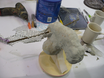
Johnson began by roughly jigsawing a profile shape of the moose’s head out of some scrap thirty-pound Precision Board™ HDU he had lying around his shop. He then built up the dimensional shape of the head using aluminum foil and sculpted the outer shell out of Magic Sculpt Epoxy Putty.
Johnson used EnRoute Software and his Gerber D-200 CNC router to cut the ribbon out of PVC. (Note: Instead of fabricating the ribbon out of more expensive metal, he decided that, since this was a prototype, he would use PVC.)
Johnson marked where he needed to bend the PVC ribbon so that this section would fit comfortably around the antlers. “I formed these bends freehand using a heat gun,” he explains.
For the “Tipsy Moose Tavern” lettering featured on the ribbon, Johnson cut out black vinyl letters on his plotter and used them as a guide for cutting them out of HDU later with a saw.
Johnson’s original idea was to paint the ribbon with Modern Masters Iron Paint and “rust” it with a Rust Activator. “The ribbon took on a nice, leathery quality, but the lettering was then difficult to read, because the moose head was brown,” he says.
 Recognizing the ribbon needed to “pop,” Johnson sanded it down some more and applied gold leaf to it. This proved to be just the right fix.
Again relying on EnRoute software and his CNC router, Johnson carved the barrel that would hang around the moose’s neck out of HDU. He originally cut the piece out in two halves, but they ended up being less than exact halves.
The solution: Johnson sandwiched HDU filler in the middle and adhered the pieces together with Gorilla Glue™. “I also hand-carved the lines of the planks, adding definition with a little brown latex stain,” he says.
Johnson next enhanced the belts around the barrel and added the rings for the collar with Magic Sculpt Epoxy Putty. “Because the HDU was already close to the color of the wood, I clear-coated it with West System Epoxy,” he explains. “It finished off nicely. The filler piece being a darker tan just added to the effect.” (Note: Johnson also upgraded the barrel’s chain instead to manila rope.)
On the sides of the barrel, Johnson decided to add the name “Moose Valley Vinyards” to fit the moose-theme even more. He output these letters as a clear decal using his Gerber Edge FX thermal transfer printer.
Johnson then hand-cut the letters, attached them to the barrel sides, and sanded them to blend in with the surrounding wood grain appearance. “I also added ‘Moose Juice’ to the front of the barrel by cutting black vinyl letters on my plotter and sanding them enough to blend in with the barrel,” he says.
Not Stuffed But Mounted
To give the moose head sign a more traditional look, Johnson mounted it onto a shield-shaped panel of cherry MDF he had cut out and then attached that panel onto a dark mahogany rectangle. This allowed him to mount the ribbon away from the antlers (and give more separation in the final appearance). “I Velcroed it to mounting blocks, so there would be no visible hardware,” says Johnson.
Johnson mounted the moose head to the panel via a keyhole. Meanwhile the shield and dark mahogany panels were mounted with cleats. “Everything is easily removable from the wall, so I can show any potential customers how a sign like this can be mounted, constructed, maintained, and renovated, if necessary,” explains Johnson.
The cleats also allow Johnson to fasten the sign to studs that aren’t dead center. “The entire sign weighs fifteen pounds, but since anything can happen, I glued the cleats to the MDF and reinforced it with screws that I pre-drilled,” he explains. “I then filled the holes with Gorilla Glue.”
 This sign puts Johnson at the “head” of the class when it comes to showing customers his capabilities. You might call this one a real “moose-terpiece.”
All photos courtesy of Gary Johnson.


