What technology can marry the classic style of a United States national historic landmark with the efficiency and elegance of twenty-first century lighting? LED lighting.
Flexible LED products are allowing designers to explore fluid, organic shapes and intricate, precise patterns that allow for precise lettering and signage design.
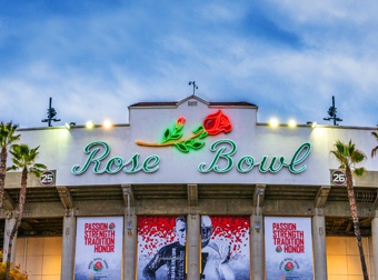
When the famous Rose Bowl in Pasadena, California underwent the first renovation for its main sign at the North entrance in fifty years, LED lighting was chosen.
The retrofit brought the words “Rose Bowl,” along with the design of the rose itself, into a modern, yet traditional look, while allowing significant savings in energy use.
The Rose Bowl sign renovation, completed last year, stands 30 feet tall-by-77 feet wide and features Vivid S RGB modules and LED Neon Flex offered by boutique LED lighting company Green LED Lighting Solutions (GLLS) of Las Vegas.
“With this project, it was very important to have the measurements as accurate as possible,” says Russell Fougere, Web and media developer for GLLS. “We also had to ensure that the color change was synchronized in certain areas.
“When working on a project as important as the Rose Bowl sign—or any project really—it is important to communicate with the client during the entire process regarding any potential issues or challenges that arise or any decisions that must be made prior to finalizing the project.”
Co-owned by Derek Breneol and Michael Burton, GLLS was founded in 2007 and opened a warehouse and headquarters In Las Vegas in 2009. Architectural lighting is the company’s “bread and butter.”
Thirty-five percent of its business is directed to signage, 40 percent to exterior lighting (building outlines, landscape lighting, and accent lighting), and 25 percent to interior lighting (backlighting displays and lightboxes, shelf lighting, and cove lighting). Meanwhile a smaller segment of their business is dedicated to art installations.
Though relatively small, the company has been privileged to work on several high-profile clients in addition to the Rose Bowl, including Disney, Universal Studios, the Solomon R. Guggenheim Museum in New York City, the Green Bay Packers Hall of Fame, Belmont Park oceanfront amusement park in San Diego, and the TopGolf Las Vegas complex at the MGM Grand Hotel and Casino.
For the Rose Bowl project, they incorporated movement through sequencing for a more dynamic display by integrating DMX512 control, which is standard for digital communication networks that are commonly used to control stage lighting and effects. “This allows for chasing sequences, which is an absolute head-turner in the sign industry,” says Fougere.
Another milestone was matching specific PANTONE colors using the RAL50 chart, which in the early days of LED lighting, was not possible. “This is important for companies to keep the color of their exterior signage consistent with their brand’s color palette,” says Fougere.
The Flat Iron Skyline
GLLS maintains a balance of supporting large brands and partnering with cutting-edge lighting designers.
Recently the company took part in a New York City installation called Flat Iron Skyline with the lighting design firm LOT.
At a median in the Flatiron District, a public installation was created to entice the public to enjoy the lighting while using the hammocks that were made available to them. The hammocks were hung from large metal arches that integrated GLLS’s Vivid Wave LED product so they could be illuminated at night.
“The fixture selected by the lighting designers has built-in lighting temperature control, which allowed them to change the temperature from warmer whites of 2700K in the early evening to cooler whites of 5000K throughout the night,” says Fougere. “‘Warm’ whites typically means a cozier, subtle effect, while upwards towards 5000K ‘cool’ whites is more akin to daylight.”
Choosing a Color Temperature
One of the company’s recent projects was to provide light panels for all Best Buy stores to backlight display retail signage for Microsoft.
Whether you’re using an LED light panel as your sole source of light or to create visual appeal, you’ll want to consider color temperature. Color temperature refers to where the color falls on the Kelvin spectrum between blue and red. Blue temperatures are cooler with higher Kelvin ratings while red temperatures are warmer.
And there’s a right time to use color of a specific range.
According to Fougere, who maintains blogs at www.glls.com/blog-2, when you buy LED light panels, you’ll typically want natural light, if you’re using the lights indoors where many people will be reading (and especially if there is no source of natural light available). “This is around the 5500K ranges,” he says.
If you want to promote a relaxed atmosphere for your staff and clients, even warmer light in the range of 2000K might be preferable. “Restaurants, for example, are among the type of businesses who want to keep customers relaxed,” says Fougere. “The right shade of blue, however, also has a calming effect and might be more appropriate when you’re using LED light panels as decoration rather than the main light source.”
According to Fougere, cooler white or blue lights are often better if you’re showcasing a product or want to provide brighter light in cramped spaces. “When you mount LED light panels under cabinets to light up the space between the cabinet and tabletop below, a warm light temperature might not cut it,” he says.
Furthermore, according to Fougere, cool lights offer stark contrast, especially when paired with black or white backgrounds. “It can create a contemporary environment in which to display products or even art without distraction,” he says. “On the other hand, the blue glare from a computer screen can cause eye strain and headaches, which is one reason you might consider installing software on your computer to adjust color temperature based on the time of day.”
If you plan to take photographs or recording videos in a space with LED panels, then color balance becomes important to recreate the setting accurately.
“Photographers have long used physical color gels on the light source to correct color balance issues, while digital image processing enables you to adjust your photos as well,” says Fougere. “Starting with a balanced color temperature enables you to take photos that have fewer shadows and aren’t washed out or orange.
“Light in a range between 3000K and 4000K tends to be balanced, without showing either blue or orange hues. Of course, you might use warm colors at one time and cool tones at others to get the right results.”
Conclusion
One of the things central to GLLS’s business goals is a commitment to staying ahead of the curve.
This means continued partnerships with lighting designers to experiment with new designs and the latest upgrades in technology.
“To this end, we’ve recently joined the International Association of Lighting Designers as we believe in constant innovation,” says Fougere, “and the lighting design community has never shied away from pushing boundaries.”
By Lori Shridhare
Photo: Green LED Lighting Solutions


