“If you want to be a full-service sign company, you need to understand donor signage,” says Jim Vitous, owner of Custom Designs Signs in Keene, New Hampshire.
Vitous believes donor signs are a type of signage that every shop can capitalize on, since opportunities for these projects are everywhere. “Every town has some sort of cause that’s going to need a donor wall—whether it’s the hospital, an animal shelter, or a local shopping center that wants to do something for children’s charities,” he says.
Springfield Hospital
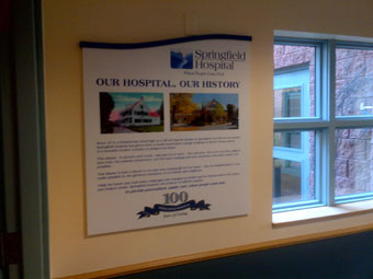
In fact, Vitous recently created a seven-panel donor wall celebrating the donors and one hundred years of caring at a small-town hospital in Springfield, Vermont. The typical donation was about $200 to $250, and when portions of all the donations were put aside for this project, it totaled about $1,000 per panel. “So it was a wall that we had to work almost to a budget, but be tasteful,” he says.
Vitous came up with the design for the panels himself, settling on a simple look that reflects the area. “There’s a river that flows through the center of the town that’s been part of the industrial heritage, and there are seven waterfalls that go through the town,” he says. “So we made seven panels that went through seven stages of the history of the hospital.” (Note: To further reflect the seven waterfalls, the panels also feature a slope cut into the tops.)
The decision was made to place the panels in a quiet hallway where patients stay for longer-term care. These patients enjoy the donor wall while taking walks and receiving visitors.

Custom Designs started the work by gathering all the verbiage and images for the project and working on the layout for each of the seven panels. The shop typically outsources graphic design work like this but made an exception here, in order to keep the project on budget.
When the graphics and text were laid out for the panels, Custom Designs sent the files to its supplier, AMI Graphics, who took some of the older, one hundred-year-old photographs and converted them to high-resolution files.
AMI then printed the files onto 3/4-inch-thick Sintra® panels using a large format HP flatbed printer with UV inks; the UV-cure inks eliminated the need for any lamination. “A direct print onto the panel was very cost-effective,” says Vitous, noting that, after printing, the Sintra panels were then cut to shape on a CNC router.
Brooks School
For the Brooks School in Massachusetts, Jim Vitous of Custom Designs Signs was tasked with designing a wall dedicated to the donors of the new $4 million science center. The wall was located in a lobby where people would gather for events and the display would be in plain view.
On this particular project, Vitous had to carry out the school’s design vision, which included using the wood from two hundred-year-old Elm trees that were cut down to make room for the new center.
But the wood was not the easiest substrate to work with. “It was so dimensionally unstable and wouldn’t take a stain—it was not our choice,” says Vitous. “I told them this stuff is going to split in a year, and they said, ‘You know what, we want that.’
“Because the school itself has a 120-year heritage, they had some hand-carved stuff there that was already that old, so it really blended in.”
The wood panels were all different sizes, with the size determined by the donation amount. The smallest panel was 8-by-48 inches and one of the largest (with information about the donor wall) was 3-by-7 feet long and weighed 85 to 100 pounds.
The different-sized panels were interspersed and stretched twenty-six feet high up on the wall. When determining letter height, Vitous had to make sure viewers could not only read the panels closest to view but also the smallest panel at the top of the wall. This distance away also dictated the size of the smallest panel, since larger text would need to fit on the panel.
To ensure everything on the display was legible, Vitous created mock-ups, which he then put on the wall. “A mock up goes a long way,” he says. “It’s usually a minimal investment for the sign guy, but often it’s a part of a fundraising display.
“It galvanizes the relationship and makes sure they won’t shop around.”
With everything sized, Vitous V-carved the names into the wood panels using his router.
The panels were then mounted to the brick wall using 1/16-inch-diameter, stainless steel rods that ran vertically all the way down the wall. The panels were mounted to the rods with standoffs, so that they appear to float on the wall.

The entire installation took about thirty hours to perform.
Donating advice about donor walls
After eight years in the sign business with Custom Designs, Vitous has done a fair amount of donor signage work. (Note: The previous owner of Custom Designs originally opened the business back in 1969. To read more on the shop’s history and where Vitous is taking the company today, turn to Shop Talk on page 64.)
Vitous’s experience has led him to develop some tips and techniques for making sure donor signs are successful. He recommends starting off any donor project by finding answers to a number of considerations.
Design. The first task is to determine the design or theme of the donor signage. Will it match the building’s current signs or architecture? Or will it introduce a new theme?
Sometimes this decision is not solely up to the sign shop. It might have to work together with an architect to settle on a theme.
No matter the design, it still should keep the focus on the donors. For this reason, Vitous chooses to use blind fasteners and blind stud mounts so that no fasteners are visible on the front of the signage.
Price. The actual donation is another determining factor in the design, and the cost of each panel should also reflect the donation amount. “If someone makes a $100 donation, the plaque can’t cost $99,” says Vitous, “because you take away from the donation, which is the real objective.”
The amount of money budgeted for each plaque or name panel will also determine the materials and processes that can be used for the donor project.
Numbers. The number of panels/names needed on a donor display is an important figure to find out up front. A sign shop should plan ahead if a donor project will require additional panels/names as more donations are made.
For starters, the number of donors will dictate the size of the names and/or the panels on a display. “It can determine everything,” says Vitous, “functionally the size of the letter. If you’re going to have a million people on the wall, they all can’t be three-inch-high letters. You’re not going to have enough wall space for that.”
(Note: Vitous also recommends finding out the longest name first, which also helps to determine plaque size and the space needed on a wall.)
Knowing whether a project will have additional donors added to it is especially important on displays with individual panels because it allows a sign shop to buy extras along with the blanks that will be fabricated immediately. It’s more cost-effective for a shop to go ahead and buy in bulk than to buy just one panel later on. Plus when the time comes to fabricate that additional panel, the shop can immediately begin the painting or carving that’s necessary on the sign blank that’s already there.
Overbuying also ensures a uniform appearance. “Trying to add a brand-new panel and make it look old is kind of tough,” says Vitous. “We over-buy on some materials or over-make some blank panels so that they all age the same.”
In addition, having a blank panel or space for a name on a display allows perspective donors to see the available “real estate” for their name, if they were to make a donation.
Location. “A critical key when you’re looking at donor signage is the location,” says Vitous. “Often we choose a location where folks will naturally gather during a function—sometimes a more peaceful location when dedicated to a deceased donor.”
The location can also affect letter size. “If donor names are located high up on a wall, then the letters must be large enough to read,” says Vitous.
By Ashley Bray
All photos: Custom Designs Signs.


