As sign industry professionals, we tend to think of signage as the key to successful wayfinding programs. No argument there, but those involved in project design, however, give a great deal more attention to the human experience.
A person’s wayfinding adventure begins with orienting oneself to his or her current position, asking “Where am I? In what direction am I facing?”
Each step through the process imprints itself with a landmark and provides a point of reference for the next steps.
The accumulative effect is the development of a personal cognitive map, a coherent mental image reinforced by each repeated movement through memorable spaces. Back in 1992 authors and wayfinding experts Paul Arthur and Romedi Passini called this “spatial problem solving.”
While signage plays a vital, linking role in the process, visual cues, inspired design, and, in some cases, new technology impact the results as well.
Craig Berger, consultant, educator, and author of Wayfinding: Designing and Implementing Graphic Navigational Systems, says, “In reality, people tend to use a variety of visual cues when it comes to navigating a building. The science of how they do this is beginning to pick up momentum in the industry.”
According to Berger, the recent focus in wayfinding has put a strong emphasis on landmarks; therefore items like donor recognition walls, stained glass windows, and kiosks are now considered to have a more meaningful role in the process, effectively doing double duty.
While there have always been elements of building design that enhance the navigability of a space, it would appear today that small details that once gave continuity to fine design are being sacrificed to bolder statements.
Houston-based wayfinding designer Steve Neumann, founder/principal of The Design Office of Steve Neumann and Friends, says, “I have noted over time that the landmarks and architectural details that used to be critical to the successful execution of a major architectural project have begun to be lacking due to financial constraints and owners who cannot respect this small element of finesse and closure in a design.”
According to Neumann, past attention to “repetitive detailing” has been abandoned for the sake of budget, construction time, and craftsmanship.
“Now we signage designers create our own enhancements,” he says, “which then allow the signage to become the unifying element within the buildings.
“Unfortunately it is a ‘disposable’ element rather than something that traditionally was semi-permanent.”
Berger cites three areas of impact relative to visual cues.
First designers are beginning to look at things like the use of special wall coverings, including super wall graphics that might be themed to the business at hand or present a larger than life numeral to identify a parking deck level.
Secondly he re-emphasizes the value of a handsomely displayed, large donor wall to draw attention to a location, as well as amplify the value of giving to the institution.
And thirdly, he describes the “directory on steroids”—no longer limited to a basic column but now a major decorative element meant to be noticed.
Those thoughts would appear to be right in line with Neumann’s. He favors the term “wayshowing” here.
“Wayshowing is based upon giving the guest, patient, visitor, customer, and (in some cases) staff devices that almost create visual benchmarks and/or a confirmation that reinforces that they are indeed on the proper path,” he says. “Now we see monumental art, sky-lit atriums, architectural feature walls, etc., that are verbally used as homing and reassurance devices to advise the public on its journey.”
Berger sees this as a maturation of the industry, where the elements of wayfinding are more “infrastructural,” all of which “requires a higher level of design.”
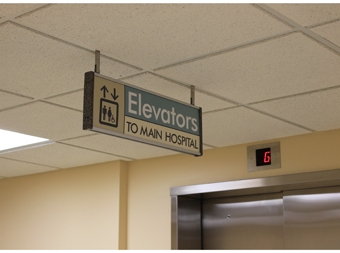
So where do signs fit in all this? Specifically, at the decision points—beginning with the initial directory or map and proceeding from there.
The determination for placement comes after a comprehensive site study and collaborative research conducted with designated stakeholders (including visitors and vendors). While the landmarks and design play a vital role in establishing the environment, the sign package is the ribbon that holds it all together and provides the detail that’s lacking.
Signs give the clarity, reassurance, and controlled messaging necessary to make the decision.
A decision point generally requires the person to make a choice. If a location leads to a frequently sought destination or department—or if it is a point of reference for another location—it is considered a decision point.
If signage can differentiate those choices and provide the information necessary to proceed, it should be placed there. The ultimate goal is to get the person to the desired destination and back again.
As far as the impact of digital technology goes, Berger is “still skeptical.”
“Has anyone been able to show a real, strong degree of success in technology-supported wayfinding in the healthcare or educational arena?” he adds. “I see passive digital screens—ones that supply some motion in the background—as a visual cue or landmark, since the eye gravitates to movement.
“However people don’t instantly engage in the interactive environment unless they walk up to a stationary setting, like a front desk.”
In other words, you have to stop to watch the motion if you want to pick up information.
Conversely static sign copy is easier to catch as you move through space.
“In reality, we need things that reach out to you, not you to them,” says Berger, discounting interior GPS. “Wayfinding is much more passive.
“People expect the environment to support them. They don’t want to work. They want things simple.”
While Neumann sees the positive with “the technology of visual communication today as almost boundless,” providing instant changeability and communication (either hard-wired or carried in our pockets), he also recognizes the negative.
“Cost and longevity are technology’s worst enemies,” he says. “While a sign can be made permanent and evolutionary with non-destructive and zero annual cost, the LED monitor does indeed have a purchasing impact along with annual maintenance upkeep and subsequent replacement, just like a lightbulb.
“Only we don’t stock replacements like we stocked 60-watt bulbs in the past.
“When an LED reader board or monitor breaks down, and its content is not available for the public direction or interest, we sit in darkness until someone buys another bulb. That old static sign carries on without failing.”
In truth, there is a place for both.
Modular architectural signage continues to serve the wayfinding market well, performing reliably 24/7 when professionally placed in optimum locations. Dynamic digital signage serves as an educational and advertising tool where people gather in waiting rooms, as well as an information tool for people who stop to check schedules, meeting room locations and regional info.
Design-wise Berger sees “response to placemaking” as a major course of study in coming years.
“How do you respond to a place—geographically or culturally—in creating an environment for a healthcare facility or university while maintaining a strong institutional quality that instills confidence in the people who come to visit or use it?” he says.
For Neumann, what resonates is advice he recalls from the late, respected Italian designer Massimo Vignelli: “Design is not something to be taken lightly, but to create a solution which must be subjected to the test of time . . . creative solutions created in partnership with our clients that reflect permanency.”
Adding his own thought to that, Neumann says, “We take inspiration from the visual cues within the built environment: materials, textures, colors, sights, sound, emotion and ultimately, the excitement of the moment which leave you with a permanent, unforgettable mental image.”
Ultimately signage must be user-focused. Understanding human behavior and expectations, as well as the principles of good design, are key to successful wayfinding.
In the process, the wayfinding experience is as much of an adventure for the designer and the sign maker as it is for the wayfinder!
—Charles J. Kelly, Jr.
Charles J. Kelly, Jr., is president of Clarke Systems in Allentown, Pennsylvania.


